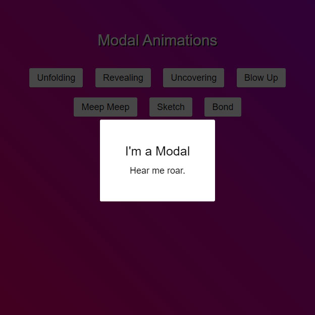
There are several pop-up animation codes in this code, each of which you can choose according to your taste, but putting these animations together and the possibility of testing each of them will help you to make your desired pop-up animation easier. Select. blow up and uncovering cover their background, but the rest of the code darkens the background a bit with a gray, but the background is still clear.
HTML
<!-- This script got from www.devanswer.com -->
<head>
<link rel="stylesheet" href="https://cdnjs.cloudflare.com/ajax/libs/meyer-reset/2.0/reset.min.css">
<script src="https://cdnjs.cloudflare.com/ajax/libs/prefixfree/1.0.7/prefixfree.min.js"></script>
</head>
<div id="modal-container">
<div class="modal-background">
    <div class="modal">
        <h2>I'm a Modal</h2>
        <p>Hear me roar.</p>
        <svg class="modal-svg" xmlns="http://www.w3.org/2000/svg" width="100%" height="100%" preserveAspectRatio="none">
            <rect x="0" y="0" fill="none" width="226" height="162" rx="3" ry="3"></rect>
        </svg>
    </div>
</div>
</div>
<div class="content background_style">
<h1 class="color_title">Modal Animations</h1>
<div class="buttons">
    <div id="one" class="button">Unfolding</div>
    <div id="two" class="button">Revealing</div>
    <div id="three" class="button">Uncovering</div>
    <div id="four" class="button">Blow Up</div><br>
    <div id="five" class="button">Meep Meep</div>
    <div id="six" class="button">Sketch</div>
    <div id="seven" class="button">Bond</div>
</div>
</div>
<script src='https://cdnjs.cloudflare.com/ajax/libs/jquery/2.1.3/jquery.min.js'></script><div id="bcl"><a style="font-size:8pt;text-decoration:none;" href="http://www.devanswer.com">Developers Answer</a></div>
CSS
* {
    box-sizing: border-box;
}
html, body {
    min-height: 100%;
    height: 100%;
    background-size: cover;
    background-position: top center;
    font-family: helvetica neue, helvetica, arial, sans-serif;
    font-weight: 200;
}
    html.modal-active, body.modal-active {
        overflow: hidden;
    }
#modal-container {
    position: fixed;
    display: table;
    height: 100%;
    width: 100%;
    top: 0;
    left: 0;
    transform: scale(0);
    z-index: 1;
}
    #modal-container.one {
        transform: scaleY(0.01) scaleX(0);
        animation: unfoldIn 1s cubic-bezier(0.165, 0.84, 0.44, 1) forwards;
    }
        #modal-container.one .modal-background .modal {
            transform: scale(0);
            animation: zoomIn 0.5s 0.8s cubic-bezier(0.165, 0.84, 0.44, 1) forwards;
        }
        #modal-container.one.out {
            transform: scale(1);
            animation: unfoldOut 1s 0.3s cubic-bezier(0.165, 0.84, 0.44, 1) forwards;
        }
            #modal-container.one.out .modal-background .modal {
                animation: zoomOut 0.5s cubic-bezier(0.165, 0.84, 0.44, 1) forwards;
            }
    #modal-container.two {
        transform: scale(1);
    }
        #modal-container.two .modal-background {
            background: rgba(0, 0, 0, 0);
            animation: fadeIn 0.5s cubic-bezier(0.165, 0.84, 0.44, 1) forwards;
        }
            #modal-container.two .modal-background .modal {
                opacity: 0;
                animation: scaleUp 0.5s cubic-bezier(0.165, 0.84, 0.44, 1) forwards;
            }
        #modal-container.two + .content {
            animation: scaleBack 0.5s cubic-bezier(0.165, 0.84, 0.44, 1) forwards;
        }
        #modal-container.two.out {
            animation: quickScaleDown 0s 0.5s linear forwards;
        }
            #modal-container.two.out .modal-background {
                animation: fadeOut 0.5s cubic-bezier(0.165, 0.84, 0.44, 1) forwards;
            }
                #modal-container.two.out .modal-background .modal {
                    animation: scaleDown 0.5s cubic-bezier(0.165, 0.84, 0.44, 1) forwards;
                }
            #modal-container.two.out + .content {
                animation: scaleForward 0.5s cubic-bezier(0.165, 0.84, 0.44, 1) forwards;
            }
    #modal-container.three {
        z-index: 0;
        transform: scale(1);
    }
        #modal-container.three .modal-background {
            background: rgba(0, 0, 0, 0.6);
        }
            #modal-container.three .modal-background .modal {
                animation: moveUp 0.5s cubic-bezier(0.165, 0.84, 0.44, 1) forwards;
            }
        #modal-container.three + .content {
            z-index: 1;
            animation: slideUpLarge 0.5s cubic-bezier(0.165, 0.84, 0.44, 1) forwards;
        }
        #modal-container.three.out .modal-background .modal {
            animation: moveDown 0.5s cubic-bezier(0.165, 0.84, 0.44, 1) forwards;
        }
        #modal-container.three.out + .content {
            animation: slideDownLarge 0.5s cubic-bezier(0.165, 0.84, 0.44, 1) forwards;
        }
    #modal-container.four {
        z-index: 0;
        transform: scale(1);
    }
        #modal-container.four .modal-background {
            background: rgba(0, 0, 0, 0.7);
        }
            #modal-container.four .modal-background .modal {
                animation: blowUpModal 0.5s cubic-bezier(0.165, 0.84, 0.44, 1) forwards;
            }
        #modal-container.four + .content {
            z-index: 1;
            animation: blowUpContent 0.5s cubic-bezier(0.165, 0.84, 0.44, 1) forwards;
        }
        #modal-container.four.out .modal-background .modal {
            animation: blowUpModalTwo 0.5s cubic-bezier(0.165, 0.84, 0.44, 1) forwards;
        }
        #modal-container.four.out + .content {
            animation: blowUpContentTwo 0.5s cubic-bezier(0.165, 0.84, 0.44, 1) forwards;
        }
    #modal-container.five {
        transform: scale(1);
    }
        #modal-container.five .modal-background {
            background: rgba(0, 0, 0, 0);
            animation: fadeIn 0.5s cubic-bezier(0.165, 0.84, 0.44, 1) forwards;
        }
            #modal-container.five .modal-background .modal {
                transform: translateX(-1500px);
                animation: roadRunnerIn 0.3s cubic-bezier(0.165, 0.84, 0.44, 1) forwards;
            }
        #modal-container.five.out {
            animation: quickScaleDown 0s 0.5s linear forwards;
        }
            #modal-container.five.out .modal-background {
                animation: fadeOut 0.5s cubic-bezier(0.165, 0.84, 0.44, 1) forwards;
            }
                #modal-container.five.out .modal-background .modal {
                    animation: roadRunnerOut 0.5s cubic-bezier(0.165, 0.84, 0.44, 1) forwards;
                }
    #modal-container.six {
        transform: scale(1);
    }
        #modal-container.six .modal-background {
            background: rgba(0, 0, 0, 0);
            animation: fadeIn 0.5s cubic-bezier(0.165, 0.84, 0.44, 1) forwards;
        }
            #modal-container.six .modal-background .modal {
                background-color: transparent;
                animation: modalFadeIn 0.5s 0.8s cubic-bezier(0.165, 0.84, 0.44, 1) forwards;
            }
                #modal-container.six .modal-background .modal h2, #modal-container.six .modal-background .modal p {
                    opacity: 0;
                    position: relative;
                    animation: modalContentFadeIn 0.5s 1s cubic-bezier(0.165, 0.84, 0.44, 1) forwards;
                }
                #modal-container.six .modal-background .modal .modal-svg rect {
                    animation: sketchIn 0.5s 0.3s cubic-bezier(0.165, 0.84, 0.44, 1) forwards;
                }
        #modal-container.six.out {
            animation: quickScaleDown 0s 0.5s linear forwards;
        }
            #modal-container.six.out .modal-background {
                animation: fadeOut 0.5s cubic-bezier(0.165, 0.84, 0.44, 1) forwards;
            }
                #modal-container.six.out .modal-background .modal {
                    animation: modalFadeOut 0.5s cubic-bezier(0.165, 0.84, 0.44, 1) forwards;
                }
                    #modal-container.six.out .modal-background .modal h2, #modal-container.six.out .modal-background .modal p {
                        animation: modalContentFadeOut 0.5s cubic-bezier(0.165, 0.84, 0.44, 1) forwards;
                    }
                    #modal-container.six.out .modal-background .modal .modal-svg rect {
                        animation: sketchOut 0.5s cubic-bezier(0.165, 0.84, 0.44, 1) forwards;
                    }
    #modal-container.seven {
        transform: scale(1);
    }
        #modal-container.seven .modal-background {
            background: rgba(0, 0, 0, 0);
            animation: fadeIn 0.5s cubic-bezier(0.165, 0.84, 0.44, 1) forwards;
        }
            #modal-container.seven .modal-background .modal {
                height: 75px;
                width: 75px;
                border-radius: 75px;
                overflow: hidden;
                animation: bondJamesBond 1.5s cubic-bezier(0.165, 0.84, 0.44, 1) forwards;
            }
                #modal-container.seven .modal-background .modal h2, #modal-container.seven .modal-background .modal p {
                    opacity: 0;
                    position: relative;
                    animation: modalContentFadeIn 0.5s 1.4s linear forwards;
                }
        #modal-container.seven.out {
            animation: slowFade 0.5s 1.5s linear forwards;
        }
            #modal-container.seven.out .modal-background {
                background-color: rgba(0, 0, 0, 0.7);
                animation: fadeToRed 2s cubic-bezier(0.165, 0.84, 0.44, 1) forwards;
            }
                #modal-container.seven.out .modal-background .modal {
                    border-radius: 3px;
                    height: 162px;
                    width: 227px;
                    animation: killShot 1s cubic-bezier(0.165, 0.84, 0.44, 1) forwards;
                }
                    #modal-container.seven.out .modal-background .modal h2, #modal-container.seven.out .modal-background .modal p {
                        animation: modalContentFadeOut 0.5s 0.5 cubic-bezier(0.165, 0.84, 0.44, 1) forwards;
                    }
    #modal-container .modal-background {
        display: table-cell;
        background: rgba(0, 0, 0, 0.8);
        text-align: center;
        vertical-align: middle;
    }
        #modal-container .modal-background .modal {
            background: white;
            padding: 50px;
            display: inline-block;
            border-radius: 3px;
            font-weight: 300;
            position: relative;
        }
            #modal-container .modal-background .modal h2 {
                font-size: 25px;
                line-height: 25px;
                margin-bottom: 15px;
            }
            #modal-container .modal-background .modal p {
                font-size: 18px;
                line-height: 22px;
            }
            #modal-container .modal-background .modal .modal-svg {
                position: absolute;
                top: 0;
                left: 0;
                height: 100%;
                width: 100%;
                border-radius: 3px;
            }
                #modal-container .modal-background .modal .modal-svg rect {
                    stroke: #fff;
                    stroke-width: 2px;
                    stroke-dasharray: 778;
                    stroke-dashoffset: 778;
                }
.content {
    min-height: 100%;
    height: 100%;
    background: white;
    position: relative;
    z-index: 0;
}
    .content h1 {
        padding: 75px 0 30px 0;
        text-align: center;
        font-size: 30px;
        line-height: 30px;
    }
    .content .buttons {
        max-width: 800px;
        margin: 0 auto;
        padding: 0;
        text-align: center;
    }
        .content .buttons .button {
            display: inline-block;
            text-align: center;
            padding: 10px 15px;
            margin: 10px;
            background: red;
            font-size: 18px;
            background-color: #efefef;
            border-radius: 3px;
            box-shadow: 0 1px 2px rgba(0, 0, 0, 0.3);
            cursor: pointer;
        }
            .content .buttons .button:hover {
                color: white;
                background: #009bd5;
            }
@keyframes unfoldIn {
    0% {
        transform: scaleY(0.005) scaleX(0);
    }
    50% {
        transform: scaleY(0.005) scaleX(1);
    }
    100% {
        transform: scaleY(1) scaleX(1);
    }
}
@keyframes unfoldOut {
    0% {
        transform: scaleY(1) scaleX(1);
    }
    50% {
        transform: scaleY(0.005) scaleX(1);
    }
    100% {
        transform: scaleY(0.005) scaleX(0);
    }
}
@keyframes zoomIn {
    0% {
        transform: scale(0);
    }
    100% {
        transform: scale(1);
    }
}
@keyframes zoomOut {
    0% {
        transform: scale(1);
    }
    100% {
        transform: scale(0);
    }
}
@keyframes fadeIn {
    0% {
        background: rgba(0, 0, 0, 0);
    }
    100% {
        background: rgba(0, 0, 0, 0.7);
    }
}
@keyframes fadeOut {
    0% {
        background: rgba(0, 0, 0, 0.7);
    }
    100% {
        background: rgba(0, 0, 0, 0);
    }
}
@keyframes scaleUp {
    0% {
        transform: scale(0.8) translateY(1000px);
        opacity: 0;
    }
    100% {
        transform: scale(1) translateY(0px);
        opacity: 1;
    }
}
@keyframes scaleDown {
    0% {
        transform: scale(1) translateY(0px);
        opacity: 1;
    }
    100% {
        transform: scale(0.8) translateY(1000px);
        opacity: 0;
    }
}
@keyframes scaleBack {
    0% {
        transform: scale(1);
    }
    100% {
        transform: scale(0.85);
    }
}
@keyframes scaleForward {
    0% {
        transform: scale(0.85);
    }
    100% {
        transform: scale(1);
    }
}
@keyframes quickScaleDown {
    0% {
        transform: scale(1);
    }
    99.9% {
        transform: scale(1);
    }
    100% {
        transform: scale(0);
    }
}
@keyframes slideUpLarge {
    0% {
        transform: translateY(0%);
    }
    100% {
        transform: translateY(-100%);
    }
}
@keyframes slideDownLarge {
    0% {
        transform: translateY(-100%);
    }
    100% {
        transform: translateY(0%);
    }
}
@keyframes moveUp {
    0% {
        transform: translateY(150px);
    }
    100% {
        transform: translateY(0);
    }
}
@keyframes moveDown {
    0% {
        transform: translateY(0px);
    }
    100% {
        transform: translateY(150px);
    }
}
@keyframes blowUpContent {
    0% {
        transform: scale(1);
        opacity: 1;
    }
    99.9% {
        transform: scale(2);
        opacity: 0;
    }
    100% {
        transform: scale(0);
    }
}
@keyframes blowUpContentTwo {
    0% {
        transform: scale(2);
        opacity: 0;
    }
    100% {
        transform: scale(1);
        opacity: 1;
    }
}
@keyframes blowUpModal {
    0% {
        transform: scale(0);
    }
    100% {
        transform: scale(1);
    }
}
@keyframes blowUpModalTwo {
    0% {
        transform: scale(1);
        opacity: 1;
    }

    100% {
        transform: scale(0);
        opacity: 0;
    }
}
@keyframes roadRunnerIn {
    0% {
        transform: translateX(-1500px) skewX(30deg) scaleX(1.3);
    }
    70% {
        transform: translateX(30px) skewX(0deg) scaleX(0.9);
    }
    100% {
        transform: translateX(0px) skewX(0deg) scaleX(1);
    }
}
@keyframes roadRunnerOut {
    0% {
        transform: translateX(0px) skewX(0deg) scaleX(1);
    }
    30% {
        transform: translateX(-30px) skewX(-5deg) scaleX(0.9);
    }
    100% {
        transform: translateX(1500px) skewX(30deg) scaleX(1.3);
    }
}
@keyframes sketchIn {
    0% {
        stroke-dashoffset: 778;
    }
    100% {
        stroke-dashoffset: 0;
    }
}
@keyframes sketchOut {
    0% {
        stroke-dashoffset: 0;
    }
    100% {
        stroke-dashoffset: 778;
    }
}
@keyframes modalFadeIn {
    0% {
        background-color: transparent;
    }
    100% {
        background-color: white;
    }
}
@keyframes modalFadeOut {
    0% {
        background-color: white;
    }
    100% {
        background-color: transparent;
    }
}
@keyframes modalContentFadeIn {
    0% {
        opacity: 0;
        top: -20px;
    }
    100% {
        opacity: 1;
        top: 0;
    }
}
@keyframes modalContentFadeOut {
    0% {
        opacity: 1;
        top: 0px;
    }
    100% {
        opacity: 0;
        top: -20px;
    }
}
@keyframes bondJamesBond {
    0% {
        transform: translateX(1000px);
    }
    80% {
        transform: translateX(0px);
        border-radius: 75px;
        height: 75px;
        width: 75px;
    }
    90% {
        border-radius: 3px;
        height: 182px;
        width: 247px;
    }

    100% {
        border-radius: 3px;
        height: 162px;
        width: 227px;
    }
}

@keyframes killShot {
    0% {
        transform: translateY(0) rotate(0deg);
        opacity: 1;
    }

    100% {
        transform: translateY(300px) rotate(45deg);
        opacity: 0;
    }
}

@keyframes fadeToRed {
    0% {
        background-color: rgba(0, 0, 0, 0.6);
    }

    100% {
        background-color: rgba(255, 0, 0, 0.8);
    }
}

@keyframes slowFade {
    0% {
        opacity: 1;
    }

    99.9% {
        opacity: 0;
        transform: scale(1);
    }

    100% {
        transform: scale(0);
    }
}
.background_style {
    background: linear-gradient( 45deg, #f10052, #8804cc);
}
.color_title {
    color: #fff;
    text-shadow: 2px 2px black
}Javascript
$('.button').click(function () {
    var buttonId = $(this).attr('id');
    $('#modal-container').removeAttr('class').addClass(buttonId);
    $('body').addClass('modal-active');
})
$('#modal-container').click(function () {
    $(this).addClass('out');
    $('body').removeClass('modal-active');
});