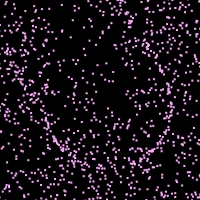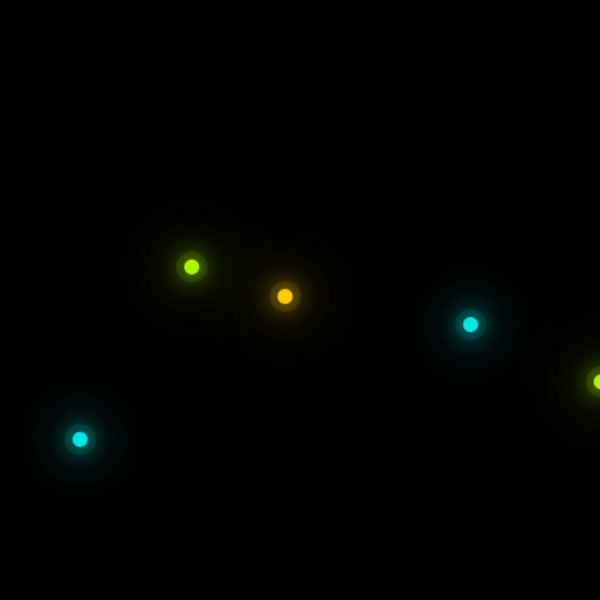
Using animated backgrounds will increase the attention of your website visitors. We have the same background in this code. This background is a black screen on which a number of points of light move. These dots are circular in shape and their colors are different. During the movement of these points, their color constantly changes with the same color spectrum.
HTML
<!-- This script got from www.devanswer.com -->
<div class="glowing">
<span style="--i:1;"></span>
<span style="--i:2;"></span>
<span style="--i:3;"></span>
</div>
<div class="glowing">
<span style="--i:1;"></span>
<span style="--i:2;"></span>
<span style="--i:3;"></span>
</div>
<div class="glowing">
<span style="--i:1;"></span>
<span style="--i:2;"></span>
<span style="--i:3;"></span>
</div>  <div class="glowing">
<span style="--i:1;"></span>
<span style="--i:2;"></span>
<span style="--i:3;"></span>
</div><div id="bcl"><a style="font-size:8pt;text-decoration:none;" href="http://www.devanswer.com">Developers Answer</a></div>
CSS
* {
  margin: 0;
  padding: 0;
}
body {
  display: flex;
  justify-content: center;
  align-items: center;
  width: 100%;
  min-height: 100vh;
  background: #000;
  overflow: hidden;
}
.glowing {
  position: relative;
  min-width: 700px;
  height: 550px;
  margin: -150px;
  transform-origin: right;
  animation: colorChange 5s linear infinite;
}
.glowing:nth-child(even) {
  transform-origin: left;
}
@keyframes colorChange {
  0% {
    filter: hue-rotate(0deg);
    transform: rotate(0deg);
  }
  100% {
    filter: hue-rotate(360deg);
    transform: rotate(360deg);
  }
}
.glowing span {
  position: absolute;
  top: calc(80px * var(--i));
  left: calc(80px * var(--i));
  bottom: calc(80px * var(--i));
  right: calc(80px * var(--i));
}
.glowing span::before {
  content: "";
  position: absolute;
  top: 50%;
  left: -8px;
  width: 15px;
  height: 15px;
  background: #f00;
  border-radius: 50%;
}
.glowing span:nth-child(3n + 1)::before {
  background: rgba(134,255,0,1);
  box-shadow: 0 0 20px rgba(134,255,0,1),
    0 0 40px rgba(134,255,0,1),
    0 0 60px rgba(134,255,0,1),
    0 0 80px rgba(134,255,0,1),
    0 0 0 8px rgba(134,255,0,.1);
}
.glowing span:nth-child(3n + 2)::before {
  background: rgba(255,214,0,1);
  box-shadow: 0 0 20px rgba(255,214,0,1),
    0 0 40px rgba(255,214,0,1),
    0 0 60px rgba(255,214,0,1),
    0 0 80px rgba(255,214,0,1),
    0 0 0 8px rgba(255,214,0,.1);
}
.glowing span:nth-child(3n + 3)::before {
  background: rgba(0,226,255,1);
  box-shadow: 0 0 20px rgba(0,226,255,1),
    0 0 40px rgba(0,226,255,1),
    0 0 60px rgba(0,226,255,1),
    0 0 80px rgba(0,226,255,1),
    0 0 0 8px rgba(0,226,255,.1);
}
.glowing span:nth-child(3n + 1) {
  animation: animate 10s alternate infinite;
}
.glowing span:nth-child(3n + 2) {
  animation: animate-reverse 3s alternate infinite;
}
.glowing span:nth-child(3n + 3) {
  animation: animate 8s alternate infinite;
}
@keyframes animate {
  0% {
    transform: rotate(180deg);
  }
  50% {
    transform: rotate(0deg);
  }
  100% {
    transform: rotate(360deg);
  }
}
@keyframes animate-reverse {
  0% {
    transform: rotate(360deg);
  }

  50% {
    transform: rotate(180deg);
  }

  100% {
    transform: rotate(0deg);
  }
}