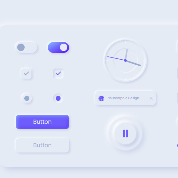
To match the different items of your website with the color theme of the website, you need to differentiate the slides of the items. If the color theme of your website is white and blue, you can use these styles for website items. In this post, there are a number of taggel and sich buttons. Some of them also have a concave shape.
HTML
<!-- This script got from www.devanswer.com -->
<link href="https://fonts.googleapis.com/css?family=Poppins:400,600,700&display=swap" rel="stylesheet">
<link href="https://fonts.googleapis.com/icon?family=Material+Icons" rel="stylesheet">
<script src="https://kit.fontawesome.com/f0601b0fb2.js" crossorigin="anonymous"></script>
<script type='module' src='https://unpkg.com/ionicons@5.0.0/dist/ionicons/ionicons.esm.js'></script>
<script nomodule='' src='https://unpkg.com/ionicons@5.0.0/dist/ionicons/ionicons.js'></script>
<link rel="stylesheet" href="https://cdnjs.cloudflare.com/ajax/libs/normalize/5.0.0/normalize.min.css">
 <div class="container">
        <div class="components">
            <div class="switch">
                <div class="switch__1">
                    <input id="switch-1" type="checkbox">
                    <label for="switch-1"></label>
                </div>
                <div class="switch__2">
                    <input id="switch-2" type="checkbox" checked>
                    <label for="switch-2"></label>
                </div>
            </div>
            <div class="checkbox">
                <div class="checkbox__1">
                    <input id="checkbox-1" type="checkbox">
                    <label for="checkbox-1">
                        <i class="material-icons">done</i>
                    </label>
                </div>
                <div class="checkbox__2">
                    <input id="checkbox-2" type="checkbox" checked>
                    <label for="checkbox-2">
                        <i class="material-icons">done</i>
                    </label>
                </div>
            </div>
            <div class="radio">
                <div class="radio__1">
                    <input id="radio-1" type="radio" name="radio" value="1">
                    <label for="radio-1"></label>
                </div>
                <div class="radio__2">
                    <input id="radio-2" type="radio" name="radio" value="2" checked>
                    <label for="radio-2"></label>
                </div>
            </div>
            <div class="btn btn__primary"><p>Button</p></div>
            <div class="btn btn__secondary"><p>Button</p></div>
            <div class="clock">
                <div class="hand hours"></div>
                <div class="hand minutes"></div>
                <div class="hand seconds"></div>
                <div class="point"></div>
                <div class="marker">
                    <span class="marker__1"></span>
                    <span class="marker__2"></span>
                    <span class="marker__3"></span>
                    <span class="marker__4"></span>
                </div>
            </div>
            <div class="chip">
                <div class="chip__icon">
                    <ion-icon name="color-palette"></ion-icon>
                </div>
                <p>Neumorphic Design</p>
                <div class="chip__close">
                    <ion-icon name="close"></ion-icon>
                </div>
            </div>
            <div class="circle">
                <span class="circle__btn">
                    <ion-icon class="pause" name="pause"></ion-icon>
                    <ion-icon class="play" name="play"></ion-icon>
                </span>
                <span class="circle__back-1"></span>
                <span class="circle__back-2"></span>
            </div>
            <div class="form">
                <input type="text" class="form__input" placeholder="Type anything...">
            </div>
            <div class="search">
                <input type="text" class="search__input" placeholder="Search...">
                <div class="search__icon">
                    <ion-icon name="search"></ion-icon>
                </div>
            </div>
            <div class="segmented-control">
                <input type="radio" name="radio2" value="3" id="tab-1" checked />
                <label for="tab-1" class="segmented-control__1">
                    <p>Tab 1</p>
                </label>
                <input type="radio" name="radio2" value="4" id="tab-2" />
                <label for="tab-2" class="segmented-control__2">
                    <p>Tab 2</p>
                </label>
                <input type="radio" name="radio2" value="5" id="tab-3" />
                <label for="tab-3" class="segmented-control__3">
                    <p>Tab 3</p>
                </label>
                <div class="segmented-control__color"></div>
            </div>
            <div class="icon">
                <div class="icon__home">
                    <ion-icon name="home"></ion-icon>
                </div>
                <div class="icon__account">
                    <ion-icon name="person"></ion-icon>
                </div>
                <div class="icon__settings">
                    <ion-icon name="settings"></ion-icon>
                </div>
            </div>
            <div class="slider">
                <div class="slider__box">
                    <span class="slider__btn" id="find"></span>
                    <span class="slider__color"></span>
                    <span class="slider__tooltip">50%</span>
                </div>
            </div>
        </div>
</div><div id="bcl"><a style="font-size:8pt;text-decoration:none;" href="http://www.devanswer.com">Developers Answer</a></div>
CSS
:root {
	--primary-light: #8abdff;
	--primary: #6d5dfc;
	--primary-dark: #5b0eeb;
	--white: #FFFFFF;
	--greyLight-1: #E4EBF5;
	--greyLight-2: #c8d0e7;
	--greyLight-3: #bec8e4;
	--greyDark: #9baacf;
}
*, *::before, *::after {
	margin: 0;
	padding: 0;
	box-sizing: inherit;
}
html {
	box-sizing: border-box;
	font-size: 62.5%;
	overflow-y: scroll;
	background: var(--greyLight-1);
}
@media screen and (min-width: 900px) {
	html {
		font-size: 75%;
	}
}
.container {
	min-height: 100vh;
	display: flex;
	justify-content: center;
	align-items: center;
	font-family: "Poppins", sans-serif;
	background: var(--greyLight-1);
}
.components {
	width: 75rem;
	height: 40rem;
	border-radius: 3rem;
	box-shadow: 0.8rem 0.8rem 1.4rem var(--greyLight-2), -0.2rem -0.2rem 1.8rem var(--white);
	padding: 4rem;
	display: grid;
	grid-template-columns: 17.6rem 19rem 20.4rem;
	grid-template-rows: repeat(autofit, -webkit-min-content);
	grid-template-rows: repeat(autofit, min-content);
	grid-column-gap: 5rem;
	grid-row-gap: 2.5rem;
	align-items: center;
}
.switch {
	grid-column: 1/2;
	display: grid;
	grid-template-columns: repeat(2, -webkit-min-content);
	grid-template-columns: repeat(2, min-content);
	grid-gap: 3rem;
	justify-self: center;
}
.switch input {
	display: none;
}
.switch__1, .switch__2 {
	width: 6rem;
}
.switch__1 label, .switch__2 label {
	display: flex;
	align-items: center;
	width: 100%;
	height: 3rem;
	box-shadow: 0.3rem 0.3rem 0.6rem var(--greyLight-2), -0.2rem -0.2rem 0.5rem var(--white);
	background: rgba(255, 255, 255, 0);
	position: relative;
	cursor: pointer;
	border-radius: 1.6rem;
}
.switch__1 label::after, .switch__2 label::after {
	content: "";
	position: absolute;
	left: 0.4rem;
	width: 2.1rem;
	height: 2.1rem;
	border-radius: 50%;
	background: var(--greyDark);
	transition: all 0.4s ease;
}
.switch__1 label::before, .switch__2 label::before {
	content: "";
	width: 100%;
	height: 100%;
	border-radius: inherit;
	background: linear-gradient(330deg, var(--primary-dark) 0%, var(--primary) 50%, var(--primary-light) 100%);
	opacity: 0;
	transition: all 0.4s ease;
}
.switch input:checked~label::before {
	opacity: 1;
}
.switch input:checked~label::after {
	left: 57%;
	background: var(--greyLight-1);
}
.checkbox {
	grid-column: 1/2;
	display: grid;
	grid-template-columns: repeat(2, 6rem);
	grid-gap: 3rem;
	justify-content: center;
}
.checkbox input {
	display: none;
}
.checkbox__1, .checkbox__2 {
	width: 6rem;
	display: flex;
	justify-content: center;
}
.checkbox__1 label, .checkbox__2 label {
	box-shadow: 0.3rem 0.3rem 0.6rem var(--greyLight-2), -0.2rem -0.2rem 0.5rem var(--white);
	cursor: pointer;
	position: relative;
	display: flex;
	justify-content: center;
	align-items: center;
	border-radius: 0.5rem;
	width: 2.8rem;
	height: 2.8rem;
}
.checkbox__1 label:hover i, .checkbox__2 label:hover i {
	color: var(--primary);
}
.checkbox__1 label i, .checkbox__2 label i {
	font-size: 1.8rem;
	font-weight: 700;
	color: var(--greyDark);
	transition: 0.3s ease;
}
.checkbox__1 input:checked~label, .checkbox__2 input:checked~label {
	box-shadow: inset 0.2rem 0.2rem 0.5rem var(--greyLight-2), inset -0.2rem -0.2rem 0.5rem var(--white);
}
.checkbox__1 input:checked~label i, .checkbox__2 input:checked~label i {
	color: var(--primary);
}
.radio {
	grid-column: 1/2;
	display: grid;
	grid-template-columns: repeat(2, 1fr);
	justify-items: center;
}
.radio input {
	display: none;
}
.radio__1 input:checked~label, .radio__2 input:checked~label {
	box-shadow: inset 0.2rem 0.2rem 0.5rem var(--greyLight-2), inset -0.2rem -0.2rem 0.5rem var(--white);
}
.radio__1 input:checked~label::after, .radio__2 input:checked~label::after {
	background: var(--primary);
}
.radio__1 label, .radio__2 label {
	box-shadow: 0.3rem 0.3rem 0.6rem var(--greyLight-2), -0.2rem -0.2rem 0.5rem var(--white);
	position: relative;
	display: flex;
	justify-content: center;
	align-items: center;
	cursor: pointer;
	width: 2.8rem;
	height: 2.8rem;
	border-radius: 50%;
}
.radio__1 label:hover::after, .radio__2 label:hover::after {
	background: var(--primary);
}
.radio__1 label::after, .radio__2 label::after {
	content: "";
	position: absolute;
	width: 1.4rem;
	height: 1.4rem;
	background: var(--greyDark);
	border-radius: 50%;
	transition: 0.3s ease;
}
.btn {
	width: 15rem;
	height: 4rem;
	border-radius: 1rem;
	box-shadow: 0.3rem 0.3rem 0.6rem var(--greyLight-2), -0.2rem -0.2rem 0.5rem var(--white);
	justify-self: center;
	display: flex;
	align-items: center;
	justify-content: center;
	cursor: pointer;
	transition: 0.3s ease;
}
.btn__primary {
	grid-column: 1/2;
	grid-row: 4/5;
	background: var(--primary);
	box-shadow: inset 0.2rem 0.2rem 1rem var(--primary-light), inset -0.2rem -0.2rem 1rem var(--primary-dark), 0.3rem 0.3rem 0.6rem var(--greyLight-2), -0.2rem -0.2rem 0.5rem var(--white);
	color: var(--greyLight-1);
}
.btn__primary:hover {
	color: var(--white);
}
.btn__primary:active {
	box-shadow: inset 0.2rem 0.2rem 1rem var(--primary-dark), inset -0.2rem -0.2rem 1rem var(--primary-light);
}
.btn__secondary {
	grid-column: 1/2;
	grid-row: 5/6;
	color: var(--greyDark);
}
.btn__secondary:hover {
	color: var(--primary);
}
.btn__secondary:active {
	box-shadow: inset 0.2rem 0.2rem 0.5rem var(--greyLight-2), inset -0.2rem -0.2rem 0.5rem var(--white);
}
.btn p {
	font-size: 1.6rem;
}
.clock {
	grid-column: 2/3;
	grid-row: 1/3;
	width: 12rem;
	height: 12rem;
	justify-self: center;
	box-shadow: 0.3rem 0.3rem 0.6rem var(--greyLight-2), -0.2rem -0.2rem 0.5rem var(--white);
	border-radius: 50%;
	display: flex;
	justify-content: center;
	align-items: center;
	position: relative;
}
.clock .hand {
	position: absolute;
	transform-origin: bottom;
	bottom: 6rem;
	border-radius: 0.2rem;
	z-index: 200;
}
.clock .hours {
	width: 0.4rem;
	height: 3.2rem;
	background: var(--greyLight-3);
}
.clock .minutes {
	width: 0.4rem;
	height: 4.6rem;
	background: var(--greyDark);
}
.clock .seconds {
	width: 0.2rem;
	height: 5.2rem;
	background: var(--primary);
}
.clock .point {
	position: absolute;
	width: 0.8rem;
	height: 0.8rem;
	border-radius: 50%;
	background: var(--primary);
	z-index: 300;
}
.clock .marker {
	width: 95%;
	height: 95%;
	border-radius: 50%;
	position: relative;
	box-shadow: inset 0.2rem 0.2rem 0.5rem var(--greyLight-2), inset -0.2rem -0.2rem 0.5rem var(--white);
}
.clock .marker::after {
	content: "";
	width: 60%;
	height: 60%;
	position: absolute;
	box-shadow: inset 1px 1px 1px var(--greyLight-2), inset -1px -1px 1px var(--white);
	border-radius: 50%;
	top: 20%;
	left: 20%;
	filter: blur(1px);
}
.clock .marker__1, .clock .marker__2, .clock .marker__3, .clock .marker__4 {
	position: absolute;
	border-radius: 0.1rem;
	box-shadow: inset 1px 1px 1px var(--greyLight-2), inset -1px -1px 1px var(--white);
}
.clock .marker__1, .clock .marker__2 {
	width: 0.2rem;
	height: 0.6rem;
	left: 5.6rem;
}
.clock .marker__3, .clock .marker__4 {
	width: 0.6rem;
	height: 0.2rem;
	top: 5.6rem;
}
.clock .marker__1 {
	top: 2%;
}
.clock .marker__2 {
	top: 98%;
	transform: translateY(-0.6rem);
}
.clock .marker__3 {
	left: 2%;
}
.clock .marker__4 {
	left: 98%;
	transform: translateX(-0.6rem);
}
.chip {
	grid-column: 2/3;
	grid-row: 3/4;
	justify-self: center;
	width: 17rem;
	height: 4rem;
	border-radius: 1rem;
	box-shadow: 0.3rem 0.3rem 0.6rem var(--greyLight-2), -0.2rem -0.2rem 0.5rem var(--white);
	display: flex;
	justify-content: space-between;
	align-items: center;
}
.chip__icon {
	width: 3rem;
	height: 3rem;
	border-radius: 1rem;
	margin: 0 0 0 0.2rem;
	display: flex;
	justify-content: center;
	align-items: center;
	font-size: 1.8rem;
	color: var(--primary);
}
.chip p {
	font-size: 0.9rem;
	margin-left: -1.8rem;
	color: var(--greyDark);
}
.chip__close {
	width: 1.6rem;
	height: 1.6rem;
	margin: 0 0.5rem;
	display: flex;
	font-size: 1.6rem;
	color: var(--greyLight-3);
	cursor: pointer;
}
.circle {
	grid-column: 2/3;
	grid-row: 4/6;
	width: 9rem;
	height: 100%;
	justify-self: center;
	border-radius: 1rem;
	display: grid;
	grid-template-rows: 1fr;
	justify-items: center;
	align-items: center;
}
.circle__btn {
	grid-row: 1/2;
	grid-column: 1/2;
	width: 6rem;
	height: 6rem;
	display: flex;
	margin: 0.6rem;
	justify-content: center;
	align-items: center;
	border-radius: 50%;
	font-size: 3.2rem;
	color: var(--primary);
	z-index: 300;
	background: var(--greyLight-1);
	box-shadow: 0.3rem 0.3rem 0.6rem var(--greyLight-2), -0.2rem -0.2rem 0.5rem var(--white);
	cursor: pointer;
	position: relative;
}
.circle__btn.shadow {
	box-shadow: inset 0.2rem 0.2rem 0.5rem var(--greyLight-2), inset -0.2rem -0.2rem 0.5rem var(--white);
}
.circle__btn .play {
	position: absolute;
	opacity: 0;
	transition: all 0.2s linear;
}
.circle__btn .play.visibility {
	opacity: 1;
}
.circle__btn .pause {
	position: absolute;
	transition: all 0.2s linear;
}
.circle__btn .pause.visibility {
	opacity: 0;
}
.circle__back-1, .circle__back-2 {
	grid-row: 1/2;
	grid-column: 1/2;
	width: 6rem;
	height: 6rem;
	border-radius: 50%;
	filter: blur(1px);
	z-index: 100;
}
.circle__back-1 {
	box-shadow: 0.4rem 0.4rem 0.8rem var(--greyLight-2), -0.4rem -0.4rem 0.8rem var(--white);
	background: linear-gradient(to bottom right, var(--greyLight-2) 0%, var(--white) 100%);
	-webkit-animation: waves 4s linear infinite;
	animation: waves 4s linear infinite;
}
.circle__back-1.paused {
	-webkit-animation-play-state: paused;
	animation-play-state: paused;
}
.circle__back-2 {
	box-shadow: 0.4rem 0.4rem 0.8rem var(--greyLight-2), -0.4rem -0.4rem 0.8rem var(--white);
	-webkit-animation: waves 4s linear 2s infinite;
	animation: waves 4s linear 2s infinite;
}
.circle__back-2.paused {
	-webkit-animation-play-state: paused;
	animation-play-state: paused;
}
.form {
	grid-column: 3/4;
	grid-row: 3/4;
}
.form__input {
	width: 20.4rem;
	height: 4rem;
	border: none;
	border-radius: 1rem;
	font-size: 1.4rem;
	padding-left: 1.4rem;
	box-shadow: inset 0.2rem 0.2rem 0.5rem var(--greyLight-2), inset -0.2rem -0.2rem 0.5rem var(--white);
	background: none;
	font-family: inherit;
	color: var(--greyDark);
}
.form__input::-moz-placeholder {
	color: var(--greyLight-3);
}
.form__input:-ms-input-placeholder {
	color: var(--greyLight-3);
}
.form__input::placeholder {
	color: var(--greyLight-3);
}
.form__input:focus {
	outline: none;
	box-shadow: 0.3rem 0.3rem 0.6rem var(--greyLight-2), -0.2rem -0.2rem 0.5rem var(--white);
}
.search {
	grid-column: 3/4;
	grid-row: 2/3;
	position: relative;
	display: flex;
	align-items: center;
}
.search__input {
	width: 20.4rem;
	height: 4rem;
	border: none;
	border-radius: 1rem;
	font-size: 1.4rem;
	padding-left: 3.8rem;
	box-shadow: inset 0.2rem 0.2rem 0.5rem var(--greyLight-2), inset -0.2rem -0.2rem 0.5rem var(--white);
	background: none;
	font-family: inherit;
	color: var(--greyDark);
}
.search__input::-moz-placeholder {
	color: var(--greyLight-3);
}
.search__input:-ms-input-placeholder {
	color: var(--greyLight-3);
}
.search__input::placeholder {
	color: var(--greyLight-3);
}
.search__input:focus {
	outline: none;
	box-shadow: 0.3rem 0.3rem 0.6rem var(--greyLight-2), -0.2rem -0.2rem 0.5rem var(--white);
}
.search__input:focus+.search__icon {
	color: var(--primary);
}
.search__icon {
	height: 2rem;
	position: absolute;
	font-size: 2rem;
	padding: 0 1rem;
	display: flex;
	color: var(--greyDark);
	transition: 0.3s ease;
}
.segmented-control {
	grid-column: 3/4;
	grid-row: 1/2;
	width: 20.4rem;
	height: 4rem;
	box-shadow: 0.3rem 0.3rem 0.6rem var(--greyLight-2), -0.2rem -0.2rem 0.5rem var(--white);
	border-radius: 1rem;
	display: flex;
	align-items: center;
	position: relative;
}
.segmented-control input {
	display: none;
}
.segmented-control>input:checked+label {
	transition: all 0.5s ease;
	color: var(--primary);
}
.segmented-control__1, .segmented-control__2, .segmented-control__3 {
	width: 6.8rem;
	height: 3.6rem;
	font-size: 1.4rem;
	display: flex;
	justify-content: center;
	align-items: center;
	cursor: pointer;
	color: var(--greyDark);
	transition: all 0.5s ease;
}
.segmented-control__1:hover, .segmented-control__2:hover, .segmented-control__3:hover {
	color: var(--primary);
}
.segmented-control__color {
	position: absolute;
	height: 3.4rem;
	width: 6.2rem;
	margin-left: 0.3rem;
	border-radius: 0.8rem;
	box-shadow: inset 0.2rem 0.2rem 0.5rem var(--greyLight-2), inset -0.2rem -0.2rem 0.5rem var(--white);
	pointer-events: none;
}
#tab-1:checked~.segmented-control__color {
	transform: translateX(0);
	transition: transform 0.3s cubic-bezier(0.645, 0.045, 0.355, 1);
}
#tab-2:checked~.segmented-control__color {
	transform: translateX(6.8rem);
	transition: transform 0.3s cubic-bezier(0.645, 0.045, 0.355, 1);
}
#tab-3:checked~.segmented-control__color {
	transform: translateX(13.6rem);
	transition: transform 0.3s cubic-bezier(0.645, 0.045, 0.355, 1);
}
.icon {
	grid-column: 3/4;
	grid-row: 4/5;
	display: flex;
	justify-content: space-between;
}
.icon__account, .icon__home, .icon__settings {
	width: 4rem;
	height: 4rem;
	border-radius: 50%;
	box-shadow: 0.3rem 0.3rem 0.6rem var(--greyLight-2), -0.2rem -0.2rem 0.5rem var(--white);
	display: flex;
	justify-content: center;
	align-items: center;
	font-size: 2rem;
	cursor: pointer;
	color: var(--greyDark);
	transition: all 0.5s ease;
}
.icon__account:active, .icon__home:active, .icon__settings:active {
	box-shadow: inset 0.2rem 0.2rem 0.5rem var(--greyLight-2), inset -0.2rem -0.2rem 0.5rem var(--white);
	color: var(--primary);
}
.icon__account:hover, .icon__home:hover, .icon__settings:hover {
	color: var(--primary);
}
.slider {
	grid-column: 3/4;
	grid-row: 5/6;
	align-self: center;
	display: flex;
	flex-direction: column;
}
.slider__box {
	width: 100%;
	height: 1rem;
	cursor: pointer;
	box-shadow: inset 0.2rem 0.2rem 0.5rem var(--greyLight-2), inset -0.2rem -0.2rem 0.5rem var(--white);
	border-radius: 1rem;
	position: relative;
	display: flex;
	justify-content: center;
	align-items: center;
}
.slider__btn {
	width: 2rem;
	height: 2rem;
	border-radius: 50%;
	background: var(--white);
	position: absolute;
	box-shadow: 0px 0.1rem 0.3rem 0px var(--greyLight-3);
	z-index: 200;
	display: flex;
	justify-content: center;
	align-items: center;
}
.slider__btn:hover~.slider__tooltip {
	opacity: 1;
}
.slider__btn::after {
	content: "";
	position: absolute;
	width: 0.8rem;
	height: 0.8rem;
	border-radius: 50%;
	box-shadow: inset 0.2rem 0.2rem 0.5rem var(--greyLight-2), inset -0.2rem -0.2rem 0.5rem var(--white);
}
.slider__color {
	height: 100%;
	width: 50%;
	position: absolute;
	left: 0;
	z-index: 100;
	border-radius: inherit;
	background: var(--primary);
	background: linear-gradient(-1deg, var(--primary-dark) 0%, var(--primary) 50%, var(--primary-light) 100%);
}
.slider__tooltip {
	position: absolute;
	top: 2.6rem;
	height: 2.5rem;
	width: 3rem;
	border-radius: 0.6rem;
	display: flex;
	justify-content: center;
	align-items: center;
	font-size: 1.2rem;
	color: var(--primary);
	box-shadow: 0.3rem 0.3rem 0.6rem var(--greyLight-2), -0.2rem -0.2rem 0.5rem var(--white);
	opacity: 0;
	transition: opacity 0.3s ease;
}
@-webkit-keyframes waves {
	0% {
		transform: scale(1);
		opacity: 1;
	}
	50% {
		opacity: 1;
	}
	100% {
		transform: scale(2);
		opacity: 0;
	}
}
@keyframes waves {
	0% {
		transform: scale(1);
		opacity: 1;
	}
	50% {
		opacity: 1;
	}
	100% {
		transform: scale(2);
		opacity: 0;
	}
}
.dribbble {
	position: fixed;
	font-size: 2.6rem;
	right: 2rem;
	bottom: 1rem;
	color: #EA4C89;
}Javascript
/*  clock */
const hours = document.querySelector('.hours');
const minutes = document.querySelector('.minutes');
const seconds = document.querySelector('.seconds');
/*  play button */
const play = document.querySelector('.play');
const pause = document.querySelector('.pause');
const playBtn = document.querySelector('.circle__btn');
const wave1 = document.querySelector('.circle__back-1');
const wave2 = document.querySelector('.circle__back-2');
/*  rate slider */
const container = document.querySelector('.slider__box');
const btn = document.querySelector('.slider__btn');
const color = document.querySelector('.slider__color');
const tooltip = document.querySelector('.slider__tooltip');
clock = () => {
    let today = new Date();
    let h = (today.getHours() % 12) + today.getMinutes() / 59; // 22 % 12 = 10pm
    let m = today.getMinutes(); // 0 - 59
    let s = today.getSeconds(); // 0 - 59
    h *= 30; // 12 * 30 = 360deg
    m *= 6;
    s *= 6; // 60 * 6 = 360deg
    rotation(hours, h);
    rotation(minutes, m);
    rotation(seconds, s);
    // call every second
    setTimeout(clock, 500);
}
rotation = (target, val) => {
    target.style.transform = `rotate(${val}deg)`;
}
window.onload = clock();
dragElement = (target, btn) => {
    target.addEventListener('mousedown', (e) => {
        onMouseMove(e);
        window.addEventListener('mousemove', onMouseMove);
        window.addEventListener('mouseup', onMouseUp);
    });
    onMouseMove = (e) => {
        e.preventDefault();
        let targetRect = target.getBoundingClientRect();
        let x = e.pageX - targetRect.left + 10;
        if (x > targetRect.width) { x = targetRect.width };
        if (x < 0) { x = 0 };
        btn.x = x - 10;
        btn.style.left = btn.x + 'px';
        // get the position of the button inside the container (%)
        let percentPosition = (btn.x + 10) / targetRect.width * 100;
        // color width = position of button (%)
        color.style.width = percentPosition + "%";
        // move the tooltip when button moves, and show the tooltip
        tooltip.style.left = btn.x - 5 + 'px';
        tooltip.style.opacity = 1;
        // show the percentage in the tooltip
        tooltip.textContent = Math.round(percentPosition) + '%';
    };
    onMouseUp = (e) => {
        window.removeEventListener('mousemove', onMouseMove);
        tooltip.style.opacity = 0;
        btn.addEventListener('mouseover', function () {
            tooltip.style.opacity = 1;
        });
        btn.addEventListener('mouseout', function () {
            tooltip.style.opacity = 0;
        });
    };
};
dragElement(container, btn);
/*  play button  */
playBtn.addEventListener('click', function (e) {
    e.preventDefault();
    pause.classList.toggle('visibility');
    play.classList.toggle('visibility');
    playBtn.classList.toggle('shadow');
    wave1.classList.toggle('paused');
    wave2.classList.toggle('paused');
});