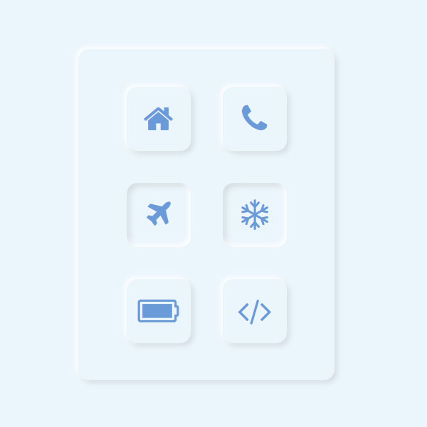
You can use different styles like this code for different elements of your website than usual. One of these styles is the use of plunger buttons. These buttons can be considered as a checkbox. Each of these buttons has a blue icon. The overall theme of these buttons and the background color are also blue.
HTML
<!-- This script got from www.devanswer.com -->
<link href="HTTPS://maxcdn.bootstrapcdn.com/font-awesome/4.1.0/css/font-awesome.min.css" rel="stylesheet">
<link href="https://stackpath.bootstrapcdn.com/font-awesome/4.7.0/css/font-awesome.min.css" rel="stylesheet">
<ul>
    <li>
        <label>
            <input type="checkbox" name="">
            <div class="icon-box">
                <i class="fa fa-home" aria-hidden="true"></i>
            </div>
        </label>
    </li>
    <li>
        <label>
            <input type="checkbox" name="">
            <div class="icon-box">
                <i class="fa fa-phone" aria-hidden="true"></i>
            </div>
        </label>
    </li>
    <li>
        <label>
            <input type="checkbox" name="">
            <div class="icon-box">
                <i class="fa fa-plane" aria-hidden="true"></i>
            </div>
        </label>
    </li>
    <li>
        <label>
            <input type="checkbox" name="">
            <div class="icon-box">
                <i class="fa fa-snowflake-o" aria-hidden="true"></i>
            </div>
        </label>
    </li>
    <li>
        <label>
            <input type="checkbox" name="">
            <div class="icon-box">
                <i class="fa fa-battery-full" aria-hidden="true"></i>
            </div>
        </label>
    </li>
    <li>
        <label>
            <input type="checkbox" name="">
            <div class="icon-box">
                <i class="fa fa-code" aria-hidden="true"></i>
            </div>
        </label>
    </li>
</ul>
<!--   Social Connections -->
<div class="social-icons">
    <a class="social-icon social-icon--twitter">
        <i class="fa fa-twitter"></i>
        <div class="tooltip">Twitter</div>
    </a>
</div><div id="bcl"><a style="font-size:8pt;text-decoration:none;" href="http://www.devanswer.com">Developers Answer</a></div>
CSS
* {
	margin: 0;
	padding: 0;
	box-sizing: border-box;
}
body {
	display: flex;
	justify-content: center;
	align-items: center;
	min-height: 100vh;
	background: #ebf5fc;
}
ul {
	position: relative;
	display: flex;
	justify-content: center;
	align-items: center;
	flex-wrap: wrap;
	border-radius: 10px;
	padding: 20px;
	width: 240px;
	background: #ebf5fc;
	box-shadow: -2px -2px 5px white, 3px 3px 5px rgba(0, 0, 0, 0.1);
}
ul li {
	position: relative;
	list-style: none;
	text-align: center;
	margin: 15px;
}
ul li label {
	position: relative;
	cursor: pointer;
}
ul li label input[type=checkbox] {
	position: absolute;
	opacity: 0;
}
ul li label :checked~.icon-box {
	box-shadow: inset -2px -2px 5px white, inset 3px 3px 5px rgba(0, 0, 0, 0.1);
}
ul li label :checked~.icon-box .fa {
	transform: scale(0.95);
}
ul li label .icon-box {
	width: 60px;
	height: 60px;
	background: #ebf5fc;
	display: flex;
	justify-content: center;
	align-items: center;
	box-shadow: -2px -2px 5px white, 3px 3px 5px rgba(0, 0, 0, 0.1);
	border-radius: 10px;
}
ul li label .icon-box .fa {
	font-size: 30px;
	color: #6a9bd8;
}
/* --------Social Icons-------- */

/* Color Variables */

/* Social Icon Mixin */

.social-icons {
	display: flex;
	position: absolute;
	bottom: 25px;
	right: 25px;
}
.social-icon {
	display: flex;
	align-items: center;
	justify-content: center;
	position: relative;
	width: 40px;
	height: 40px;
	margin: 0 0.7rem;
	border-radius: 50%;
	cursor: pointer;
	font-family: "Helvetica Neue", "Helvetica", "Arial", sans-serif;
	font-size: 1.5rem;
	text-decoration: none;
	transition: all 0.15s ease;
}
.social-icon:hover {
	color: #fff;
}
.social-icon:hover .tooltip {
	visibility: visible;
	opacity: 1;
	transform: translate(-50%, -150%);
}
.social-icon:active {
	box-shadow: 0px 1px 3px rgba(0, 0, 0, 0.5) inset;
}
.social-icon--twitter {
	background: #2b97f1;
	color: #fff;
}
.social-icon--twitter .tooltip {
	background: #2b97f1;
	color: currentColor;
}
.social-icon--twitter .tooltip:after {
	border-top-color: #2b97f1;
}
.social-icon--codepen {
	background: #000;
	color: #fff;
}
.social-icon--codepen .tooltip {
	background: #000;
	color: currentColor;
}
.social-icon--codepen .tooltip:after {
	border-top-color: #000;
}
.social-icon i {
	position: relative;
	top: 1px;
}
/* Tooltips */

.tooltip {
	display: block;
	position: absolute;
	top: 0;
	left: 50%;
	padding: 0.4rem 0.6rem;
	border-radius: 40px;
	font-size: 0.4rem;
	font-weight: bold;
	opacity: 0;
	pointer-events: none;
	text-transform: uppercase;
	transform: translate(-50%, -100%);
	transition: all 0.3s ease;
	z-index: 1;
}
.tooltip:after {
	display: block;
	position: absolute;
	bottom: 1px;
	left: 50%;
	width: 0;
	height: 0;
	content: "";
	border: solid;
	border-width: 10px 10px 0 10px;
	border-color: transparent;
	transform: translate(-50%, 100%);
}