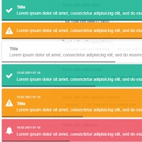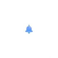
Using a simple button is not particularly beautiful, but using an animated button is both remarkably beautiful and attracts the audience more attention, such as the following code, which is a notification symbol that protrudes a circle larger than its original radius from the center. And it disappears and the notification icon, which is a ringtone, also shakes.
HTML
<!-- This script got from www.devanswer.com -->
<link rel='stylesheet' href='https://cdnjs.cloudflare.com/ajax/libs/twitter-bootstrap/4.1.3/css/bootstrap.min.css'>
<link rel='stylesheet' href='https://cdnjs.cloudflare.com/ajax/libs/font-awesome/5.8.1/css/all.min.css'>
<div class="my-btn">
        <div class="my-btn-border"></div>
        <i class="fas fa-bell btn-bell"></i>
</div>
<script src='https://cdnjs.cloudflare.com/ajax/libs/jquery/3.4.1/jquery.min.js'></script><div id="bcl"><a style="font-size:8pt;text-decoration:none;" href="http://www.devanswer.com">Developers Answer</a></div>
CSS
body {
    height: 100%;
    overflow-x: hidden;
    margin: 0 auto;
}

.my-btn, .my-btn-border, .btn-bell {
    border-radius: 50%;
    position: absolute;
    top: 50%;
    left: 50%;
    transform: translate(-50%, -50%);
}

.my-btn {
    height: 60px;
    width: 60px;
    box-shadow: -1px 2px 10px #999;
    background: #ef7575;
    animation-name: col;
    animation-duration: 2s;
    animation-iteration-count: infinite;
}

.my-btn-border {
    height: 59px;
    width: 59px;
    border: 1px solid #ef7575 !important;
    animation-name: bord-pop;
    animation-duration: 2s;
    animation-iteration-count: infinite;
    box-shadow: 2px 2px 5px #ccc, -2px -2px 5px #ccc;
}

.btn-bell {
    color: white;
    font-size: 20px;
    animation-name: bell-ring;
    animation-duration: 2s;
    animation-iteration-count: infinite;
}

@keyframes bord-pop {
    0% {
        transform: translate(-50%, -50%);
    }

    50% {
        transform: translate(-50%, -50%) scale(1.9);
        opacity: 0.1;
    }

    100% {
        transform: translate(-50%, -50%) scale(1.9);
        opacity: 0;
    }
}

@keyframes col {
    0% {
        transform: scale(1) translate(0,0);
    }

    10% {
        transform: scale(1.1) translate(0,0);
    }

    75% {
        transform: scale(1) translate(0,0);
    }

    100% {
        transform: scale(1) translate(0,0);
    }
}

@keyframes bell-ring {
    0% {
        transform: translate(-50%, -50%);
    }

    5%, 15% {
        transform: translate(-50%, -50%) rotate(25deg);
    }

    10%, 20% {
        transform: translate(-50%, -50%) rotate(-25deg);
    }

    25% {
        transform: translate(-50%, -50%) rotate(0deg);
    }

    100% {
        transform: translate(-50%, -50%) rotate(0deg);
    }
}Javascript
$(function () {
    // check this out on a mobile device.
    if (/Mobi/.test(navigator.userAgent)) {
        setInterval(function () {
            navigator.vibrate();
        }, 3000);
    }
});