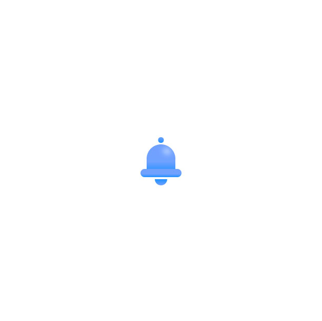
Simple codes are a little attractive, but codes with animation attract the audience's attention more and give more beauty to the site, such as the following code, which is a notification symbol in the form of a ring, and in the present state, this ring moves left and right. This code is pure CSS and is very suitable for websites that want simplicity and beauty together.
HTML
<!-- This script got from www.devanswer.com -->
<div class="notification">
  <div class="notification--top">
    <div class="notification--top__ref"></div>
  </div>
  <div class="notification--btm"></div>
  <div class="notification--circle">
  </div>
</div><div id="bcl"><a style="font-size:8pt;text-decoration:none;" href="http://www.devanswer.com">Developers Answer</a></div>
CSS
:root {
    --blue1: #70a1ff;
    --blue2: #1e90ff;
}

body {
    margin: 0;
    padding: 0;
    width: 100%;
    height: 100vh;
    display: flex;
    justify-content: center;
    align-items: center;
    overflow: hidden;
}

.notification {
    width: 80px;
    height: 80px;
    position: relative;
    transform-origin: 50% -10%;
}

.notification--top {
    position: absolute;
    top: 0%;
    left: 50%;
    transform: translate(-50%);
    height: 70%;
    width: 70%;
    background: var(--blue1);
    border-radius: 50% 50% 0 0;
    background: linear-gradient(var(--blue1) 60%, var(--blue2) 100%);
}

    .notification--top::before {
        content: "";
        position: absolute;
        top: -25%;
        left: 50%;
        transform: translate(-50%);
        height: 20%;
        width: 20%;
        background: var(--blue1);
        background: linear-gradient(var(--blue1) 0%, var(--blue2) 100%);
        border-radius: 50%;
    }

.notification--top__ref {
    width: 30%;
    height: 20%;
    position: absolute;
    top: 15%;
    left: 55%;
    transform: rotate(20deg);
    background: radial-gradient(#fff, transparent);
    filter: blur(5px);
    border-radius: 50%;
}

.notification--btm {
    position: absolute;
    top: 60%;
    left: 50%;
    transform: translate(-50%);
    height: 20%;
    width: 100%;
    background: var(--blue1);
    border-radius: 20px;
    background: linear-gradient(var(--blue1) 60%, var(--blue2) 100%);
}

.notification--circle {
    position: absolute;
    top: 70%;
    left: 50%;
    transform: translate(-50%);
    height: 30%;
    width: 30%;
    border-radius: 50%;
    background: linear-gradient(transparent 50%, var(--blue2) 50%, var(--blue1) 100%);
}

.notification:hover {
    animation: ring 1.2s ease-in-out 1;
}

    .notification:hover .notification--circle {
        animation: ring-circle 0.9s ease-in-out 1;
    }

@keyframes ring {
    0% {
        transform: rotate(0deg);
    }

    10%, 30%, 50%, 70%, 90% {
        transform: rotate(20deg);
    }

    20%, 40%, 60%, 80% {
        transform: rotate(-20deg);
    }

    100% {
        transform: rotate(0deg);
    }
}

@keyframes ring-circle {
    0% {
        left: 50%;
    }

    10%, 30%, 50%, 70%, 90% {
        left: 40%;
    }

    20%, 40%, 60%, 80% {
        left: 60%;
    }

    100% {
        left: 50%;
    }
}