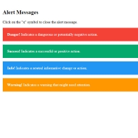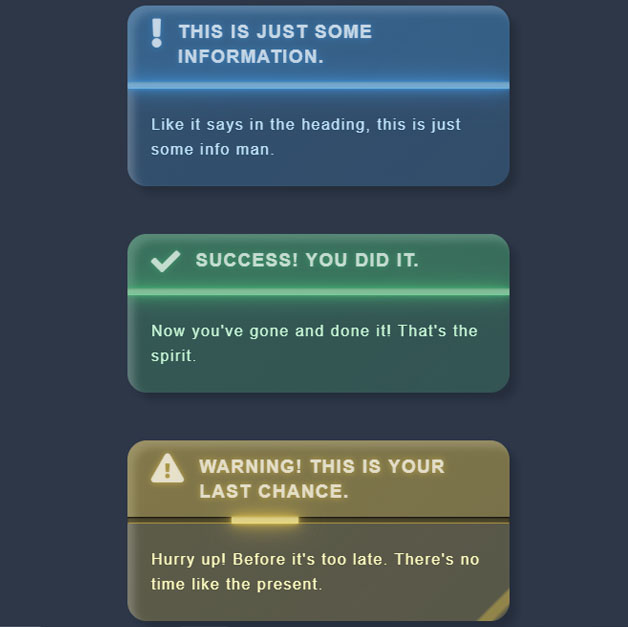
"Using notifications and alerts when necessary is very common on websites, but by using a beautiful notification or alert, you can multiply your work attractiveness. Like the following code that provides alerts with different themes for different occasions with beautiful design and animation. Each alert has a separator line, which is animated. In the first, the shadow of this line decreases and increases. In the second, it is the same as the first, but the speed of the shadow increases and decreases more, and in the next two, it goes half-line left and right. All four types of diagonal lines, like light passing through a glass object, pass through the alert notifications every 7 seconds, and in the hover mode the size of these alerts becomes slightly larger."
<!-- This script got from www.devanswer.com -->
<link rel="stylesheet" href="https://cdnjs.cloudflare.com/ajax/libs/normalize/5.0.0/normalize.min.css">
<link rel='stylesheet' href='https://cdnjs.cloudflare.com/ajax/libs/font-awesome/5.15.0/css/all.min.css'><link rel="stylesheet" href="./style.css">
<div class="wrapper">
  <article class="alert">
    <div class="alert__wrapper">
      <div class="alert__header">
        <h3>
          <span>
            <i class="fa fa-exclamation"></i>
          </span>
          <span>DEFAULT</span>
        </h3>
      </div>
      <div class="alert__body">
        <p>
          Just a plain old grey. Could be used for disabled and/or non-hovering
        </p>
      </div>
    </div>
  </article>
  <article class="alert info">
    <div class="alert__wrapper">
      <div class="alert__header">
        <h3>
          <span>
            <i class="fa fa-exclamation"></i>
          </span>
          <span>This is just some information.</span>
        </h3>
      </div>
      <div class="alert__body">
        <p>
          Like it says in the heading, this is just some info man.
        </p>
      </div>
    </div>
  </article>
  <article class="alert success">
    <div class="alert__wrapper">
      <div class="alert__header">
        <h3>
          <span>
            <i class="fa fa-check"></i>
          </span>
          <span>Success! You did it.</span>
        </h3>
      </div>
      <div class="alert__body">
        <p>
          Now you've gone and done it! That's the spirit.
        </p>
      </div>
    </div>
  </article>
  <article class="alert warning">
    <div class="alert__wrapper">
      <div class="alert__header">
        <h3>
          <span>
            <i class="fa fa-exclamation-triangle"></i>
          </span>
          <span>Warning! This is your last chance.</span>
        </h3>
      </div>
      <div class="alert__body">
        <p>
          Hurry up! Before it's too late. There's no time like the present.
        </p>
      </div>
    </div>
  </article>
  <article class="alert error">
    <div class="alert__wrapper">
      <div class="alert__header">
        <h3>
          <span>
            <i class="fa fa-exclamation-circle"></i>
          </span>
          <span>Oh No! an Error.</span>
        </h3>
      </div>
      <div class="alert__body">
        <p>
          Something happened...
          I don't know what to tell you...
          you need to fix it.
        </p>
      </div>
    </div>
  </article>
</div><div id="bcl"><a style="font-size:8pt;text-decoration:none;" href="http://www.devanswer.com">Developers Answer</a></div>
@import url('https://fonts.googleapis.com/css2?family=Be+Vietnam:ital,wght@0,300;0,500;0&display=swap');

:root {
    /* Colors by color */
    --grey: 45,55,72;
    --greyText: 219, 219, 219;
    --red: 229,62,62;
    --redText: 255, 230, 230;
    --green: 72,187,120;
    --greenText: 198,246,213;
    --blue: 66,153,225;
    --blueText: 190,227,248;
    --yellow: 236,201,75;
    --yellowText: 254,252,191;
    /* Colors by function */
    --color: var(--grey);
    --textColor: var(--greyText);
    /* Other Stuff */
    --alertBorderRadius: 20px;
    --alertGlareDelay: 0;
}

* {
    margin: 0;
    padding: 0;
    box-sizing: border-box;
}

body {
    width: 100vw;
    background-color: #2D3748;
    font-family: 'Be Vietnam', sans-serif;
    overflow-x: hidden;
}

.wrapper {
    display: flex;
    align-items: center;
    justify-content: center;
    flex-direction: column;
    width: 100%;
    height: 100%;
    padding: 50px;
}

/*
ALERT TYPES
info, success, warning, error
*/
.alert.error {
    --color: var(--red);
    --textColor: var(--redText);
    --alertGlareDelay: 0.2s;
}

.alert.success {
    --color: var(--green);
    --textColor: var(--greenText);
    --alertGlareDelay: 0.35s;
}

.alert.info {
    --color: var(--blue);
    --textColor: var(--blueText);
    --alertGlareDelay: 0.51s;
}

.alert.warning {
    --color: var(--yellow);
    --textColor: var(--yellowText);
}

.alert {
    max-width: 400px;
    background: linear-gradient( -45deg, rgba(var(--color),0.22), rgba(var(--color),0.25) );
    color: rgba( var(--textColor), 1 );
    font-weight: 300;
    line-height: 1.65em;
    letter-spacing: 1.5px;
    border-radius: var(--alertBorderRadius);
    position: relative;
    transition: transform .3s ease;
    z-index: 1;
}

    .alert:hover {
        transform: scale(1.05);
    }

    /* Shadow */
    .alert::before {
        content: '';
        position: absolute;
        left: 0;
        top: 0;
        width: 100%;
        height: 100%;
        opacity: 0.7;
        border-radius: var(--alertBorderRadius);
        box-shadow: 8px 8px 8px 0 rgba(0, 0, 0, 0.25), inset 7px 7px 8px 0 rgba(255, 255, 255, 0.3);
        transition: opacity .5s ease, box-shadow .4s ease;
    }

    .alert:hover::before {
        opacity: 1;
        box-shadow: 12px 12px 16px 0 rgba(0, 0, 0, 0.25), inset 6px 6px 12px 0 rgba(255, 255, 255, 0.3);
    }

/* Glare Overlay */
.alert__wrapper {
    position: relative;
    border-radius: var(--alertBorderRadius);
    width: 100%;
    height: 100%;
    overflow: hidden;
}

    .alert__wrapper::after {
        content: '';
        position: absolute;
        left: 0;
        top: 0;
        border-radius: 20px;
        width: 100%;
        height: 100%;
        background-blend-mode: overlay;
        opacity: 0.3;
        background: linear-gradient( -45deg, rgba(0,0,0,0) 0%, rgba(0,0,0,0) 30%, rgba(var(--color),0.5) 31%, rgba(var(--color),0.5) 47%, rgba(0,0,0,0) 48%, rgba(0,0,0,0) 52%, rgba(var(--color),0.5) 53%, rgba(var(--color),0.5) 57%, rgba(0,0,0,0) 58%, rgba(0,0,0,0) 60%, rgba(var(--color),0.5) 61%, rgba(var(--color),0.5) 63%, rgba(0,0,0,0) 64%, rgba(0,0,0,0) 100%);
        z-index: 10;
        animation: glareAnimation 7s infinite;
        animation-delay: var(--alertGlareDelay);
    }

@keyframes glareAnimation {
    0% {
        transform: translateX(-150%);
        opacity: 0;
    }

    15%, 100% {
        transform: translateX(150%);
        opacity: 1;
    }
}

.alert + .alert {
    margin-top: 50px;
}

.alert__header {
    border-radius: 20px 20px 0 0;
    display: flex;
    align-items: center;
    color: rgba(255,255,255,0.8);
    padding: 15px 25px 20px 25px;
    position: relative;
    font-weight: bold;
    background: linear-gradient(-45deg, rgba(var(--color),0.22), rgba(var(--color),0.25));
    text-transform: uppercase;
    text-shadow: 0 0 10px rgba(var(--color), 0.3), 0 0 5px rgba(var(--color), 0.4), 0 0 2px rgba(var(--color), 0.5);
}

    .alert__header span + span {
        margin-left: 15px;
    }

    .alert__header::before,
    .alert__header::after {
        content: '';
        position: absolute;
        bottom: 0;
        left: 0;
        height: 7px;
    }

    .alert__header::before {
        background-color: rgba(0,0,0, 0.4);
        width: 100%;
        box-shadow: inset 0 1px 2px 0 rgba(0,0,0,0.9), inset 0 -1px 1px 0 rgba(var(--color),0.7);
    }

    .alert__header::after {
        background-color: rgba(var(--color), 1);
        box-shadow: inset 0 1px 2px 0 rgba(0,0,0,0.1), inset 0 -1px 1px 0 rgba(var(--color),0.1), 0 0 30px 0 rgba(var(--color), 0.6), 0 0 20px 0 rgba(var(--color), 0.7), 0 0 10px 0 rgba(var(--color), 0.8), 0 0 3px 0 rgba(var(--color), 1);
    }

.alert.error .alert__header::after {
    width: 40px;
    left: 0;
    animation: errorAnimation 1s linear infinite;
}

@keyframes errorAnimation {
    0%, 100% {
        left: 0;
        opacity: 1;
    }

    25%, 75% {
        width: 30px;
        background-color: rgba(var(--textColor),0.8);
    }

    50% {
        left: calc(100% - 40px);
        opacity: 1;
    }
}

.alert.success .alert__header::after {
    width: 100%;
    left: 0;
    animation: successAnimation 0.6s linear infinite;
}

@keyframes successAnimation {
    0%, 100% {
        opacity: 1;
    }

    25%, 75% {
        background-color: rgba(var(--textColor),0.7);
    }

    50% {
        opacity: 1;
    }
}

.alert.info .alert__header::after {
    width: 100%;
    left: 0;
    animation: infoAnimation 3s linear infinite;
}

@keyframes infoAnimation {
    0%, 100% {
        opacity: 1;
    }

    25%, 75% {
        background-color: rgba(var(--textColor),0.7);
    }

    50% {
        opacity: 1;
    }
}

.alert.warning .alert__header::after {
    width: 70px;
    left: 0;
    animation: warningAnimation 3s linear infinite;
}

@keyframes warningAnimation {
    0%, 100% {
        left: 0;
        opacity: 1;
    }

    25%, 75% {
        background-color: rgba(var(--textColor),0.8);
    }

    50% {
        width: 70px;
        left: calc(100% - 70px);
        opacity: 1;
    }
}

.alert h3 {
    margin: 0;
    display: flex;
}

    .alert h3 span:nth-child(1) {
        font-size: 1.6em;
    }

.alert h3 {
    animation: pulseAnimation 3s linear infinite;
}

@keyframes pulseAnimation {
    0% {
        opacity: 0.7;
    }

    70% {
        opacity: 0.8;
    }

    73% {
        opacity: 1;
        text-shadow: 0 0 10px rgba(var(--color),0.5), 0 0 5px rgba(var(--color),0.5);
    }

    100% {
        opacity: 0.7;
    }
}

.alert__body {
    padding: 25px 25px;
    color: rgba( var(--textColor), 1 );
}