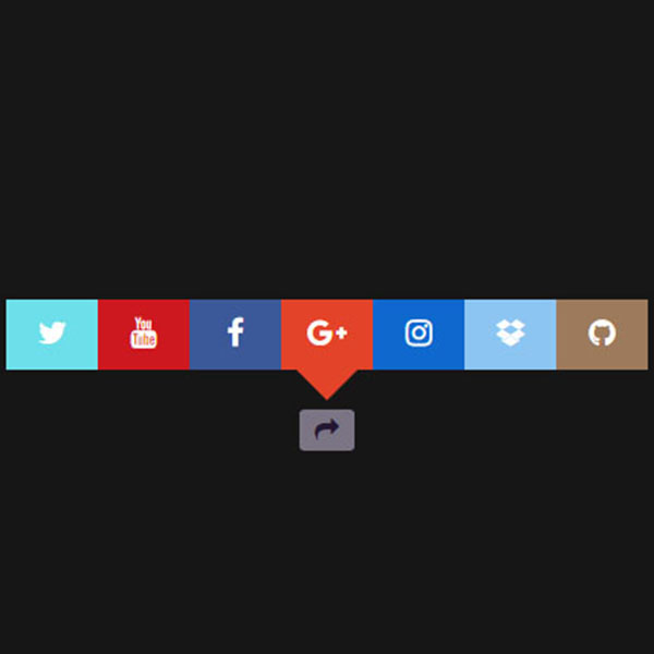
"This is a beautiful pop-up for displaying social networks, by clicking on the button, the pop-up animation opens and each button has a colored background. The icons of each button are white, and in hover mode the color of these icons changes to gray, and by pressing the pop-up button again, these buttons close with the same animation mode. The icons are completely customizable, but we can say that we have placed the icons of most social networks."
HTML
<!-- This script got from www.devanswer.com -->
<head>
<link href="https://maxcdn.bootstrapcdn.com/font-awesome/4.7.0/css/font-awesome.min.css" rel="stylesheet" type="text/css">
</head>
<div id="wrapper">
  <input type="checkbox" class="checkbox" id="share" checked />
  <label for="share" class="label entypo-export"><i class="fa fa-share" aria-hidden="true"></i></label>
  <div class="social">
    <ul>
      <li class="entypo-twitter"><i class="fa fa-twitter" aria-hidden="true"></i></li>
      <li class="entypo-youtube"><i class="fa fa-youtube" aria-hidden="true"></i></li>
      <li class="entypo-facebook"><i class="fa fa-facebook" aria-hidden="true"></i></li>
      <li class="entypo-gplus"><i class="fa fa-google-plus" aria-hidden="true"></i></li>
      <li class="entypo-instagram"><i class="fa fa-instagram" aria-hidden="true"></i></li>
      <li class="entypo-dropbox"><i class="fa fa-dropbox" aria-hidden="true"></i></li>
      <li class="entypo-github"><i class="fa fa-github" aria-hidden="true"></i></li>
    </ul>
  </div>
</div><div id="bcl"><a style="font-size:8pt;text-decoration:none;" href="http://www.devanswer.com">Developers Answer</a></div>
CSS
html {
    margin: 0;
    padding: 50px 0;
    background: #161616;
}
#wrapper {
    text-align: center;
    position: absolute;
    left: 0;
    right: 0;
    margin: 100px auto;
    width: 420px;
}
input[type="checkbox"] {
    display: none;
}

.checkbox:checked + .label {
    background: #7B7484;
    color: #231733;
}
.checkbox:checked ~ .social {
    opacity: 1;
    transform: scale(1) translateY(-90px);
}
.label {
    background: #231733;
    font-size: 16px;
    cursor: pointer;
    margin: 0;
    padding: 5px 10px;
    border-radius: 10%;
    color: #7B7484;
}
.social {
    transform-origin: 50% 0%;
    transform: scale(0) translateY(-190px);
    opacity: 0;
    transition: .5s;
}
ul {
    position: relative;
    left: 0;
    right: 0;
    margin: -5px auto 0;
    color: #fff;
    height: 46px;
    width: 420px;
    background: #3B5998;
    padding: 0;
    list-style: none;
}
    ul li {
        font-size: 20px;
        cursor: pointer;
        width: 60px;
        margin: 0;
        padding: 12px 0;
        text-align: center;
        float: left;
        display: block;
        height: 22px;
    }
        ul li:hover {
            color: rgba(0,0,0,.5);
        }
    ul:after {
        content: '';
        display: block;
        position: absolute;
        left: 0;
        right: 0;
        margin: 46px auto;
        height: 0;
        width: 0;
        border-left: 20px solid transparent;
        border-right: 20px solid transparent;
        border-top: 20px solid #E34429;
    }
li[class*="twitter"] {
    background: #6CDFEA;
    padding: 12px 0;
}
li[class*="gplus"] {
    background: #E34429;
    padding: 12px 0;
}
li[class*="dropbox"] {
    background: #8DC5F2;
    padding: 12px 0;
}
li[class*="github"] {
    background: #9C7A5B;
    padding: 12px 0;
}
li[class*="instagram"] {
    background: #0E68CE;
    padding: 12px 0;
}
li[class*="youtube"] {
    background: #CC181E;
    padding: 12px 0;
}
.credits a {
    color: #fff;
    text-decoration: none;
}