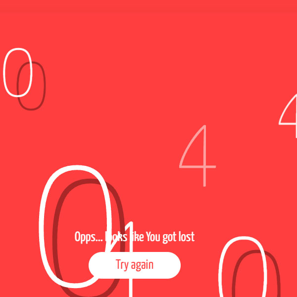
In this post, we have a 404 page with a white and red color theme. At first, red and white circles move from the center to the periphery. The 404 phrases are then displayed in a flashing way in different parts of the website. The letters used in the phrase 404 are red and white. There is also a button at the bottom of the page that clicks on it to run the entire animation from the beginning. Otherwise, after several times by displaying the characters of the phrase 404, the animation will run from the beginning.
HTML
<!-- This script got from www.devanswer.com -->
<link rel="stylesheet" href="https://cdnjs.cloudflare.com/ajax/libs/normalize/5.0.0/normalize.min.css">
<link rel='stylesheet' href='https://fonts.googleapis.com/css?family=Yanone+Kaffeesatz:200,400'>
<div class="page-wrapper">
  <div class="circles-layer">
    <div class="circle -white"></div>
    <div class="circle -red"></div>
    <div class="circle -white"></div>
    <div class="circle -red"></div>
  </div>
  <div class="numbers-layer">
    <div class="number">4</div>
    <div class="number">4</div>
    <div class="number">4</div>
    <div class="number">4</div>
    <div class="number">4</div>
    <div class="number">4</div>
    <div class="number">4</div>
    <div class="number">4</div>
    <div class="number -with-shadow">0</div>
    <div class="number -with-shadow">0</div>
    <div class="number -with-shadow">0</div>
    <div class="number -with-shadow">0</div>
  </div>
  <div class="oops-message">
    <div class="test">Opps... looks like You got lost</div><a class="button" href="">Try again</a>
  </div>
</div><div id="bcl"><a style="font-size:8pt;text-decoration:none;" href="http://www.devanswer.com">Developers Answer</a></div>
CSS
* {
    margin: 0;
    padding: 0;
    box-sizing: border-box;
}
:root {
    --white:    #FFFFFF;
    --red:      #FF3F3F;
    --dark-red: #AA2727;

    font-family: 'Yanone Kaffeesatz', sans-serif;
    font-size: calc( 14px + (25 - 14) * ((100vw - 400px) / ( 1200 - 400)));
}
body {
    background: var(--red);
}
.page-wrapper {
    position: relative;
    height: 90vh;
    width: 90vw;
    margin: 5vh 0 0 5vw;
    overflow: hidden;
    background: var(--red);
    box-shadow: 0 2rem 3rem var(--dark-red);
}
@-webkit-keyframes circle-animation {
    0%   { transform: translateX(-50%) translateY(-50%) scale(0); }
    10%  { transform: translateX(-50%) translateY(-50%) scale(1); }
    100% { transform: translateX(-50%) translateY(-50%) scale(1); }
}
@keyframes circle-animation {
    0%   { transform: translateX(-50%) translateY(-50%) scale(0); }
    10%  { transform: translateX(-50%) translateY(-50%) scale(1); }
    100% { transform: translateX(-50%) translateY(-50%) scale(1); }
}
.circles-layer {
    position: absolute;
    top: 0;
    left: 0;
    height: 100%;
    width: 100%;
}
.circles-layer > .circle {
        position: absolute;
        top: 50%;
        left: 50%;
        height: 300vw;
        width: 300vw;
        transform: translateX(-50%) translateY(-50%);
        border-radius: 50%;
        -webkit-animation: circle-animation 10s linear infinite;
                animation: circle-animation 10s linear infinite;
        will-change: transform;
}
.circles-layer > .circle.-white {
            border: 30vw solid var(--white);
}
.circles-layer > .circle.-red {
            border: 25vw solid var(--dark-red);
}
.circles-layer > .circle:nth-of-type(2) {
            -webkit-animation-delay: 100ms;
                    animation-delay: 100ms;
}
.circles-layer > .circle:nth-of-type(3) {
            -webkit-animation-delay: 150ms;
                    animation-delay: 150ms;
}
.circles-layer > .circle:nth-of-type(4) {
            -webkit-animation-delay: 200ms;
                    animation-delay: 200ms;
}
@-webkit-keyframes number-animation {
    0%   { transform: scale(0);   opacity: 0; }
    30%  { transform: scale(0);   opacity: 0; }
    32%  { transform: scale(.95); opacity: 1; }
    35%  { transform: scale(1);   opacity: 1; }
    37%  { transform: scale(1);   opacity: 1; }
    40%  { transform: scale(0);   opacity: 0; }
    50%  { transform: scale(0);   opacity: 0; }
    52%  { transform: scale(.45); opacity: 1; }
    55%  { transform: scale(.5);  opacity: 1; }
    57%  { transform: scale(.5);  opacity: 1; }
    60%  { transform: scale(0);   opacity: 0; }
    70%  { transform: scale(0);   opacity: 0; }
    72%  { transform: scale(.75); opacity: 1; }
    75%  { transform: scale(.8);  opacity: 1; }
    77%  { transform: scale(.8);  opacity: 1; }
    80%  { transform: scale(0);   opacity: 0; }
    100% { transform: scale(0);   opacity: 0; }
}
@keyframes number-animation {
    0%   { transform: scale(0);   opacity: 0; }
    30%  { transform: scale(0);   opacity: 0; }
    32%  { transform: scale(.95); opacity: 1; }
    35%  { transform: scale(1);   opacity: 1; }
    37%  { transform: scale(1);   opacity: 1; }
    40%  { transform: scale(0);   opacity: 0; }
    50%  { transform: scale(0);   opacity: 0; }
    52%  { transform: scale(.45); opacity: 1; }
    55%  { transform: scale(.5);  opacity: 1; }
    57%  { transform: scale(.5);  opacity: 1; }
    60%  { transform: scale(0);   opacity: 0; }
    70%  { transform: scale(0);   opacity: 0; }
    72%  { transform: scale(.75); opacity: 1; }
    75%  { transform: scale(.8);  opacity: 1; }
    77%  { transform: scale(.8);  opacity: 1; }
    80%  { transform: scale(0);   opacity: 0; }
    100% { transform: scale(0);   opacity: 0; }
}
.numbers-layer {
    position: absolute;
    top: -1rem;
    left: -1rem;
    height: 100%;
    width: 100%;
}
.numbers-layer > .number {
        position: absolute;
        font-size: 10rem;
        color: var(--white);
        transform: scale(0);
        opacity: 0;
        font-weight: 200;
        -webkit-animation: number-animation 10s linear infinite;
                animation: number-animation 10s linear infinite;
        will-change: transform, opacity;
}
.numbers-layer > .number.-with-shadow {
            text-shadow: 1rem 1rem var(--dark-red);
}
.numbers-layer > .number:nth-of-type(1)  { top: 5%;  left: 5%;  -webkit-animation-delay:  0;  animation-delay:  0;    }
.numbers-layer > .number:nth-of-type(2)  { top: 15%; left: 55%; -webkit-animation-delay: 40ms; animation-delay: 40ms;
        font-size: 15rem; }
.numbers-layer > .number:nth-of-type(3)  { top: 25%; left: 15%; -webkit-animation-delay: 80ms; animation-delay: 80ms; }
.numbers-layer > .number:nth-of-type(4)  { top: 75%; left: 20%; -webkit-animation-delay: 120ms; animation-delay: 120ms; }
.numbers-layer > .number:nth-of-type(5)  { top: 25%; left: 75%; -webkit-animation-delay: 160ms; animation-delay: 160ms;
        font-size: 6rem; }
.numbers-layer > .number:nth-of-type(6)  { top: 65%; left: 45%; -webkit-animation-delay: 200ms; animation-delay: 200ms; }
.numbers-layer > .number:nth-of-type(7)  { top: 45%; left: 85%; -webkit-animation-delay: 240ms; animation-delay: 240ms; }
.numbers-layer > .number:nth-of-type(8)  { top: 10%; left: 85%; -webkit-animation-delay: 280ms; animation-delay: 280ms; }
.numbers-layer > .number:nth-of-type(9)  { top: 40%; left: 35%; -webkit-animation-delay: 320ms; animation-delay: 320ms;
        font-size: 15rem; }
.numbers-layer > .number:nth-of-type(10) { top: 70%; left: 65%; -webkit-animation-delay: 360ms; animation-delay: 360ms; }
.numbers-layer > .number:nth-of-type(11) { top: 10%; left: 30%; -webkit-animation-delay: 400ms; animation-delay: 400ms;
        font-size: 6rem; }
.numbers-layer > .number:nth-of-type(12) { top: 45%; left: 10%; -webkit-animation-delay: 440ms; animation-delay: 440ms; }
.oops-message {
    position: absolute;
    width: 20rem;
    left: 50%;
    bottom: 2rem;
    margin-left: -10rem;
    font-weight: 400;
    text-align: center;
    color: var(--white);
}
.oops-message > .button {
        display: inline-block;
        margin-top: .5rem;
        background: var(--white);
        color: var(--red);
        padding: 0 2rem;
        line-height: 2rem;
        text-decoration: none;
        border-radius: 1rem;
        transition: all 120ms ease-in;
}
.oops-message > .button:hover,
        .oops-message > .button:focus {
            background: var(--dark-red);
            color: var(--white);
}