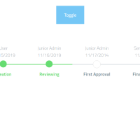
Do you need a timeline that works in all devices with any screen widths? Then you must use a responsive code. In the following script you can find a responsive timeline whose cards width vary with the screen width to get fit with the destination device. Besides, there is an action button developed for each card to do a specific action.
HTML
<!-- This script got from www.devanswer.com -->
<div class="container">
<h1 class="project-name">RESPONSIVE TIMELINE</h1>
<div id="timeline">
<div class="timeline-item">
<div class="timeline-icon">
<svg version="1.1" id="Layer_1" xmlns="http://www.w3.org/2000/svg" xmlns:xlink="http://www.w3.org/1999/xlink" x="0px" y="0px"
width="21px" height="20px" viewBox="0 0 21 20" enable-background="new 0 0 21 20" xml:space="preserve">
<path fill="#FFFFFF" d="M19.998,6.766l-5.759-0.544c-0.362-0.032-0.676-0.264-0.822-0.61l-2.064-4.999
c-0.329-0.825-1.5-0.825-1.83,0L7.476,5.611c-0.132,0.346-0.462,0.578-0.824,0.61L0.894,6.766C0.035,6.848-0.312,7.921,0.333,8.499
l4.338,3.811c0.279,0.246,0.395,0.609,0.314,0.975l-1.304,5.345c-0.199,0.842,0.708,1.534,1.468,1.089l4.801-2.822
c0.313-0.181,0.695-0.181,1.006,0l4.803,2.822c0.759,0.445,1.666-0.23,1.468-1.089l-1.288-5.345
c-0.081-0.365,0.035-0.729,0.313-0.975l4.34-3.811C21.219,7.921,20.855,6.848,19.998,6.766z"/>
</svg>
</div>
<div class="timeline-content">
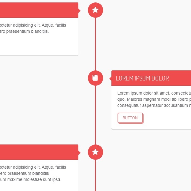
<h2>LOREM IPSUM DOLOR</h2>
<p>
Lorem ipsum dolor sit amet, consectetur adipisicing elit.
Atque, facilis quo maiores magnam modi ab libero praesentium blanditiis.
</p>
<a href="#" class="btn">button</a>
</div>
</div>
<div class="timeline-item">
<div class="timeline-icon">
<svg version="1.1" id="Layer_1" xmlns="http://www.w3.org/2000/svg" xmlns:xlink="http://www.w3.org/1999/xlink" x="0px" y="0px"
width="21px" height="20px" viewBox="0 0 21 20" enable-background="new 0 0 21 20" xml:space="preserve">
<g>
<path fill="#FFFFFF" d="M17.92,3.065l-1.669-2.302c-0.336-0.464-0.87-0.75-1.479-0.755C14.732,0.008,7.653,0,7.653,0v5.6
c0,0.096-0.047,0.185-0.127,0.237c-0.081,0.052-0.181,0.06-0.268,0.02l-1.413-0.64C5.773,5.183,5.69,5.183,5.617,5.215l-1.489,0.65
c-0.087,0.038-0.19,0.029-0.271-0.023c-0.079-0.052-0.13-0.141-0.13-0.235V0H2.191C1.655,0,1.233,0.434,1.233,0.97
c0,0,0.025,15.952,0.031,15.993c0.084,0.509,0.379,0.962,0.811,1.242l2.334,1.528C4.671,19.905,4.974,20,5.286,20h10.307
c1.452,0,2.634-1.189,2.634-2.64V4.007C18.227,3.666,18.12,3.339,17.92,3.065z M16.42,17.36c0,0.464-0.361,0.833-0.827,0.833H5.341
l-1.675-1.089h10.341c0.537,0,0.953-0.44,0.953-0.979V2.039l1.459,2.027V17.36L16.42,17.36z"/>
</g>
</svg>
</div>
<div class="timeline-content right">
<h2>LOREM IPSUM DOLOR</h2>
<p>
Lorem ipsum dolor sit amet, consectetur adipisicing elit. Atque, facilis quo. Maiores magnam modi ab libero praesentium blanditiis consequatur aspernatur accusantium maxime molestiae sunt ipsa.
</p>
<a href="#" class="btn">button</a>
</div>
</div>
<div class="timeline-item">
<div class="timeline-icon">
<svg version="1.1" id="Layer_1" xmlns="http://www.w3.org/2000/svg" xmlns:xlink="http://www.w3.org/1999/xlink" x="0px" y="0px"
width="21px" height="20px" viewBox="0 0 21 20" enable-background="new 0 0 21 20" xml:space="preserve">
<path fill="#FFFFFF" d="M19.998,6.766l-5.759-0.544c-0.362-0.032-0.676-0.264-0.822-0.61l-2.064-4.999
c-0.329-0.825-1.5-0.825-1.83,0L7.476,5.611c-0.132,0.346-0.462,0.578-0.824,0.61L0.894,6.766C0.035,6.848-0.312,7.921,0.333,8.499
l4.338,3.811c0.279,0.246,0.395,0.609,0.314,0.975l-1.304,5.345c-0.199,0.842,0.708,1.534,1.468,1.089l4.801-2.822
c0.313-0.181,0.695-0.181,1.006,0l4.803,2.822c0.759,0.445,1.666-0.23,1.468-1.089l-1.288-5.345
c-0.081-0.365,0.035-0.729,0.313-0.975l4.34-3.811C21.219,7.921,20.855,6.848,19.998,6.766z"/>
</svg>
</div>
<div class="timeline-content">
<h2>LOREM IPSUM DOLOR</h2>
<p>
Lorem ipsum dolor sit amet, consectetur adipisicing elit. Atque, facilis quo. Maiores magnam modi ab libero praesentium blanditiis consequatur aspernatur accusantium maxime molestiae sunt ipsa.
</p>
<a href="#" class="btn">button</a>
</div>
</div>
</div>
</div><div id="bcl"><a style="font-size:8pt;text-decoration:none;" href="http://www.devanswer.com">Developers Answer</a></div>
CSS
@import "https://fonts.googleapis.com/css?family=Dosis:300,400,500,600,700";
header:after, #timeline .timeline-item:after, header:before, #timeline .timeline-item:before {
  content: '';
  display: block;
  width: 100%;
  clear: both;
}

*, *:before, *:after {
  box-sizing: border-box;
  -webkit-box-sizing: border-box;
  -moz-box-sizing: border-box;
}

body, html {
  height: 100%;
}

body {
  background: #f9f9f9;
  background-size: cover;
  margin: 0;
  padding: 0;
  font-family: helvetica, arial, tahoma, verdana;
  line-height: 20px;
  font-size: 14px;
  color: #726f77;
}

img {
  max-width: 100%;
}

a {
  text-decoration: none;
}

.container {
  max-width: 1100px;
  margin: 0 auto;
}

h1, h2, h3, h4 {
  font-family: "Dosis", arial, tahoma, verdana;
  font-weight: 500;
}

.project-name {
  text-align: center;
  padding: 10px 0;
}

header {
  background: #2b2e48;
  padding: 10px;
  -webkit-box-shadow: 0 3px 3px rgba(0, 0, 0, 0.05);
  -moz-box-shadow: 0 3px 3px rgba(0, 0, 0, 0.05);
  -ms-box-shadow: 0 3px 3px rgba(0, 0, 0, 0.05);
  box-shadow: 0 3px 3px rgba(0, 0, 0, 0.05);
}
header .logo {
  color: #ee4d4d;
  float: left;
  font-family: "Dosis", arial, tahoma, verdana;
  font-size: 22px;
  font-weight: 500;
}
header .logo > span {
  color: #f7aaaa;
  font-weight: 300;
}
header .social {
  float: right;
}
header .social .btn {
  font-family: "Dosis";
  font-size: 14px;
  margin: 10px 5px;
}

#timeline {
  width: 100%;
  margin: 30px auto;
  position: relative;
  padding: 0 10px;
  -webkit-transition: all 0.4s ease;
  -moz-transition: all 0.4s ease;
  -ms-transition: all 0.4s ease;
  transition: all 0.4s ease;
}
#timeline:before {
  content: "";
  width: 3px;
  height: 100%;
  background: #ee4d4d;
  left: 50%;
  top: 0;
  position: absolute;
}
#timeline:after {
  content: "";
  clear: both;
  display: table;
  width: 100%;
}
#timeline .timeline-item {
  margin-bottom: 50px;
  position: relative;
}
#timeline .timeline-item .timeline-icon {
  background: #ee4d4d;
  width: 50px;
  height: 50px;
  position: absolute;
  top: 0;
  left: 50%;
  overflow: hidden;
  margin-left: -23px;
  -webkit-border-radius: 50%;
  -moz-border-radius: 50%;
  -ms-border-radius: 50%;
  border-radius: 50%;
}
#timeline .timeline-item .timeline-icon svg {
  position: relative;
  top: 14px;
  left: 14px;
}
#timeline .timeline-item .timeline-content {
  width: 45%;
  background: #fff;
  padding: 20px;
  -webkit-box-shadow: 0 3px 0 rgba(0, 0, 0, 0.1);
  -moz-box-shadow: 0 3px 0 rgba(0, 0, 0, 0.1);
  -ms-box-shadow: 0 3px 0 rgba(0, 0, 0, 0.1);
  box-shadow: 0 3px 0 rgba(0, 0, 0, 0.1);
  -webkit-border-radius: 5px;
  -moz-border-radius: 5px;
  -ms-border-radius: 5px;
  border-radius: 5px;
  -webkit-transition: all 0.3s ease;
  -moz-transition: all 0.3s ease;
  -ms-transition: all 0.3s ease;
  transition: all 0.3s ease;
}
#timeline .timeline-item .timeline-content h2 {
  padding: 15px;
  background: #ee4d4d;
  color: #fff;
  margin: -20px -20px 0 -20px;
  font-weight: 300;
  -webkit-border-radius: 3px 3px 0 0;
  -moz-border-radius: 3px 3px 0 0;
  -ms-border-radius: 3px 3px 0 0;
  border-radius: 3px 3px 0 0;
}
#timeline .timeline-item .timeline-content:before {
  content: '';
  position: absolute;
  left: 45%;
  top: 20px;
  width: 0;
  height: 0;
  border-top: 7px solid transparent;
  border-bottom: 7px solid transparent;
  border-left: 7px solid #ee4d4d;
}
#timeline .timeline-item .timeline-content.right {
  float: right;
}
#timeline .timeline-item .timeline-content.right:before {
  content: '';
  right: 45%;
  left: inherit;
  border-left: 0;
  border-right: 7px solid #ee4d4d;
}

.btn {
  padding: 5px 15px;
  text-decoration: none;
  background: transparent;
  border: 2px solid #f27c7c;
  color: #f27c7c;
  display: inline-block;
  position: relative;
  text-transform: uppercase;
  font-size: 12px;
  -webkit-border-radius: 5px;
  -moz-border-radius: 5px;
  -ms-border-radius: 5px;
  border-radius: 5px;
  -webkit-transition: background 0.3s ease;
  -moz-transition: background 0.3s ease;
  -ms-transition: background 0.3s ease;
  transition: background 0.3s ease;
  -webkit-box-shadow: 2px 2px 0 #f27c7c;
  -moz-box-shadow: 2px 2px 0 #f27c7c;
  -ms-box-shadow: 2px 2px 0 #f27c7c;
  box-shadow: 2px 2px 0 #f27c7c;
}
.btn:hover {
  box-shadow: none;
  top: 2px;
  left: 2px;
  -webkit-box-shadow: 2px 2px 0 transparent;
  -moz-box-shadow: 2px 2px 0 transparent;
  -ms-box-shadow: 2px 2px 0 transparent;
  box-shadow: 2px 2px 0 transparent;
}

@media screen and (max-width: 768px) {
  #timeline {
    margin: 30px;
    padding: 0px;
    width: 90%;
  }
  #timeline:before {
    left: 0;
  }
  #timeline .timeline-item .timeline-content {
    width: 90%;
    float: right;
  }
  #timeline .timeline-item .timeline-content:before, #timeline .timeline-item .timeline-content.right:before {
    left: 10%;
    margin-left: -6px;
    border-left: 0;
    border-right: 7px solid #ee4d4d;
  }
  #timeline .timeline-item .timeline-icon {
    left: 0;
  }
}