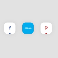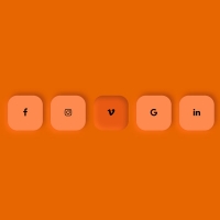
To make your website more attractive, you can use the effects that occur during the hover for your website. One of these effects can be in the use of social buttons. In this post, there is normally a green button titled Share. This button is expanded in hover mode and becomes social buttons with the same color but the icons of each social network.
HTML
<!-- This script got from www.devanswer.com -->
<link rel='stylesheet' href='https://fonts.googleapis.com/css?family=Montserrat:600&display=swap'>
<link rel="stylesheet" href="https://stackpath.bootstrapcdn.com/font-awesome/4.7.0/css/font-awesome.min.css" />
<div class="center">
<ul>
<li><i class="fa fa-facebook"></i></li>
<li><i class="fa fa-twitter"></i></li>
<li><i class="fa fa-instagram"></i></li>
<li><i class="fa fa-linkedin"></i></li>
<li><i class="fa fa-youtube"></i></li>
<div class="text">Follow</div>
</ul>
</div>
<div id="bcl"><a style="font-size:8pt;text-decoration:none;" href="http://www.devanswer.com">Developers Answer</a></div>
CSS
Access-Control-Allow-Origin: *
* {
  margin: 0;
  padding: 0;
  box-sizing: border-box;
}
body {
  display: flex;
  height: 100vh;
  text-align: center;
  align-items: center;
  justify-content: center;
}
.center {
  /* width: 315px;
  text-align: left; */
}
.center ul {
  list-style: none;
  position: relative;
  display: inline-block;
}
.center ul .text {
  position: absolute;
  top: 0;
  left: 0;
  right: 0;
  background: #1f7a7a;
  color: #eee;
  line-height: 50px;
  border-radius: 50px;
  font-size: 22px;
  pointer-events: none;
  text-align: center;
  font-family: "Montserrat", sans-serif;
  transition: opacity 0.5s 0.75s ease-out;
}
.center ul:hover .text {
  opacity: 0;
  transition: opacity 0.5s 0.125s ease-out;
}
.center ul li {
  display: inline-block;
  height: 50px;
  width: 50px;
  background: #1f7a7a;
  text-align: center;
  line-height: 55px;
  margin: 0 -16px;
  cursor: pointer;
  border-radius: 0px;
  transition: background-color 0.5s ease-out, border-radius 0.5s 0.25s ease-out,
    margin 0.5s 0.25s ease-out;
}
.center ul li:hover {
  background: #1a6565;
}
.center ul li i {
  color: #eee;
  font-size: 22px;
  opacity: 0;
  transition: opacity 1.7s;
}
.center ul:hover li i {
  opacity: 1;
}
.center ul li:nth-child(1) {
  border-bottom-left-radius: 25px;
  border-top-left-radius: 25px;
}
.center ul li:nth-child(5) {
  border-bottom-right-radius: 25px;
  border-top-right-radius: 25px;
}
.center ul:hover li {
  border-radius: 50px;
  margin: 0 3px;
}