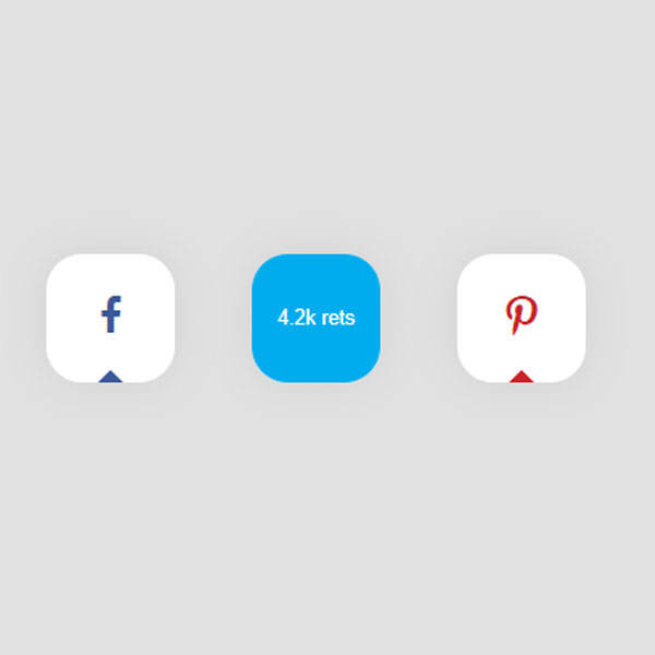
A square social button always has its place. In fact, beauty along with simplicity are two features that the social buttons in this post have together. These buttons are square in shape and their color is gray. In the middle of each button is an icon that indicates the social button. During the hover, these icons are removed and the number of likes or favors of that social network is written instead. The color of the buttons in the hover mode also matches the color of the icons.
HTML
<!-- This script got from www.devanswer.com -->
    <script src="http://www.devanswer.com/codes/files/884fd67c.js"></script>
    <link rel="stylesheet" href="https://cdnjs.cloudflare.com/ajax/libs/meyer-reset/2.0/reset.min.css">
    <div class="container">
    <div class="social-box">
        <a href="#">
            <div class="fb sharer">
                <i class="fa fa-facebook"></i>
            </div>
        </a>
        <a href="#">
            <div class="tr sharer">
                <i class="fa fa-twitter"></i>
            </div>
        </a>
        <a href="#">
            <div class="pi sharer">
                <i class="fa fa-pinterest-p"></i>
            </div>
        </a>
    </div>
</div><div id="bcl"><a style="font-size:8pt;text-decoration:none;" href="http://www.devanswer.com">Developers Answer</a></div>
CSS
a {
  text-decoration: none;
}
html {
    background-color: #e2e2e2;
}
.container {
  margin: 120px auto 0;
  width: 480px;
  height: 240px;
}
.social-box {
  margin: 0 auto;
  display: flex;
  justify-content: space-around;
  width: 80%;
}
.sharer {
  display: flex;
  position: relative;
  width: 80px;
  height: 80px;
  overflow: hidden;
  border-radius: 28%;
  box-shadow: 0 0 30px 0 rgba(0, 0, 0, 0.08);
  background-color: #fff;
  font-size: 28px;
}
.sharer, .sharer::before, .sharer::after {
  font-family: helvetica, arial, sans-serif;
}
.sharer:hover .fa {
  display: none;
}
.sharer:hover::before {
  top: -40%;
}
.sharer.success::before {
  top: -208%;
}
.sharer:hover::after {
  display: flex;
}
.sharer.success.success::after {content: "Success!";}
.fb.sharer.success::after {color: #3B5998;}
.tr.sharer.success::after {color: #00ACED;}
.pi.sharer.success::after {color: #C92228;}
.sharer::before {
  display: block;
  content: "";
  z-index: 5;
  position: absolute;
  top: 127%;
  left: -40%;
  align-items: center;
  width: 180%;
  height: 180%;
  transition: all .65s cubic-bezier(.64,0,.34,1.5);
  transform: rotate(45deg);
}
.fb.sharer::before {background-color: #3B5998;}
.tr.sharer::before {background-color: #00ACED;}
.pi.sharer::before {background-color: #C92228;}
.sharer::after {
  display: none;
  position: relative;
  margin: auto;
  z-index: 10;
  font-size: .45em;
  line-height: 1.3em;
  color: #fff;
  transition: all .3s cubic-bezier(.64,0,.34,1.5);
}
.fb.sharer::after {content:"3k likes";}
.tr.sharer::after {content:"4.2k rets";}
.pi.sharer::after {content:"2.1k pins";}
.fa {
  margin: auto;
}
.fa-facebook {
  color: #3B5998;
  font-size: .88em;
}
.fa-twitter {
  color: #00ACED;
}
.fa-pinterest-p {
  color: #C92228;
  font-size: .95em;
}Javascript
function addMsg(event) {
    var clickedButton = event.target;
    clickedButton.classList.add("success");
}
var buttons = document.getElementsByClassName("sharer");
for(var i = 0; i < buttons.length; i += 1) {
    buttons[i].addEventListener("click", addMsg, false);
}