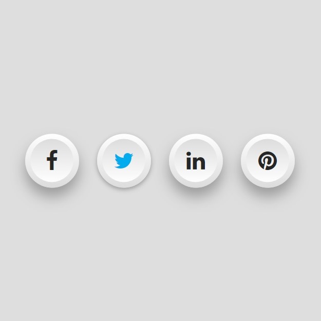
Stylish social sharing buttons have more effects for sure. Below you can create these useful buttons in a more beautiful way. You can make shiny silver buttons with effects on getting and loosing focus. The color gets changed when the mouse comes over the button and it turned off when the most left.
HTML
<!-- This script got from www.devanswer.com -->
<ul>
<li><a title="On Facebook" href="https://www.facebook.com/sharer.php?u=http://devanswer.com"><i class="fa fa-facebook" aria-hidden="true"></i></a></li>
<li><a title="On Twitter" href="https://twitter.com/intent/tweet?text=DevAnswer&url=http://devanswer.com"><i class="fa fa-twitter" aria-hidden="true"></i></a></li>
<li><a title="On LinkedIn" href="https://www.linkedin.com/shareArticle?mini=true&url=http://devanswer.com"><i class="fa fa-linkedin" aria-hidden="true"></i></a></li>
<li><a title="Pin It" href="https://www.pinterest.com/pin/create/button/?url=http://devanswer.com"><i class="fa fa-pinterest" aria-hidden="true"></i></a></li>
</ul>
<link rel='stylesheet' href='https://cdnjs.cloudflare.com/ajax/libs/font-awesome/4.7.0/css/font-awesome.min.css'><div id="bcl"><a style="font-size:8pt;text-decoration:none;" href="http://www.devanswer.com">Developers Answer</a></div>
CSS
body {
  margin:0;
  padding:0;
  background: #dedede;
}

ul {
  position:absolute;
  top:50%;
  left:50%;
  transform: translate(-50%, -50%);
  margin:0;
  padding:0;
  display:flex;
}

ul li {
  list-style: none;
}

ul li a {
  position: relative;
  width:60px;
  height:60px;
  display:block;
  text-align:center;
  margin:0 10px;
  border-radius: 50%;
  padding: 6px;
  box-sizing: border-box;
  text-decoration:none;
  box-shadow: 0 10px 15px rgba(0,0,0,0.3);
  background: linear-gradient(0deg, #ddd, #fff);
  transition: .5s;
}

ul li a:hover {
  box-shadow: 0 2px 5px rgba(0,0,0,0.3);
}

ul li a .fa {
  widht: 100%;
  height:100%;
  display:block;
  background: linear-gradient(0deg, #fff, #ddd);
  border-radius: 50%;
  line-height: calc(60px - 12px);
  font-size:24px;
  color: #262626;
  transition: .5s;
}

ul li:nth-child(1) a:hover .fa {
  color: #3b5998;
}

ul li:nth-child(2) a:hover .fa {
  color: #00aced;
}

ul li:nth-child(3) a:hover .fa {
  color: #dd4b39;
}

ul li:nth-child(4) a:hover .fa {
  color: #007bb6;
}

ul li:nth-child(5) a:hover .fa {
  color: #e4405f;
}