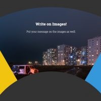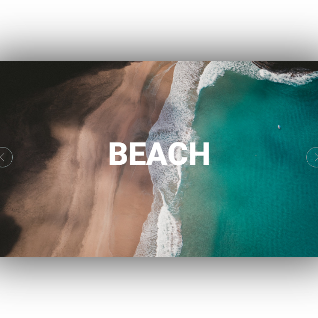
Transition effects are one of the most important parts of sliders. A beautiful transition effect and can attract visitors to see the next slide and makes the site perfect. This code has amazing transition effect with the aid of circles and images, all by math. Just click on the next or previous buttons to see the effects. Besides you can add a title to each slide. Hope to be useful.
HTML
<!-- This script got from www.devanswer.com -->
<div class='parent'>
  <div class='slider'>
   <button type="button" id='right' class='right' name="button">

       <svg version="1.1" id="Capa_1" width='40px' height='40px ' xmlns="http://www.w3.org/2000/svg" xmlns:xlink="http://www.w3.org/1999/xlink" x="0px" y="0px"
         viewBox="0 0 477.175 477.175" style="enable-background:new 0 0 477.175 477.175;" xml:space="preserve">
       <g>
        <path style='fill: #9d9d9d;' d="M360.731,229.075l-225.1-225.1c-5.3-5.3-13.8-5.3-19.1,0s-5.3,13.8,0,19.1l215.5,215.5l-215.5,215.5
          c-5.3,5.3-5.3,13.8,0,19.1c2.6,2.6,6.1,4,9.5,4c3.4,0,6.9-1.3,9.5-4l225.1-225.1C365.931,242.875,365.931,234.275,360.731,229.075z
          "/>
       </g>

       </svg>

       </button>
   <button type="button" id='left' class='left' name="button">
       <svg version="1.1" id="Capa_2" xmlns="http://www.w3.org/2000/svg" xmlns:xlink="http://www.w3.org/1999/xlink" x="0px" y="0px"
         viewBox="0 0 477.175 477.175" style="enable-background:new 0 0 477.175 477.175;" xml:space="preserve">
       <g>
        <path style='fill: #9d9d9d;' d="M145.188,238.575l215.5-215.5c5.3-5.3,5.3-13.8,0-19.1s-13.8-5.3-19.1,0l-225.1,225.1c-5.3,5.3-5.3,13.8,0,19.1l225.1,225
          c2.6,2.6,6.1,4,9.5,4s6.9-1.3,9.5-4c5.3-5.3,5.3-13.8,0-19.1L145.188,238.575z"/>
       </g>
       </svg>
       </button>
   <svg id='svg2' class='up2' xmlns="http://www.w3.org/2000/svg" xmlns:xlink="http://www.w3.org/1999/xlink">
      <circle id='circle1' class='circle1 steap' cx="34px" cy="49%" r="20"  />
      <circle id='circle2' class='circle2 steap' cx="34px" cy="49%" r="100"  />
      <circle id='circle3' class='circle3 steap' cx="34px" cy="49%" r="180"  />
      <circle id='circle4' class='circle4 steap' cx="34px" cy="49%" r="260"  />
      <circle id='circle5' class='circle5 steap' cx="34px" cy="49%" r="340"  />
      <circle id='circle6' class='circle6 steap' cx="34px" cy="49%" r="420"  />
      <circle id='circle7' class='circle7 steap' cx="34px" cy="49%" r="500"  />
      <circle id='circle8' class='circle8 steap' cx="34px" cy="49%" r="580"  />
      <circle id='circle9' class='circle9 steap' cx="34px" cy="49%" r="660"  />
    </svg>
   <svg id='svg1' class='up2' xmlns="http://www.w3.org/2000/svg" xmlns:xlink="http://www.w3.org/1999/xlink">
      <circle id='circle10' class='circle10 steap' cx="648px" cy="49%" r="20"  />
      <circle id='circle11' class='circle11 steap' cx="648px" cy="49%" r="100"  />
      <circle id='circle12' class='circle12 steap' cx="648px" cy="49%" r="180"  />
      <circle id='circle13' class='circle13 steap' cx="648px" cy="49%" r="260"  />
      <circle id='circle14' class='circle14 steap' cx="648px" cy="49%" r="340"  />
      <circle id='circle15' class='circle15 steap' cx="648px" cy="49%" r="420"  />
      <circle id='circle16' class='circle16 steap' cx="648px" cy="49%" r="500"  />
      <circle id='circle17' class='circle17 steap' cx="648px" cy="49%" r="580"  />
      <circle id='circle18' class='circle18 steap' cx="648px" cy="49%" r="660"  />
    </svg>
   <div id='slide1' class='slide1 up1'>MOUNTAIN</div>
   <div id='slide2' class='slide2'>BEACH</div>
   <div id='slide3' class='slide3'>FOREST</div>
   <div id='slide4' class='slide4'>DESERT</div>
  </div>
 </div><div id="bcl"><a style="font-size:8pt;text-decoration:none;" href="http://www.devanswer.com">Developers Answer</a></div>
CSS
@import url("https://fonts.googleapis.com/css?family=Heebo:400,700,800");
* {
  margin: 0;
  padding: 0;
  box-sizing: border-box;
}

.parent {
  width: 681px;
  height: 384px;
  top: 0;
  bottom: 0;
  left: 0;
  right: 0;
  margin: auto auto;
  overflow: hidden;
  position: absolute;
  -webkit-box-shadow: 0 0 88px 5px rgba(0, 0, 0, 0.75);
  -moz-box-shadow: 0 0 88px 5px rgba(0, 0, 0, 0.75);
  box-shadow: 0 0 88px 5px rgba(0, 0, 0, 0.75);
}

svg {
  position: absolute;
  z-index: 1;
  width: 681px;
  height: 384px;
}

button {
  position: absolute;
  z-index: 50;
  width: 40px;
  overflow: hidden;
  height: 40px;
  border: none;
  border-radius: 50%;
  background: #fff;
  cursor: pointer;
  -webkit-box-shadow: 0 0 88px 5px rgba(0, 0, 0, 0.75);
  -moz-box-shadow: 0 0 88px 5px rgba(0, 0, 0, 0.75);
  box-shadow: 0 0 88px 5px rgba(0, 0, 0, 0.75);
}
button:focus {
  outline-width: 0;
}

circle {
  stroke: #fff;
  fill: none;
  transition: 0.3s;
}

#svg1 circle {
  transition-timing-function: linear;
}

#svg2 circle {
  transition-timing-function: linear;
}

#Capa_1 {
  position: absolute;
  width: 16px;
  height: 16px;
  transform: translate(-7px, -8px);
}

#Capa_2 {
  position: absolute;
  width: 16px;
  height: 16px;
  transform: translate(-9px, -8px);
}

.right {
  margin-left: 628px;
  margin-top: 168px;
  border: 1px solid #849494;
  background-color: transparent;
  transition: .5s;
}
.right:hover {
  background-color: #fff;
}

.left {
  margin-left: 0.5%;
  margin-top: 6.17%;
  border: 1px solid #849494;
  background-color: transparent;
  transition: .5s;
}
.left:hover {
  background-color: #fff;
}

.circle1 {
  transition-delay: 0.05s;
}

.circle2 {
  transition-delay: 0.1s;
}

.circle3 {
  transition-delay: 0.15s;
}

.circle4 {
  transition-delay: 0.2s;
}

.circle5 {
  transition-delay: 0.25s;
}

.circle6 {
  transition-delay: 0.3s;
}

.circle7 {
  transition-delay: 0.35s;
}

.circle8 {
  transition-delay: 0.4s;
}

.circle9 {
  transition-delay: 0.45s;
}

.circle10 {
  transition-delay: 0.05s;
}

.circle11 {
  transition-delay: 0.1s;
}

.circle12 {
  transition-delay: 0.15s;
}

.circle13 {
  transition-delay: 0.2s;
}

.circle14 {
  transition-delay: 0.25s;
}

.circle15 {
  transition-delay: 0.3s;
}

.circle16 {
  transition-delay: 0.35s;
}

.circle17 {
  transition-delay: 0.4s;
}

.circle18 {
  transition-delay: 0.45s;
}

.slide1 {
  background-image: url("http://devanswer.com/codes/files/slider-w.jpg");
}

.slide2 {
  background-image: url("http://devanswer.com/codes/files/slider-x.jpg");
}

.slide3 {
  background-image: url("http://devanswer.com/codes/files/slider-y.jpg");
}

.slide4 {
  background-image: url("http://devanswer.com/codes/files/slider-z.jpg");
}

.slider {
  position: absolute;
  width: 400%;
  height: 100%;
  background: #000;
  display: inline-flex;
  overflow: hidden;
}

.slide1, .slide2, .slide3, .slide4 {
  position: absolute;
  background-position: center;
  background-size: cover;
  color: #fff;
  font-size: 62px;
  padding-top: 138px;
  font-weight: 800;
  font-family: 'Heebo', sans-serif;
  text-align: center;
  width: 25%;
  height: 100%;
  z-index: 10;
  transition: 1.4s;
}

.tran {
  transform: scale(1.3);
}

.up1 {
  z-index: 20;
}

.up2 {
  z-index: 40;
}

.steap {
  stroke-width: 0;
}

.streak {
  stroke-width: 82px;
}

@media (max-width: 700px) {
  .parent {
    margin-left: 1%;
  }
}Javascript
var curpage = 1;
var sliding = false;
var click = true;
var left = document.getElementById("left");
var right = document.getElementById("right");
var pagePrefix = "slide";
var pageShift = 500;
var transitionPrefix = "circle";
var svg = true;

function leftSlide() {
	if (click) {
		if (curpage == 1) curpage = 5;
		console.log("woek");
		sliding = true;
		curpage--;
		svg = true;
		click = false;
		for (k = 1; k <= 4; k++) {
			var a1 = document.getElementById(pagePrefix + k);
			a1.className += " tran";
		}
		setTimeout(() => {
			move();
		}, 200);
		setTimeout(() => {
			for (k = 1; k <= 4; k++) {
				var a1 = document.getElementById(pagePrefix + k);
				a1.classList.remove("tran");
			}
		}, 1400);
	}
}

function rightSlide() {
	if (click) {
		if (curpage == 4) curpage = 0;
		console.log("woek");
		sliding = true;
		curpage++;
		svg = false;
		click = false;
		for (k = 1; k <= 4; k++) {
			var a1 = document.getElementById(pagePrefix + k);
			a1.className += " tran";
		}
		setTimeout(() => {
			move();
		}, 200);
		setTimeout(() => {
			for (k = 1; k <= 4; k++) {
				var a1 = document.getElementById(pagePrefix + k);
				a1.classList.remove("tran");
			}
		}, 1400);
	}
}

function move() {
	if (sliding) {
		sliding = false;
		if (svg) {
			for (j = 1; j <= 9; j++) {
				var c = document.getElementById(transitionPrefix + j);
				c.classList.remove("steap");
				c.setAttribute("class", transitionPrefix + j + " streak");
				console.log("streak");
			}
		} else {
			for (j = 10; j <= 18; j++) {
				var c = document.getElementById(transitionPrefix + j);
				c.classList.remove("steap");
				c.setAttribute("class", transitionPrefix + j + " streak");
				console.log("streak");
			}
		}

		// for(k=1;k<=4;k++){
		//   var a1 = document.getElementById(pagePrefix + k);
		//   a1.className += ' tran';
		// }

		setTimeout(() => {
			for (i = 1; i <= 4; i++) {
				if (i == curpage) {
					var a = document.getElementById(pagePrefix + i);
					a.className += " up1";
				} else {
					var b = document.getElementById(pagePrefix + i);
					b.classList.remove("up1");
				}
			}
			sliding = true;
		}, 600);
		setTimeout(() => {
			click = true;
		}, 1700);

		setTimeout(() => {
			if (svg) {
				for (j = 1; j <= 9; j++) {
					var c = document.getElementById(transitionPrefix + j);
					c.classList.remove("streak");
					c.setAttribute("class", transitionPrefix + j + " steap");
				}
			} else {
				for (j = 10; j <= 18; j++) {
					var c = document.getElementById(transitionPrefix + j);
					c.classList.remove("streak");
					c.setAttribute("class", transitionPrefix + j + " steap");
				}
				sliding = true;
			}
		}, 850);
		setTimeout(() => {
			click = true;
		}, 1700);
	}
}

left.onmousedown = () => {
	leftSlide();
};

right.onmousedown = () => {
	rightSlide();
};

document.onkeydown = e => {
	if (e.keyCode == 37) {
		leftSlide();
	} else if (e.keyCode == 39) {
		rightSlide();
	}
};

//for codepen header
setTimeout(() => {
	rightSlide();
}, 500);