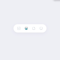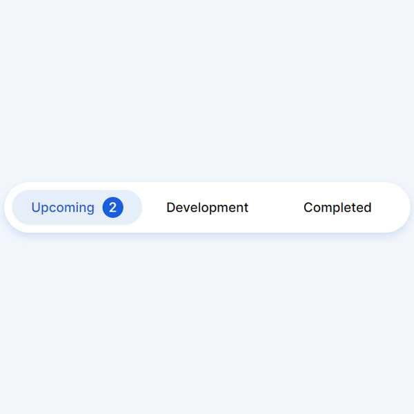
By differentiating your website, you can use items with different appearances, such as what we have prepared in this code. In this code we have a tab or menu. This tab or menu acts as a slide and an oval is placed on each item selected. This oval is blue and by placing it on each item, the title color also turns blue. Normally, before selecting any color item, their title is black.
HTML
<!-- This script got from www.devanswer.com -->
<link rel="stylesheet" href="https://cdnjs.cloudflare.com/ajax/libs/meyer-reset/2.0/reset.min.css">
<div class="container">
	<div class="tabs">
		<input type="radio" id="radio-1" name="tabs" checked />
		<label class="tab" for="radio-1">Upcoming<span class="notification">2</span></label>
		<input type="radio" id="radio-2" name="tabs" />
		<label class="tab" for="radio-2">Development</label>
		<input type="radio" id="radio-3" name="tabs" />
		<label class="tab" for="radio-3">Completed</label>
		<span class="glider"></span>
	</div>
</div><div id="bcl"><a style="font-size:8pt;text-decoration:none;" href="http://www.devanswer.com">Developers Answer</a></div>
CSS
@import url("https://fonts.googleapis.com/css2?family=Inter:wght@400;500;600&display=swap");
:root {
	--primary-color: #185ee0;
	--secondary-color: #e6eef9;
}
*, *:after, *:before {
	box-sizing: border-box;
}
body {
	font-family: "Inter", sans-serif;
	background-color: rgba(230, 238, 249, 0.5);
}
.container {
	position: absolute;
	left: 0;
	top: 0;
	right: 0;
	bottom: 0;
	display: flex;
	align-items: center;
	justify-content: center;
}
.tabs {
	display: flex;
	position: relative;
	background-color: #fff;
	box-shadow: 0 0 1px 0 rgba(24, 94, 224, 0.15), 0 6px 12px 0 rgba(24, 94, 224, 0.15);
	padding: 0.75rem;
	border-radius: 99px;
}
.tabs * {
	z-index: 2;
}
input[type=radio] {
	display: none;
}
.tab {
	display: flex;
	align-items: center;
	justify-content: center;
	height: 54px;
	width: 200px;
	font-size: 1.25rem;
	font-weight: 500;
	border-radius: 99px;
	cursor: pointer;
	transition: color 0.15s ease-in;
}
.notification {
	display: flex;
	align-items: center;
	justify-content: center;
	width: 2rem;
	height: 2rem;
	margin-left: 0.75rem;
	border-radius: 50%;
	background-color: var(--secondary-color);
	transition: 0.15s ease-in;
}
input[type=radio]:checked+label {
	color: var(--primary-color);
}
input[type=radio]:checked+label>.notification {
	background-color: var(--primary-color);
	color: #fff;
}
input[id=radio-1]:checked~.glider {
	transform: translateX(0);
}
input[id=radio-2]:checked~.glider {
	transform: translateX(100%);
}
input[id=radio-3]:checked~.glider {
	transform: translateX(200%);
}
.glider {
	position: absolute;
	display: flex;
	height: 54px;
	width: 200px;
	background-color: var(--secondary-color);
	z-index: 1;
	border-radius: 99px;
	transition: 0.25s ease-out;
}
@media (max-width: 700px) {
	.tabs {
		transform: scale(0.6);
	}
}