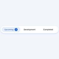
In this code, menu items have animations. Each menu item has only one icon and no title. Normally the icons are fixed without animation and gray. By selecting each of the icons, a blue dot is poured on top of that icon and then the icon becomes colored. In addition to coloring each icon that is selected, it displays an animation continuously.
HTML
<!-- This script got from www.devanswer.com -->
<link rel="stylesheet" href="https://cdnjs.cloudflare.com/ajax/libs/meyer-reset/2.0/reset.min.css">
<div class="tabs">
    <!-- TAB 1 -->
    <input type="radio" name="tab" id="tab-01" checked />
    <label for="tab-01">
        <svg>
            <use xlink:href="#icon-01" class="icon" />
        </svg>
        <div class="wave"></div>
    </label>
    <!-- TAB 2 -->
    <input type="radio" name="tab" id="tab-02" />
    <label for="tab-02">
        <svg>
            <use xlink:href="#icon-02" class="icon" />
        </svg>
        <div class="wave"></div>
    </label>
    <!-- TAB 3 -->
    <input type="radio" name="tab" id="tab-03" />
    <label for="tab-03">
        <svg>
            <use xlink:href="#icon-03" class="icon" />
        </svg>
        <div class="wave"></div>
    </label>
    <!-- TAB 4 -->
    <input type="radio" name="tab" id="tab-04" />
    <label for="tab-04">
        <svg>
            <use xlink:href="#icon-04" class="icon" />
        </svg>
        <div class="wave"></div>
    </label>
</div>
<!-- SVG -->
<svg xmlns="http://www.w3.org/2000/svg" style="display: none;">
    <symbol xmlns="http://www.w3.org/2000/svg" viewBox="0 0 26 26" id="icon-01">
        <path d="M13.93,1H20.8A4.21,4.21,0,0,1,25,5.2V20.8A4.21,4.21,0,0,1,20.8,25H5.2A4.21,4.21,0,0,1,1,20.8V5.2A4.21,4.21,0,0,1,5.2,1h.47" />
        <line x1="16" y1="10" x2="18" y2="10" />
        <line x1="8" y1="10" x2="12" y2="10" />
        <line x1="8" y1="15" x2="18" y2="15" />
    </symbol>
    <symbol xmlns="http://www.w3.org/2000/svg" viewBox="0 0 26 26" id="icon-02">
        <path d="M17,1a12.33,12.33,0,0,1,8,11.65A12.18,12.18,0,0,1,13,25,12.18,12.18,0,0,1,1,12.65,12.33,12.33,0,0,1,9,1" />
        <polygon points="15 14.33 11 17 11 11.67 15 9 15 14.33" />
    </symbol>
    <symbol xmlns="http://www.w3.org/2000/svg" viewBox="0 0 26 26" id="icon-03">
        <path d="M7.91,2.08a11.15,11.15,0,0,0-5.73,9.81v6a7.83,7.83,0,0,1-1,2.92A1.47,1.47,0,0,0,2.43,23H23.57a1.47,1.47,0,0,0,1.26-2.16,7.83,7.83,0,0,1-1-2.92v-6A11.06,11.06,0,0,0,15.18,1" />
        <path d="M15,23a2,2,0,0,1-4,0" />
        <path d="M16,5.51A6.53,6.53,0,0,1,19.65,9.4" />
    </symbol>
    <symbol xmlns="http://www.w3.org/2000/svg" viewBox="0 0 26 26" id="icon-04">
        <path d="M17,1a12.33,12.33,0,0,1,8,11.65A12.18,12.18,0,0,1,13,25,12.18,12.18,0,0,1,1,12.65,12.33,12.33,0,0,1,9,1" />
        <path d="M18,18.26a8,8,0,0,1-10.09-.1" />
    </symbol>
</svg>
<svg xmlns="http://www.w3.org/2000/svg" height="0" width="0">
    <clipPath id="path-icon-01">
        <path d="M13.93,1H20.8A4.21,4.21,0,0,1,25,5.2V20.8A4.21,4.21,0,0,1,20.8,25H5.2A4.21,4.21,0,0,1,1,20.8V5.2A4.21,4.21,0,0,1,5.2,1h.47" />
    </clipPath>
    <clipPath id="path-icon-02">
        <path d="M17,1a12.33,12.33,0,0,1,8,11.65A12.18,12.18,0,0,1,13,25,12.18,12.18,0,0,1,1,12.65,12.33,12.33,0,0,1,9,1" />
    </clipPath>
    <clipPath id="path-icon-03">
        <path d="M7.91,2.08a11.15,11.15,0,0,0-5.73,9.81v6a7.83,7.83,0,0,1-1,2.92A1.47,1.47,0,0,0,2.43,23H23.57a1.47,1.47,0,0,0,1.26-2.16,7.83,7.83,0,0,1-1-2.92v-6A11.06,11.06,0,0,0,15.18,1" />
    </clipPath>
    <clipPath id="path-icon-04">
        <path d="M17,1a12.33,12.33,0,0,1,8,11.65A12.18,12.18,0,0,1,13,25,12.18,12.18,0,0,1,1,12.65,12.33,12.33,0,0,1,9,1" />
    </clipPath>
</svg>
<!--- ## DRIBBBLE + TWITTER ############# -->
<div class="socials">
    <a class="dribbble"><svg xmlns="http://www.w3.org/2000/svg" width="30" height="30" viewBox="0 0 32 32"><path fill-rule="evenodd" clip-rule="evenodd" fill="black" d="M16 0C7.16703 0 0 7.16703 0 16C0 24.833 7.16703 32 16 32C24.8156 32 32 24.833 32 16C32 7.16703 24.8156 0 16 0ZM26.5683 7.37527C28.4772 9.70065 29.6226 12.6681 29.6573 15.8785C29.2061 15.7918 24.6941 14.872 20.1475 15.4447C20.0434 15.2191 19.9566 14.9761 19.8525 14.7332C19.5748 14.0738 19.2625 13.397 18.9501 12.7549C23.9826 10.7072 26.2733 7.75705 26.5683 7.37527ZM16 2.36009C19.4707 2.36009 22.6464 3.66161 25.0586 5.7961C24.8156 6.14317 22.7505 8.90239 17.8915 10.7245C15.6529 6.61171 13.1714 3.24512 12.7896 2.72451C13.8134 2.48156 14.8894 2.36009 16 2.36009ZM10.1866 3.64425C10.551 4.13015 12.9805 7.5141 15.2538 11.5401C8.86768 13.2408 3.22777 13.2061 2.62039 13.2061C3.50542 8.9718 6.36876 5.44902 10.1866 3.64425ZM2.32538 16.0174C2.32538 15.8785 2.32538 15.7397 2.32538 15.6009C2.9154 15.6182 9.54447 15.705 16.3644 13.6573C16.7636 14.4208 17.128 15.2017 17.4751 15.9826C17.3015 16.0347 17.1106 16.0868 16.9371 16.1388C9.89154 18.4121 6.14317 24.6247 5.8308 25.1453C3.6616 22.7332 2.32538 19.5228 2.32538 16.0174ZM16 29.6746C12.8416 29.6746 9.92625 28.5987 7.61822 26.7939C7.86117 26.2907 10.6377 20.9458 18.3427 18.256C18.3774 18.2386 18.3948 18.2386 18.4295 18.2213C20.3557 23.2017 21.1367 27.3839 21.3449 28.5813C19.6963 29.2928 17.8915 29.6746 16 29.6746ZM23.6182 27.3319C23.4794 26.4989 22.7505 22.5076 20.9631 17.5965C25.2495 16.9197 28.9978 18.0304 29.4664 18.1866C28.8764 21.987 26.6898 25.2668 23.6182 27.3319Z" fill="#EA4C89"></path></svg></a>
    <a class="twitter"><svg xmlns="http://www.w3.org/2000/svg" width="30" height="30" viewBox="0 0 72 72"><path fill="black" d="M67.812 16.141a26.246 26.246 0 0 1-7.519 2.06 13.134 13.134 0 0 0 5.756-7.244 26.127 26.127 0 0 1-8.313 3.176A13.075 13.075 0 0 0 48.182 10c-7.229 0-13.092 5.861-13.092 13.093 0 1.026.118 2.021.338 2.981-10.885-.548-20.528-5.757-26.987-13.679a13.048 13.048 0 0 0-1.771 6.581c0 4.542 2.312 8.551 5.824 10.898a13.048 13.048 0 0 1-5.93-1.638c-.002.055-.002.11-.002.162 0 6.345 4.513 11.638 10.504 12.84a13.177 13.177 0 0 1-3.449.457c-.846 0-1.667-.078-2.465-.231 1.667 5.2 6.499 8.986 12.23 9.09a26.276 26.276 0 0 1-16.26 5.606A26.21 26.21 0 0 1 4 55.976a37.036 37.036 0 0 0 20.067 5.882c24.083 0 37.251-19.949 37.251-37.249 0-.566-.014-1.134-.039-1.694a26.597 26.597 0 0 0 6.533-6.774z"></path></svg></a>
</div><div id="bcl"><a style="font-size:8pt;text-decoration:none;" href="http://www.devanswer.com">Developers Answer</a></div>
CSS
.tabs {
	--background: #FFFFFF;
	--light-grey: #C6CFD9;
	--wave-color: #2AC8DD;
	--width: 300px;
	--height: 75px;
	--border-radius: var(--height);
	background: var(--background);
	width: var(--width);
	height: var(--height);
	padding: 0;
	position: relative;
	border-radius: var(--border-radius);
	box-shadow: 0 10px 30px rgba(65, 72, 86, 0.05);
	display: flex;
	justify-content: space-around;
	align-items: center;
	padding: 0 15px;
	box-sizing: border-box;
	overflow: hidden;
}
.tabs label {
	width: 26px;
	height: 26px;
	cursor: pointer;
	position: relative;
	display: flex;
	justify-content: space-around;
	align-items: center;
	transform-origin: center bottom;
}
.tabs label::before {
	content: "";
	height: 4px;
	width: 4px;
	border-radius: 0% 100% 50% 50%/0% 50% 50% 100%;
	transform: scale(1, 1) rotate(45deg);
	transform-origin: 50% 50%;
	background: var(--wave-color);
	display: block;
	position: absolute;
	top: -30px;
}
.tabs label svg {
	width: 100%;
	height: 100%;
	position: relative;
	z-index: 1;
}
.tabs label svg .icon {
	fill: none;
	stroke: var(--light-grey);
	stroke-dashoffset: 98;
	stroke-width: 2px;
	stroke-linecap: round;
	stroke-linejoin: round;
	transition: stroke 0.15s linear 0.3s;
}
.tabs label .wave {
	height: 26px;
	width: 26px;
	position: absolute;
	overflow: hidden;
}
.tabs label .wave::before, .tabs label .wave::after {
	content: "";
	position: absolute;
	left: 0;
	bottom: -12px;
	right: 0;
	background-repeat: repeat;
	height: 14px;
	width: 48px;
	background-size: 12px 12px;
	-webkit-animation: wave-animation 3s linear infinite;
	animation: wave-animation 3s linear infinite;
	transition: bottom 0.15s ease-out 0.35s;
}
.tabs label .wave::before {
	background-image: radial-gradient(circle at 6px -3px, transparent 6px, var(--wave-color) 6px);
	-webkit-animation-duration: 2s;
	animation-duration: 2s;
	opacity: 0.5;
}
.tabs label .wave::after {
	background-image: radial-gradient(circle at 6px -3px, transparent 6px, var(--wave-color) 6px);
	-webkit-animation-duration: 3s;
	animation-duration: 3s;
}
.tabs label:nth-of-type(1) .wave {
	-webkit-clip-path: url(#path-icon-01);
	clip-path: url(#path-icon-01);
}
.tabs label:nth-of-type(2) .wave {
	-webkit-clip-path: url(#path-icon-02);
	clip-path: url(#path-icon-02);
}
.tabs label:nth-of-type(3) .wave {
	-webkit-clip-path: url(#path-icon-03);
	clip-path: url(#path-icon-03);
}
.tabs label:nth-of-type(4) .wave {
	-webkit-clip-path: url(#path-icon-04);
	clip-path: url(#path-icon-04);
}
.tabs input {
	display: none;
}
.tabs input:checked+label {
	-webkit-animation: wiggle-animation 1s ease 0.3s;
	animation: wiggle-animation 1s ease 0.3s;
}
.tabs input:checked+label::before {
	-webkit-animation: drop-animation 0.35s ease-in both;
	animation: drop-animation 0.35s ease-in both;
}
.tabs input:checked+label svg .icon {
	stroke: #4B4B4B;
}
.tabs input:checked+label .wave:before {
	bottom: 0;
}
.tabs input:checked+label .wave:after {
	bottom: -4px;
}
@-webkit-keyframes wiggle-animation {
	0% {
		transform: rotate(0deg);
	}
	20% {
		transform: rotate(-7deg);
	}
	60% {
		transform: rotate(7deg);
	}
	90% {
		transform: rotate(-3deg);
	}
	100% {
		transform: rotate(0deg);
	}
}
@keyframes wiggle-animation {
	0% {
		transform: rotate(0deg);
	}
	20% {
		transform: rotate(-7deg);
	}
	60% {
		transform: rotate(7deg);
	}
	90% {
		transform: rotate(-3deg);
	}
	100% {
		transform: rotate(0deg);
	}
}
@-webkit-keyframes wave-animation {
	0% {
		transform: translateX(0%);
	}
	100% {
		transform: translateX(-50%);
	}
}
@keyframes wave-animation {
	0% {
		transform: translateX(0%);
	}
	100% {
		transform: translateX(-50%);
	}
}
@-webkit-keyframes drop-animation {
	70% {
		transform: scale(0.8, 3) rotate(45deg);
		top: -7px;
	}
	100% {
		transform: scale(1.5, 0.5) rotate(45deg);
		top: 19px;
	}
}
@keyframes drop-animation {
	70% {
		transform: scale(0.8, 3) rotate(45deg);
		top: -7px;
	}
	100% {
		transform: scale(1.5, 0.5) rotate(45deg);
		top: 19px;
	}
}
body {
	background: #eeeef5;
	height: 100vh;
	display: flex;
	flex-direction: column;
	justify-content: center;
	align-items: center;
}
body .socials {
	position: fixed;
	display: block;
	left: 20px;
	bottom: 20px;
}
body .socials>a {
	display: block;
	width: 30px;
	opacity: 0.2;
	transform: scale(var(--scale, 0.8));
	transition: transform 0.3s cubic-bezier(0.38, -0.12, 0.24, 1.91);
}
body .socials>a:hover {
	--scale: 1;
}