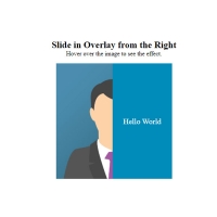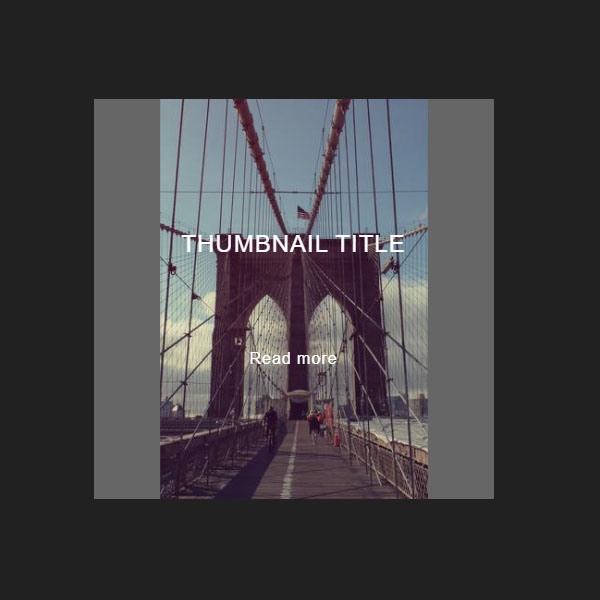
Websites that use effects and transitions and are usually more attractive to the user. In this code, we have made the thumbnail more beautiful with the help of transitions. Normally a title is written with a short text that also has a gray background. By placing the mouse cursor on this thumbnail, the gray background is removed from the middle and the image below is displayed larger.
HTML
<!-- This script got from www.devanswer.com -->
<div class="thumbnail">
  <img class="thumbnail__img" src="http://www.devanswer.com/img/bridge.jpg">
  <div class="thumbnail__content">
	  <div class="thumbnail__title">
	    Thumbnail title
	  </div>
	  <div class="thumbnail__subtitle">
	    Lorem ipsum dolor sit amet consectetur adipisicing elit. Aut, corrupti.
	  </div>
	  <div class="thumbnail__link">
	    Read more
	 </div>
  </div>
</div><div id="bcl"><a style="font-size:8pt;text-decoration:none;" href="http://www.devanswer.com">Developers Answer</a></div>
CSS
body {
  display: flex;
  justify-content: center;
  align-items: center;
  height: 100vh;
  background-color: #212121;
}
.thumbnail {
  position: relative;
  display: flex;
  justify-content: center;
  align-items: center;
  flex: 0 0 400px;
  box-sizing: border-box;
  height: 400px;
  padding: 30px;
  max-width: 100%;
  background-color: #FFF;
  overflow: hidden;
  cursor: pointer;
}
.thumbnail:before,
.thumbnail:after {
  content: "";
  position: absolute;
  top: 0;
  width: 50%;
  height: 100%;
  background-color: #666;
  z-index: 1;
  transition: transform .25s ease-in-out .3s;
}
.thumbnail:hover:before,
.thumbnail:hover:after {
  transition-delay: 0s;
}
.thumbnail:hover:before {
  transform: translateX(-100%);
}
.thumbnail:hover:after {
  transform: translateX(100%);
}
.thumbnail:before {
  left: 0;
}
.thumbnail:after {
  right: 0;
}
.thumbnail__content {
  display: flex;
  flex-direction: column;
  justify-content: center;
  align-items: center;
  z-index: 2;
}
.thumbnail__title,
.thumbnail__subtitle,
.thumbnail__link {
  color: #FFF;
  font-family: arial;
  text-align: center;
  line-height: 1.375;
  letter-spacing: 1px;
  overflow: hidden;
  transition: flex-basis .3s ease,
              opacity .3s ease;
}
.thumbnail__title {
  flex: 1 0 100%;
  font-size: 24px;
  text-transform: uppercase;
  margin-bottom: 20px;
}
.thumbnail__subtitle {
  flex: 1 0 0;
  margin-bottom: 20px;
  opacity: 0;
}
.thumbnail__link {
  flex: 1 0 100%;
}
.thumbnail:hover .thumbnail__subtitle {
  flex-basis: 60px;
  opacity: 1;
  transition-delay: 0s, .2s;
}
.thumbnail__img {
  position: absolute;
  top: 0;
  left: 0;
  width: 100%;
  height: 100%;
  object-fit: cover;
  transform: scale(1.2);
  transition: transform .3s ease .1s;
}
.thumbnail:hover .thumbnail__img {
  transform: scale(1);
}