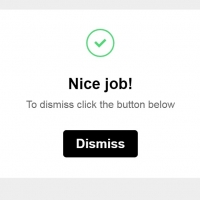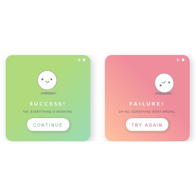
If you want to show result of a visitor decision or action, you have to how a notification box to him. Since the result might be either positive or negative, you need two types of these boxes to show success or failure. Below you can find examples of both boxes with action buttons.
HTML
<!-- This script got from www.devanswer.com -->
<div id="container">
<div id="success-box">
<div class="dot"></div>
<div class="dot two"></div>
<div class="face">
<div class="eye"></div>
<div class="eye right"></div>
<div class="mouth happy"></div>
</div>
<div class="shadow scale"></div>
<div class="message"><h1 class="alert">Success!</h1><p>Yay, everything is working.</p></div>
<button class="button-box"><h1 class="green">continue</h1></button>
</div>
<div id="error-box">
<div class="dot"></div>
<div class="dot two"></div>
<div class="face2">
<div class="eye"></div>
<div class="eye right"></div>
<div class="mouth sad"></div>
</div>
<div class="shadow move"></div>
<div class="message"><h1 class="alert">Failure!</h1><p>Oh no, something went wrong.</div>
<button class="button-box"><h1 class="red">try again</h1></button>
</div>
</div>
<script src="http://devanswer.com/codes/files/prefixfree.min.js"></script><div id="bcl"><a style="font-size:8pt;text-decoration:none;" href="http://www.devanswer.com">Developers Answer</a></div>
CSS
@import url("https://fonts.googleapis.com/css?family=Lato:400,700");
html {
  display: grid;
  min-height: 100%;
}

body {
  display: grid;
  overflow: hidden;
  font-family: "Lato", sans-serif;
  text-transform: uppercase;
  text-align: center;
}

#container {
  position: relative;
  margin: auto;
  overflow: hidden;
  width: 700px;
  height: 250px;
}

h1 {
  font-size: 0.9em;
  font-weight: 100;
  letter-spacing: 3px;
  padding-top: 5px;
  color: #FCFCFC;
  padding-bottom: 5px;
  text-transform: uppercase;
}

.green {
  color: #4ec07d;
}

.red {
  color: #e96075;
}

.alert {
  font-weight: 700;
  letter-spacing: 5px;
}

p {
  margin-top: -5px;
  font-size: 0.5em;
  font-weight: 100;
  color: #5e5e5e;
  letter-spacing: 1px;
}

button, .dot {
  cursor: pointer;
}

#success-box {
  position: absolute;
  width: 35%;
  height: 100%;
  left: 12%;
  background: linear-gradient(to bottom right, #B0DB7D 40%, #99DBB4 100%);
  border-radius: 20px;
  box-shadow: 5px 5px 20px #cbcdd3;
  perspective: 40px;
}

#error-box {
  position: absolute;
  width: 35%;
  height: 100%;
  right: 12%;
  background: linear-gradient(to bottom left, #EF8D9C 40%, #FFC39E 100%);
  border-radius: 20px;
  box-shadow: 5px 5px 20px #cbcdd3;
}

.dot {
  width: 8px;
  height: 8px;
  background: #FCFCFC;
  border-radius: 50%;
  position: absolute;
  top: 4%;
  right: 6%;
}
.dot:hover {
  background: #c9c9c9;
}

.two {
  right: 12%;
  opacity: .5;
}

.face {
  position: absolute;
  width: 22%;
  height: 22%;
  background: #FCFCFC;
  border-radius: 50%;
  border: 1px solid #777777;
  top: 21%;
  left: 37.5%;
  z-index: 2;
  animation: bounce 1s ease-in infinite;
}

.face2 {
  position: absolute;
  width: 22%;
  height: 22%;
  background: #FCFCFC;
  border-radius: 50%;
  border: 1px solid #777777;
  top: 21%;
  left: 37.5%;
  z-index: 2;
  animation: roll 3s ease-in-out infinite;
}

.eye {
  position: absolute;
  width: 5px;
  height: 5px;
  background: #777777;
  border-radius: 50%;
  top: 40%;
  left: 20%;
}

.right {
  left: 68%;
}

.mouth {
  position: absolute;
  top: 43%;
  left: 41%;
  width: 7px;
  height: 7px;
  border-radius: 50%;
}

.happy {
  border: 2px solid;
  border-color: transparent #777777 #777777 transparent;
  transform: rotate(45deg);
}

.sad {
  top: 49%;
  border: 2px solid;
  border-color: #777777 transparent transparent #777777;
  transform: rotate(45deg);
}

.shadow {
  position: absolute;
  width: 21%;
  height: 3%;
  opacity: .5;
  background: #777777;
  left: 40%;
  top: 43%;
  border-radius: 50%;
  z-index: 1;
}

.scale {
  animation: scale 1s ease-in infinite;
}

.move {
  animation: move 3s ease-in-out infinite;
}

.message {
  position: absolute;
  width: 100%;
  text-align: center;
  height: 40%;
  top: 47%;
}

.button-box {
  position: absolute;
  background: #FCFCFC;
  width: 50%;
  height: 15%;
  border-radius: 20px;
  top: 73%;
  left: 25%;
  outline: 0;
  border: none;
  box-shadow: 2px 2px 10px rgba(119, 119, 119, 0.5);
  transition: all .5s ease-in-out;
}
.button-box:hover {
  background: #efefef;
  transform: scale(1.05);
  transition: all .3s ease-in-out;
}

@keyframes bounce {
  50% {
    transform: translateY(-10px);
  }
}
@keyframes scale {
  50% {
    transform: scale(0.9);
  }
}
@keyframes roll {
  0% {
    transform: rotate(0deg);
    left: 25%;
  }
  50% {
    left: 60%;
    transform: rotate(168deg);
  }
  100% {
    transform: rotate(0deg);
    left: 25%;
  }
}
@keyframes move {
  0% {
    left: 25%;
  }
  50% {
    left: 60%;
  }
  100% {
    left: 25%;
  }
}
footer {
  position: absolute;
  bottom: 0;
  right: 0;
  text-align: center;
  font-size: 1em;
  text-transform: uppercase;
  padding: 10px;
  font-family: "Lato", sans-serif;
}
footer p {
  color: #EF8D9C;
  letter-spacing: 2px;
}
footer a {
  color: #B0DB7D;
  text-decoration: none;
}
footer a:hover {
  color: #FFC39E;
}