Using effects and animations is a good option when you want your site to be smooth and motionless. In the following code, we have a timeline that in the case of hover, the title of each timeline is displayed in animation and turns blue and beautifies the appearance of the site and makes more visitors to your site.
HTML
<!-- This script got from www.devanswer.com -->
<ul class="timeline">
<li class="timeline-event">
<label class="timeline-event-icon"></label>
<div class="timeline-event-copy">
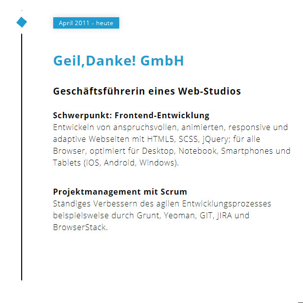
<p class="timeline-event-thumbnail">April 2011 - heute</p>
<h3>Geil,Danke! GmbH</h3>
<h4>Geschäftsführerin eines Web-Studios</h4>
<p><strong>Schwerpunkt: Frontend-Entwicklung</strong><br>Entwickeln von anspruchsvollen, animierten, responsive und adaptive Webseiten mit HTML5, SCSS, jQuery; für alle Browser, optimiert für Desktop, Notebook, Smartphones und Tablets (iOS, Android, Windows).</p>
<p><strong>Projektmanagement mit Scrum</strong><br>Ständiges Verbessern des agilen Entwicklungsprozesses beispielsweise durch Grunt, Yeoman, GIT, JIRA und BrowserStack.</p>
</div>
</li>
<li class="timeline-event">
<label class="timeline-event-icon"></label>
<div class="timeline-event-copy">
<p class="timeline-event-thumbnail">November 2009 - März 2011</p>
<h3>Freelancer</h3>
<h4>Designer und Autor</h4>
<p>Konzeption, Design und Produktion von Digitalen Magazinen mit InDesign, der Adobe Digital Publishing Suite und HTML5. Co-Autorin der Fachbücher "Digitales Publizieren für Tablets" und "Adobe Digital Publishing Suite" erschienen im dpunkt.verlag.</p>
</div>
</li>
<li class="timeline-event">
<label class="timeline-event-icon"></label>
<div class="timeline-event-copy">
<p class="timeline-event-thumbnail">April 2011 - heute</p>
<h3>konplan gmbh</h3>
<h4>IT-Consultant</h4>
<p><strong>Systemarchitektur, Consulting</strong><br>Konzeption und Modellierung von Systemen und APIs für Digital Publishing und Entitlement nach SOA</p>
</div>
</li>
</ul><div id="bcl"><a style="font-size:8pt;text-decoration:none;" href="http://www.devanswer.com">Developers Answer</a></div>
CSS
@import url(https://fonts.googleapis.com/css?family=Open+Sans:300,700);

body {
    font-family: 'Open Sans', 'Helvetica Neue', Helvetica, Arial, sans-serif;
    font-size: 1em;
    font-weight: 300;
    line-height: 1.5;
    letter-spacing: 0.05em;
}

* {
    box-sizing: border-box;
}

/* Styling */
.timeline {
    margin: 4em auto;
    position: relative;
    max-width: 46em;
    list-style: none;
}

    .timeline:before {
        background-color: black;
        content: " ";
        margin-left: -1px;
        position: absolute;
        top: 0;
        left: 4.5em;
        width: 2px;
        height: 100%;
    }

.timeline-event {
    position: relative;
}

    .timeline-event:hover .timeline-event-icon {
        transform: rotate(220deg);
        transition: all 0.3s ease-in-out 0s;
        background-color: #1f9bcf;
    }

    .timeline-event:hover .timeline-event-thumbnail {
        box-shadow: 0 0 11px rgba(33, 33, 33, 0.2);
        background-color: #1f9bcf;
    }

    .timeline-event:hover .timeline-event-copy h3 {
        animation-name: color_change;
        animation-duration: 1s;
        animation-iteration-count: 1;
        animation-direction: alternate;
        color: #1f9bcf;
    }

.timeline-event-copy {
    padding: 2em;
    position: relative;
    top: -1.875em;
    left: 4em;
    width: 80%;
}

    .timeline-event-copy h3 {
        font-size: 1.75em;
    }

    .timeline-event-copy h4 {
        font-size: 1.2em;
        margin-bottom: 1.2em;
    }

    .timeline-event-copy strong {
        font-weight: 700;
    }

    .timeline-event-copy p:not(.timeline-event-thumbnail) {
        padding-bottom: 1.2em;
    }

.timeline-event-icon {
    transform: rotate(45deg);
    background-color: black;
    outline: 10px solid white;
    display: block;
    margin: 0.5em 0.5em 0.5em -0.5em;
    position: absolute;
    top: 0.5em;
    left: 2em;
    width: 1em;
    height: 1em;
}

.timeline-event-thumbnail {
    transition: box-shadow 0.5s ease-in 0.1s;
    color: white;
    font-size: 0.75em;
    background-color: black;
    box-shadow: inset 0 0 0 0em #ef795a;
    display: inline-block;
    margin-bottom: 1.2em;
    padding: 0.25em 1em 0.2em 1em;
}

@-webkit-keyframes color_change {
    0% {
        color: black;
    }

    100% {
        color: #1f9bcf;
    }
}