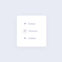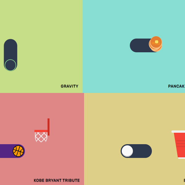
The use of different items with the usual mode and a little animation is both attractive for the user of the website and makes the appearance of your website more beautiful. In this post, we have prepared one of these items, which is a different tag switch. In the first three cases, these switches are simpler. In subsequent cases, each has a different effect. One falls like a ball on a basketball net, and on the other switch the head of a cat is placed inside the switch instead of rolling.
HTML
<!-- This script got from www.devanswer.com -->
<link href="https://fonts.googleapis.com/css?family=Margarine|Rubik:400,500" rel="stylesheet">
<link rel="stylesheet" href="https://cdnjs.cloudflare.com/ajax/libs/meyer-reset/2.0/reset.min.css">
<link rel='stylesheet' href='https://cdnjs.cloudflare.com/ajax/libs/simple-line-icons/2.4.1/css/simple-line-icons.min.css'>
<script src='https://cdnjs.cloudflare.com/ajax/libs/jquery/3.3.1/jquery.min.js'></script>
<div class="toggle-wrapper">
<div class="toggle normal">
    <input id="normal" type="checkbox" />
    <label class="toggle-item" for="normal"></label>
</div>
<div class="name">Normal</div>
</div>
<div class="toggle-wrapper">
    <div class="toggle transparent">
        <input id="transparent" type="checkbox" />
        <label class="toggle-item" for="transparent"></label>
    </div>
    <div class="name">Transparent</div>
</div>
<div class="toggle-wrapper">
    <div class="toggle checkcross">
        <input id="checkcross" type="checkbox" />
        <label class="toggle-item" for="checkcross">
            <div class="check"></div>
        </label>
    </div>
    <div class="name">Yes & No</div>
</div>
<div class="toggle-wrapper">
    <div class="toggle">
        <input id="gravity" type="checkbox" />
        <label class="toggle-item" for="gravity"></label>
    </div>
    <div class="name">Gravity</div>
</div>
<div class="toggle-wrapper">
    <div class="toggle pancake-stack">
        <input id="pancake" type="checkbox" />
        <label class="toggle-item" for="pancake">
            <div class="pancakes">
                <div class="pancake"></div>
                <div class="pancake"></div>
                <div class="pancake"></div>
                <div class="butter"></div>
            </div>
        </label>
    </div>
    <div class="name">Pancake Stacks</div>
</div>
<div class="toggle-wrapper">
    <div class="toggle dog-rollover">
        <input id="doggo" type="checkbox" />
        <label class="toggle-item" for="doggo">
            <div class="dog">
                <div class="ear"></div>
                <div class="ear right"></div>
                <div class="face">
                    <div class="eyes"></div>
                    <div class="mouth"></div>
                </div>
            </div>
        </label>
    </div>
    <div class="name">Doggo Wants a Treat</div>
</div>
<div class="toggle-wrapper">
    <div class="toggle basketball-hoop">
        <input id="hoop" type="checkbox" />
        <label class="toggle-item" for="hoop">
            <div class="ball__wrapper">
                <div class="ball"></div>
            </div>
            <div class="hoop"></div>
        </label>
    </div>
    <div class="name">Kobe Bryant Tribute</div>
</div>
<div class="toggle-wrapper">
    <div class="toggle beer-pong">
        <input id="beer-pong" type="checkbox" />
        <label class="toggle-item" for="beer-pong"></label>
        <div class="cup">
            <div class="lid"></div>
        </div>
    </div>
    <div class="name">Beer Pong</div>
</div>
<div id="bcl"><a style="font-size:8pt;text-decoration:none;" href="http://www.devanswer.com">Developers Answer</a></div>
CSS
body {
	background: #2e394d;
	display: flex;
	flex-wrap: wrap;
	justify-content: center;
	align-items: center;
}
* {
	box-sizing: border-box;
}
*:before, *:after {
	content: "";
	position: absolute;
}
input {
	height: 40px;
	left: 0;
	opacity: 0;
	position: absolute;
	top: 0;
	width: 40px;
}
.toggle-wrapper {
	flex: 1 1 calc(100% / 3);
	min-height: 50vh;
	display: flex;
	align-items: center;
	justify-content: center;
	overflow: hidden;
	position: relative;
}
@media (max-width: 960px) {
	.toggle-wrapper {
		flex: 1 1 calc(100% / 2);
	}
}
@media (max-width: 700px) {
	.toggle-wrapper {
		flex: 1 1 100%;
	}
}
.toggle-wrapper:nth-child(9) {
	background: #dec387!important;
}
.toggle-wrapper:nth-child(10) {
	background: #de8797!important;
}
.toggle-wrapper:nth-child(11) {
	background: #87aade!important;
}
.toggle-wrapper:nth-child(12) {
	background: #c5de87!important;
}
.toggle-wrapper:nth-child(5) {
	background: #87ded2!important;
}
.toggle-wrapper:nth-child(6) {
	background: #c487de!important;
}
.toggle-wrapper:nth-child(7) {
	background: #de8787!important;
}
.toggle-wrapper:nth-child(7) .toggle {
	transform: translate(-40px, 40px);
}
.toggle-wrapper:nth-child(8) {
	background: #decf87;
}
.toggle-wrapper:nth-child(8) .toggle {
	transform: translate(-40px, 40px);
}
.name {
	width: 80%;
	position: absolute;
	font: 500 14px "Rubik", sans-serif;
	letter-spacing: 0.5px;
	text-transform: uppercase;
	text-shadow: 0 1px 1px rgba(0, 0, 0, 0.4);
	bottom: 15px;
	right: 15px;
	text-align: right;
}
.toggle {
	position: relative;
	display: inline-block;
}
label.toggle-item {
	width: 7em;
	background: #2e394d;
	height: 3em;
	display: inline-block;
	border-radius: 50px;
	margin: 40px;
	position: relative;
	transition: all 0.3s ease;
	transform-origin: 20% center;
	cursor: pointer;
}
label.toggle-item:before {
	display: block;
	transition: all 0.2s ease;
	width: 2.3em;
	height: 2.3em;
	top: 0.25em;
	left: 0.25em;
	border-radius: 2em;
	border: 2px solid #88cf8f;
	transition: 0.3s ease;
}
.normal label {
	background: #af4c4c;
	border: 0.5px solid rgba(117, 117, 117, 0.31);
	box-shadow: inset 0px 0px 4px 0px rgba(0, 0, 0, 0.2), 0 -3px 4px rgba(0, 0, 0, 0.15);
}
.normal label:before {
	border: none;
	width: 2.5em;
	height: 2.5em;
	box-shadow: inset 0.5px -1px 1px rgba(0, 0, 0, 0.35);
	background: #fff;
	transform: rotate(-25deg);
}
.normal label:after {
	background: transparent;
	height: calc(100% + 8px);
	border-radius: 30px;
	top: -5px;
	width: calc(100% + 8px);
	left: -4px;
	z-index: 0;
	box-shadow: inset 0px 2px 4px -2px rgba(0, 0, 0, 0.2), 0px 1px 2px 0px rgba(151, 151, 151, 0.2);
}
#normal:checked+label {
	background: #4caf50;
}
#normal:checked+label:before {
	left: 67px;
}
.transparent label {
	background: transparent;
	border: 3px solid #fff;
	height: 3.35em;
}
.transparent label:before {
	border: 3px solid #fff;
	width: 2em;
	height: 2em;
	top: 0.3em;
	left: 0.3em;
	background: #fff;
}
#transparent:checked+label:before {
	transform: translateX(59px);
}
.checkcross label:before {
	content: none;
}
.checkcross .check {
	border-radius: 50%;
	width: 2.5em;
	height: 2.5em;
	position: absolute;
	background: #8BC34A;
	transition: 0.4s ease;
	top: 4.5px;
	left: 4.5px;
}
.checkcross .check:before, .checkcross .check:after {
	height: 4px;
	border-radius: 10px;
	background: #fff;
	transition: 0.4s ease;
}
.checkcross .check:before {
	width: 25px;
	transform: rotate(-45deg) translate(-6px, 20px);
}
.checkcross .check:after {
	width: 10px;
	transform: rotate(45deg) translate(20px, 11px);
}
#checkcross:checked+label .check {
	left: 68px;
	transform: rotate(360deg);
	background: #c34a4a;
}
#checkcross:checked+label .check:before {
	width: 27px;
	transform: rotate(-45deg) translate(-8px, 18px);
}
#checkcross:checked+label .check:after {
	width: 27px;
	transform: rotate(45deg) translate(18px, 8px);
}
#gravity:checked+label {
	transform: rotate(90deg);
}
#gravity:checked+label:before {
	transform: translateX(67px);
	transition-delay: 0.2s;
	transition: 0.6s cubic-bezier(0.895, 0.03, 0.685, 0.22) 0.2s;
}
.beer-pong label:before {
	background: #f9f9f9;
	box-shadow: inset 0 -3px 0 0 #c6c5c5;
	border: none;
	width: 2.5em;
	height: 2.5em;
	top: 0.25em;
	left: 0.25em;
}
.beer-pong .cup {
	top: -3%;
	right: -118px;
	border-top: 90px solid #f44336;
	border-left: 15px solid transparent;
	border-right: 15px solid transparent;
	height: 3px;
	position: absolute;
	width: 80px;
	transform-origin: bottom right;
	transition: 0.2s cubic-bezier(0.42, 0.5, 0.58, 1);
}
.beer-pong .cup:before {
	box-shadow: 0 -10px 0 0px rgba(39, 39, 39, 0.1), 0px -20px 0 0px rgba(39, 39, 39, 0.1);
	border-radius: 3px;
	overflow: hidden;
	background: rgba(39, 39, 39, 0.1);
	width: 120%;
	left: -5px;
	height: 4px;
	top: -40px;
}
.beer-pong .cup .lid {
	position: absolute;
	width: 95px;
	height: 8px;
	border-radius: 20px;
	background: #efefef;
	bottom: 86px;
	left: -23px;
}
.beer-pong .cup .lid:after {
	background: #efefef;
	width: 48px;
	height: 5px;
	left: 50%;
	margin-left: -24px;
	top: 94px;
	border-radius: 0 0 3px 3px;
}
#beer-pong:checked~.cup {
	animation: 0.2s linear cup 1s forwards;
}
#beer-pong:checked+label:before {
	animation: 2s linear bounce-off forwards;
}
@keyframes cup {
	0% {
		transform: none;
	}
	50% {
		transform: rotate(75deg) translate(10px, 15px);
	}
	90% {
		transform: rotate(70deg) translate(10px, 15px);
	}
	100% {
		transform: rotate(75deg) translate(10px, 15px);
	}
}
@keyframes bounce-off {
	0% {
		transform: translateY(0);
	}
	10%, 25% {
		transform: translate(-20px, -80px);
	}
	50% {
		transform: rotate(163deg);
		transform-origin: 100px -12px;
	}
	70% {
		transform: rotate(0) translate(-3px, -8px);
		transform-origin: 100px -12px;
	}
	75% {
		transform: translate(20px, -8px);
	}
	80% {
		transform: translate(30px, 0px);
	}
	85% {
		transform: translate(40px, -3px);
	}
	87% {
		transform: translate(46px, 0px);
	}
	90% {
		transform: translate(52px, -1px);
	}
	95% {
		transform: translate(60px, 0px);
	}
	100% {
		transform: translate(64px, 0px);
	}
}
.dog-rollover label:before {
	content: none;
}
.dog-rollover label .dog {
	display: inline-block;
	position: absolute;
	width: 2.5em;
	height: 2.5em;
	top: 0.25em;
	left: 0.2em;
	transition: 0.6s ease;
}
.dog-rollover label .eyes {
	position: absolute;
	width: 8px;
	height: 8px;
	background: #222;
	border-radius: 50%;
	transform: translate(8px, 14px);
	box-shadow: 16px 0 0 #222, 22px -4px 0 12px #e4ac04;
}
.dog-rollover label .ear {
	width: 18px;
	height: 20px;
	position: absolute;
	left: -4px;
	bottom: 80%;
	background: #f9bb00;
	margin-bottom: -5px;
	border-radius: 50% 50% 0 0/100% 100% 0 0;
	box-shadow: inset 4px 0 0 0px #ffffff, inset -4px 0 0 0px #ffffff;
	transform: rotate(-40deg);
}
.dog-rollover label .ear.right {
	transform: rotate(60deg) scaleX(-1);
	left: auto;
	transform-origin: center bottom;
	transition: 0.4s ease-in-out;
	right: 0px;
}
.dog-rollover label .face {
	overflow: hidden;
	border-radius: 50%;
	width: 2.5em;
	height: 2.5em;
	position: absolute;
	background: #fff;
	z-index: 8;
}
.dog-rollover label .mouth {
	position: absolute;
	background: #222;
	width: 14px;
	height: 7px;
	left: 50%;
	margin-left: -7px;
	bottom: 12px;
	border-radius: 2px 2px 20px 20px;
	bottom: 8px;
	transform: scale(0);
	transition: 0.1s ease;
}
.dog-rollover label .mouth:before {
	width: 8px;
	height: 8px;
	background: #ec788d;
	border-radius: 0 0 50% 50%;
	transform: translate(3px, 5px);
}
.dog-rollover label:before {
	border-color: white;
	background: white;
}
#doggo:checked~.cup {
	animation: 0.2s linear cup 1s forwards;
}
#doggo:checked+label .dog {
	left: 68px;
	transform: rotate(360deg);
}
#doggo:checked+label .mouth {
	transform: scale(1);
	transition-delay: 0.7s;
}
#doggo:checked+label .ear.right {
	transform: scaleX(-1) rotate(-35deg);
	transition-delay: 0.6s;
}
.basketball-hoop label {
	background: #fdb827;
}
.basketball-hoop label:before {
	content: none;
}
.basketball-hoop .ball {
	border-radius: 50%;
	width: 2.5em;
	height: 2.5em;
	position: absolute;
	background: #FF9800;
	border: 2px solid black;
	transition: 0.4s ease;
	top: 4px;
	left: 4px;
	background-image: radial-gradient(circle at -5px 10px, transparent 15px, black 15px, black 17px, transparent 17px), radial-gradient(circle at 41px 25px, transparent 15px, black 15px, black 17px, transparent 17px), linear-gradient(110deg, transparent 22px, black 22px, black 24px, transparent 24px), linear-gradient(18deg, transparent 22px, black 22px, black 24px, transparent 24px);
}
.basketball-hoop .ball__wrapper {
	transition: 0.4s ease;
	width: 195%;
	height: 200%;
	transform-origin: 50% -2%;
}
.basketball-hoop .hoop {
	top: -50px;
	right: -84px;
	width: 50px;
	background: #f44336;
	height: 8px;
	position: absolute;
}
.basketball-hoop .hoop:before {
	position: absolute;
	right: -4px;
	width: 7px;
	height: 60px;
	background: #cd2e22;
	top: -40px;
}
.basketball-hoop .hoop:after {
	width: 40px;
	height: 35px;
	background: repeating-linear-gradient(45deg, transparent, transparent 13px, white 13px, white 15px), repeating-linear-gradient(-45deg, transparent, transparent 13px, white 13px, white 15px);
	top: 8px;
	border-radius: 0 0 20% 20%/40% 40% 60% 60%;
	border: 2px solid #fff;
	border-width: 0 2px;
	left: 2px;
	z-index: 20;
}
#hoop:checked+label {
	background: #542583;
	transition-delay: 1.35s;
}
#hoop:checked+label .ball__wrapper {
	animation: 1.5s linear ball-wrapper forwards;
}
#hoop:checked+label .ball {
	animation: 1.5s linear ball forwards;
}
@keyframes ball {
	0% {
		transform: none;
	}
	40% {
		transform: rotate(-150deg);
	}
	48% {
		transform: rotate(-150deg) translateY(92px);
	}
	52% {
		transform: rotate(-150deg) translate(-10px, 80px);
	}
	56% {
		transform: rotate(-150deg) translate(-25px, 91px);
	}
	60% {
		transform: rotate(-150deg) translate(-35px, 86px);
	}
	65% {
		transform: rotate(-150deg) translate(-45px, 91px);
	}
	70% {
		transform: rotate(-150deg) translate(-50px, 87px);
	}
	75% {
		transform: rotate(-150deg) translate(-60px, 91px);
	}
	80% {
		transform: rotate(-150deg) translate(-65px, 88px);
	}
	85% {
		transform: rotate(-150deg) translate(-70px, 91px);
	}
	90% {
		transform: rotate(-150deg) translate(-75px, 90px);
	}
	95% {
		transform: rotate(-150deg) translate(-80px, 90px);
	}
	100% {
		transform: rotate(-150deg) translate(-82px, 91px);
	}
}
@keyframes ball-wrapper {
	0% {
		transform: none;
	}
	40%, 100% {
		transform: rotate(150deg);
	}
}
.pancake-stack label:before {
	content: none;
}
.pancake-stack .pancakes {
	transition: 0.6s cubic-bezier(0.175, 0.885, 0.32, 1.275);
}
.pancake-stack .pancake {
	background: #e27c31;
	border-radius: 50%;
	width: 2.5em;
	height: 2.5em;
	position: absolute;
	transition: 0.4s ease;
	top: 2px;
	left: 4px;
	box-shadow: 0 2px 0 2px #fbbe7c;
}
.pancake-stack .pancake:nth-child(2) {
	left: 0;
	top: -3px;
	transform: scale(0);
	transition: 0.2s ease 0.2s;
}
.pancake-stack .pancake:nth-child(3) {
	top: -8px;
	transform: scale(0);
	transition: 0.2s ease 0.2s;
}
.pancake-stack .pancake:nth-child(3):before, .pancake-stack .pancake:nth-child(3):after {
	background: #ef8927;
	border-radius: 20px;
	width: 50%;
	height: 20%;
}
.pancake-stack .pancake:nth-child(3):before {
	top: 20px;
	left: 5px;
}
.pancake-stack .pancake:nth-child(3):after {
	top: 22px;
	right: 5px;
}
.pancake-stack .butter {
	width: 12px;
	height: 11px;
	background: #fbdb60;
	top: 6px;
	left: 20px;
	position: absolute;
	border-radius: 4px;
	box-shadow: 0 1px 0 1px #d67823;
	transform: scale(0);
	transition: 0.2s ease;
}
#pancake:checked+label .pancakes {
	transform: translateX(70px);
}
#pancake:checked+label .pancake:nth-child(2) {
	transform: scale(1);
	transition-delay: 0.2s;
}
#pancake:checked+label .pancake:nth-child(3) {
	transform: scale(1);
	transition-delay: 0.4s;
}
#pancake:checked+label .butter {
	transform: scale(1);
	transition-delay: 0.6s;
}
.footer {
	flex-wrap: wrap;
	padding: 5rem 5rem 3rem;
	text-align: center;
	min-height: 20vh;
	display: flex;
	font: 14px/1.7 "Rubik";
	color: #fff;
	align-items: center;
	justify-content: center;
}
.footer a {
	text-decoration: none;
	color: #fff;
	padding: 3px 0;
	border-bottom: 1px dashed;
}
.footer a:hover {
	border-bottom: 1px solid;
}
footer {
	margin-top: 1.5rem;
}
footer a {
	text-decoration: none;
	display: inline-block;
	width: 45px;
	height: 45px;
	border-radius: 50%;
	background: transparent;
	border: 1px dashed #fff;
	color: #fff;
	margin: 5px;
}
footer a:hover {
	background: rgba(255, 255, 255, 0.1);
}
footer a .icons {
	margin-top: 8px;
	display: inline-block;
	font-size: 20px;
}
footer a .icons:before {
	position: relative;
}