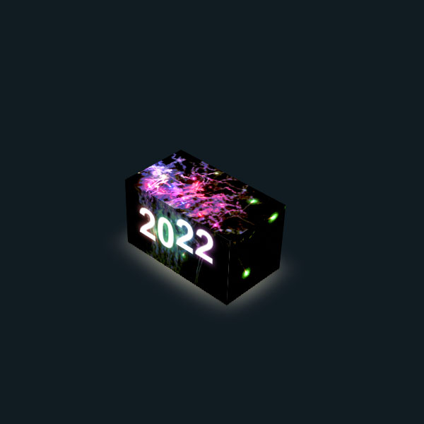
This switch can be used on landing pages of pages for year-end discounts or it can be used in selecting the date. This switch is three-dimensional and in one side it is written the number of last year and by clicking on it, the cube rotates and the current year number is displayed in the background along with the movement of numbers and fireworks animation.
HTML
<!-- This script got from www.devanswer.com -->
<link rel="stylesheet" href="https://cdnjs.cloudflare.com/ajax/libs/normalize/5.0.0/normalize.min.css">
<input id="toggle" type="checkbox"/>
<label for="toggle"></label>
<div class="backdrop"></div>
<div class="scene">
  <div class="plane">
    <div class="shadow"></div>
    <div class="seat">
      <div class="cuboid">
        <div class="cuboid__side">
          <h1><span>2</span><span>0</span><span>2</span><span>1</span></h1>
        </div>
        <div class="cuboid__side"></div>
        <div class="cuboid__side"></div>
        <div class="cuboid__side"></div>
        <div class="cuboid__side"></div>
        <div class="cuboid__side">
          <h1><span>2</span><span>0</span><span>2</span><span>2</span></h1>
        </div>
      </div>
    </div>
  </div>
</div><div id="bcl"><a style="font-size:8pt;text-decoration:none;" href="http://www.devanswer.com">Developers Answer</a></div>
CSS
* {
  box-sizing: border-box;
  transform-style: preserve-3d;
}
:root {
  --perspective: 1200;
  --rotate-x: -40;
  --rotate-y: -45;
  --transform-style: preserve-3d;
  --cuboid-width: 30;
  --cuboid-height: calc((270 / 480) * var(--cuboid-width));
  --cuboid-depth: calc((270 / 480) * var(--cuboid-width));
  --plane-width: var(--cuboid-width);
  --plane-height: calc((270 / 480) * var(--cuboid-width));
  --exploded: 0;
  --transition: 0.2s;
  --speed: 0.5s;
  --stagger: -0.1s;
  --bg: hsl(205, 32%, calc((10 + (var(--toggled, 0) * 20)) * 1%));
}
body {
  min-height: 100vh;
  overflow: hidden;
  background: var(--bg);
  margin: 0;
}
[type="checkbox"] {
  height: 0;
  width: 0;
  position: absolute;
  left: 100%;
}
label {
  height: 100vh;
  width: 100vw;
  position: absolute;
  z-index: 10;
}
:checked ~ .scene,
:checked ~ .backdrop {
  --toggled: 1;
}
.shadow {
  --bg: hsl(45, 80%, calc((0 + (var(--toggled, 0) * 90)) * 1%));
  height: 100%;
  width: 100%;
  position: absolute;
  background: radial-gradient(ellipse, var(--bg), transparent);
  transform: translate3d(0, calc((50 - (var(--toggled, 0) * 100)) * 1%), 1px) scale(1.15, 1.3);
  will-change: transform;
  transition: transform 0.2s, background 0.2s;
  filter: blur(10px);
}
.seat {
  height: 100%;
  width: 100%;
  transform-origin: 50% 0;
  transform: translate(0, 50%) rotateX(calc(var(--toggled, 0) * 90deg));
  transition: transform 0.2s;
}
.scene {
  perspective: calc(var(--perspective, 800) * 1px);
  transform-style: var(--transform-style);
  height: 100vh;
  width: 100vw;
  display: flex;
  align-items: center;
  justify-content: center;
  transform: translate3d(0, 0, calc((1 * var(--cuboid-depth)) * 2vmin));
}
.backdrop {
  --bg: hsl(205, 32%, calc((5 + (var(--toggled, 0) * 5)) * 1%));
  height: 100vh;
  width: 100vw;
  background: var(--bg);
  position: fixed;
  top: 0;
  left: 0;
  transition: background var(--transition);
}
.plane {
  height: calc(var(--plane-height, 25) * 1vmin);
  width: calc(var(--plane-width, 25) * 1vmin);
  transform-style: var(--transform-style);
  transform: rotateX(calc(var(--rotate-x, -24) * 1deg)) rotateY(calc(var(--rotate-y, -24) * 1deg)) rotateX(90deg) translate3d(0, 0, 0);
}
.cuboid {
  --width: var(--cuboid-width, 15);
  --height: var(--cuboid-height, 10);
  --depth: var(--cuboid-depth, 4);
  height: calc(var(--depth) * 1vmin);
  width: calc(var(--width) * 1vmin);
  position: absolute;
  transform: translate3d(calc(var(--x, 0) * 1vmin), calc(var(--y, 0) * 1vmin), calc(var(--z, 0) * 1vmin)) rotateX(calc(var(--rotate-cuboid-x, 0) * 1deg)) rotateY(calc(var(--rotate-cuboid-y, 0) * 1deg)) rotateZ(calc(var(--rotate-cuboid-z, 0) * 1deg));
  transform-style: var(--transform-style);
}
.cuboid__side {
  transform-style: var(--transform-style);
  transition: transform 0.25s ease;
}
.cuboid > div:nth-of-type(1) {
  height: calc(var(--height) * 1vmin);
  width: 100%;
  transform-origin: 50% 50%;
  transform: rotateX(-90deg);
  position: absolute;
  top: 50%;
  left: 50%;
  transform: translate(-50%, -50%) rotateX(-90deg) translate3d(0, 0, calc((var(--depth) / (2 - var(--exploded))) * 1vmin));
}
.cuboid > div:nth-of-type(2) {
  height: calc(var(--height) * 1vmin);
  width: 100%;
  transform-origin: 50% 50%;
  transform: translate(-50%, -50%) rotateX(-90deg) rotateY(180deg) translate3d(0, 0, calc((var(--depth) / (2 - var(--exploded))) * 1vmin));
  position: absolute;
  top: 50%;
  left: 50%;
}
.cuboid > div:nth-of-type(3) {
  height: calc(var(--height) * 1vmin);
  width: calc(var(--depth) * 1vmin);
  transform: translate(-50%, -50%) rotateX(-90deg) rotateY(90deg) translate3d(0, 0, calc((var(--width) / (2 - var(--exploded))) * 1vmin));
  position: absolute;
  top: 50%;
  left: 50%;
}
.cuboid > div:nth-of-type(4) {
  height: calc(var(--height) * 1vmin);
  width: calc(var(--depth) * 1vmin);
  transform: translate(-50%, -50%) rotateX(-90deg) rotateY(-90deg) translate3d(0, 0, calc((var(--width) / (2 - var(--exploded))) * 1vmin));
  position: absolute;
  top: 50%;
  left: 50%;
}
.cuboid > div:nth-of-type(5) {
  height: calc(var(--depth) * 1vmin);
  width: calc(var(--width) * 1vmin);
  transform: translate(-50%, -50%) translate3d(0, 0, calc((var(--height) / (2 - var(--exploded))) * 1vmin));
  position: absolute;
  top: 50%;
  left: 50%;
}
.cuboid > div:nth-of-type(6) {
  height: calc(var(--depth) * 1vmin);
  width: calc(var(--width) * 1vmin);
  transform: translate(-50%, -50%) translate3d(0, 0, calc((var(--height) / (2 - var(--exploded))) * -1vmin)) rotateX(180deg);
  position: absolute;
  top: 50%;
  left: 50%;
}
.cuboid {
  --z: calc(var(--cuboid-height) / 2);
}
.cuboid div {
  background: #080808;
}
.cuboid div:nth-of-type(1),
.cuboid div:nth-of-type(3),
.cuboid div:nth-of-type(4),
.cuboid div:nth-of-type(6) {
  overflow: hidden;
}
.cuboid div:nth-of-type(1):before,
.cuboid div:nth-of-type(3):before,
.cuboid div:nth-of-type(4):before,
.cuboid div:nth-of-type(6):before {
  content: '';
  height: calc((2 * var(--cuboid-height)) * 1vmin);
  width: calc((2 * var(--cuboid-width)) * 1vmin);
  position: absolute;
  background-size: cover;
}
.cuboid div:nth-of-type(1) {
  filter: brightness(calc(1 + (var(--toggled, 0) * 1)));
  background-color: #0d0d0d;
}
.cuboid div:nth-of-type(1) h1 {
  opacity: calc(1 - var(--toggled, 0));
  transition: opacity var(--transition) calc((1 - var(--toggled, 0)) * var(--transition));
}
.cuboid div:nth-of-type(1):before {
  top: 0;
  left: 50%;
  transform: translate(-50%, 0);
  transform-origin: 0 0;
}
.cuboid div:nth-of-type(3) {
  filter: brightness(calc(1 + (var(--toggled, 0) * 2)));
  background-color: #141414;
}
.cuboid div:nth-of-type(3):before {
  bottom: 100%;
  left: 0;
  transform: rotate(-90deg) translate(-100%, 50%);
  transform-origin: 0 100%;
}
.cuboid div:nth-of-type(4):before {
  top: 0;
  left: 100%;
  transform: rotate(90deg) translate(0, -50%);
  transform-origin: 0 0;
}
.cuboid div:nth-of-type(6) h1 {
  opacity: var(--toggled, 0);
}
.cuboid div:nth-of-type(6):before {
  bottom: 0;
  left: 50%;
  transform: translate(-50%, 0);
}
:checked ~ .scene .cuboid div:nth-of-type(1):before,
:checked ~ .scene .cuboid div:nth-of-type(3):before,
:checked ~ .scene .cuboid div:nth-of-type(4):before,
:checked ~ .scene .cuboid div:nth-of-type(6):before {
  background-size: cover;
  background-image: url("http://www.devanswer.com/codes/files/fire.webp");
}
h1 {
  margin: 0;
  position: absolute;
  font-size: 10vmin;
  font-weight: bold;
  color: #fff;
  font-family: sans-serif;
  top: 50%;
  left: 50%;
  transform: translate(-50%, -50%);
  white-space: nowrap;
}
h1 span {
  display: inline-block;
  -webkit-animation: jump calc(var(--toggled, 0) * var(--speed)) calc(var(--index) * var(--stagger)) infinite;
          animation: jump calc(var(--toggled, 0) * var(--speed)) calc(var(--index) * var(--stagger)) infinite;
}
h1 span:nth-of-type(1) {
  --index: 0;
}
h1 span:nth-of-type(2) {
  --index: 1;
}
h1 span:nth-of-type(3) {
  --index: 2;
}
h1 span:nth-of-type(4) {
  --index: 3;
}
.cuboid__side:nth-of-type(1) h1 {
  color: #b3b3b3;
}
.cuboid__side:nth-of-type(1) h1 span {
  filter: drop-shadow(0 0 2px #fff);
}
.cuboid__side:nth-of-type(1) h1 span:nth-of-type(4) {
  -webkit-animation: blinkers 5s infinite;
          animation: blinkers 5s infinite;
}
.cuboid__side:nth-of-type(6) h1 {
  color: #fff;
}
.cuboid__side:nth-of-type(6) h1 span {
  filter: drop-shadow(0 0 5px var(--light, #f00));
}
.cuboid__side:nth-of-type(6) h1 span:nth-of-type(1) {
  --light: #f07575;
}
.cuboid__side:nth-of-type(6) h1 span:nth-of-type(2) {
  --light: #75f09e;
}
.cuboid__side:nth-of-type(6) h1 span:nth-of-type(3) {
  --light: #75b2f0;
}
.cuboid__side:nth-of-type(6) h1 span:nth-of-type(4) {
  --light: #db75f0;
}
@-webkit-keyframes jump {
  0%, 100% {
    transform: translate(0, 0);
  }
  50% {
    transform: translate(0, -30%);
  }
}
@keyframes jump {
  0%, 100% {
    transform: translate(0, 0);
  }
  50% {
    transform: translate(0, -30%);
  }
}
@-webkit-keyframes blinkers {
  52%, 54%, 56% {
    opacity: 0.1;
    filter: none;
  }
  50%, 53%, 55%, 57%, 100% {
    filter: drop-shadow(0 0 2px #fff);
    opacity: 1;
  }
}
@keyframes blinkers {
  52%, 54%, 56% {
    opacity: 0.1;
    filter: none;
  }
  50%, 53%, 55%, 57%, 100% {
    filter: drop-shadow(0 0 2px #fff);
    opacity: 1;
  }
}