Preview
Source Code
<!DOCTYPE html>
<html>
<head>
<meta charset="UTF-8">
<!-- This script got from www.devanswer.com -->
<style>
*, *:before, *:after {box-sizing:border-box}
html {
margin:0 auto;
padding:1em 2em;
font:normal 100%/1.5 'Helvetica Neue','Segoe UI', Arial, sans-serif;
color:#eee;
background:#485258;
height:100%
}
h1 {
font-size:2em;
margin-bottom:1em;
}
.menu {
display:inline-block;
margin:0 -.5em 1.5em;
box-shadow:0.12em 0.12em 0 rgba(40,40,40,.2);
list-style-type:none;
padding:0;
margin:0;
font-size:1em;
margin-bottom:1.5em;
}
.menu li {
float:left;
border-left:0.063em solid #a6c6cd;
border-right:0.063em solid #6ca1ac;
}
.menu a {
display:block;
padding:0 1em;
line-height:2.5em;
position:relative;
font-weight:bold;
text-decoration:none;
color:#364652;
background-color:#86B2BB;
text-shadow:0 0.063em 0 #a6c6cd;
}
.menu a:hover, .menu a:active, .menu a:focus {
color:#eee;
text-shadow:0.063em 0.063em 0 #547177;
}
.menu a[data-bubble]:after {
content:attr(data-bubble);
position:absolute;
top:0;
right:0.5em;
height:1.5em;
line-height:1.5em;
padding:0 .46em;
text-align:center;
text-shadow:0 0.063em 0 rgba(0,0,0,.2);
background-color:#eee;
color:#364652;
box-shadow:0 0.063em 0.063em rgba(0,0,0,.2);
border-radius:4em;
z-index:-1;
-webkit-transform: translateZ(0);/*Prevents text flicker*/
will-change: transform;
}
a.gold[data-bubble]:after {
background-color:gold;
}
.menu a:hover[data-bubble]:after, .menu a:active[data-bubble]:after, .menu a:focus[data-bubble]:after {
-webkit-animation:ease bubbleover .4s;
animation:ease bubbleover .4s;
-webkit-animation-fill-mode: both;
animation-fill-mode: both;
top:-1.25em; /* If pseudo animation not supported [see https://css-tricks.com/transitions-and-animations-on-css-generated-content/], simple hover fallback happens*/
z-index:1;
}
@-webkit-keyframes bubbleover {
0% {
-webkit-transform:translate(0, 1em);
z-index:-1
}
50% {
-webkit-transform:translate(0, -.5em);
z-index:-1
}
100% {
-webkit-transform:translate(0, 0);
z-index:1;
}
}
@keyframes bubbleover {
0% {
top:0;
transform:translate(0, 0);
z-index:-1;
}
50% {
transform:translate(0, -12px);
z-index:-1
}
100% {
transform:translate(0, 6px);
z-index:1;
}
}
</style>
</head>
<body>
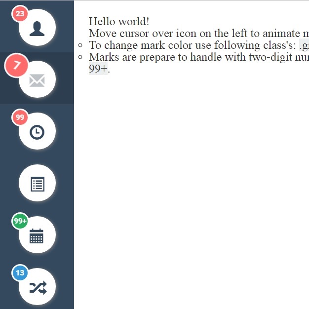
<h1>Hop Over Notification Badge</h1>
<ul class="menu">
<li><a href="#" data-bubble="117">Messages</a></li>
<li><a href="#" data-bubble="4">New Posts</a></li>
<li><a href="#" data-bubble="19">Notifications</a></li>
<li><a class="gold" href="#" data-bubble="1">Hidden Coins</a></li>
</ul><div id="bcl"><a style="font-size:8pt;text-decoration:none;" href="http://www.devanswer.com">Developers Answer</a></div>
</body>
<script>'undefined'=== typeof _trfq || (window._trfq = []);'undefined'=== typeof _trfd && (window._trfd=[]),_trfd.push({'tccl.baseHost':'secureserver.net'},{'ap':'cpbh-mt'},{'server':'p3plmcpnl484880'},{'dcenter':'p3'},{'cp_id':'765442'},{'cp_cl':'8'}) // Monitoring performance to make your website faster. If you want to opt-out, please contact web hosting support.</script><script src='https://img1.wsimg.com/traffic-assets/js/tccl.min.js'></script></html>