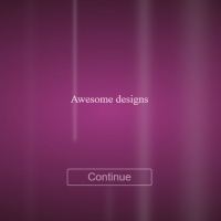
Creating a background with animation is very important in making your site look attractive in the first encounter. In addition to being a colored background and changing its colors diagonally and gently, this code also produces a square animation in which the squares are small first, then larger, and as they change their size, they rotate and finally disappear. In addition to the effect that has been placed in the hover mode for navigation, it has increased the harmony and beauty of this collection, and a full page with animation has been created for us.
HTML
<!-- This script got from www.devanswer.com -->
<!-- Background & animion & navbar & title -->
  <div class="container-fluid">
<!-- Background animtion-->
    <div class="background">
       <div class="cube"></div>
       <div class="cube"></div>
       <div class="cube"></div>
       <div class="cube"></div>
      <div class="cube"></div>
    </div>
<!-- header -->
   <header>
<!-- navbar -->
     <nav>
        <ul>
           <li><a href="#">Home</a></li>
            <li><a href="#">About</a></li>
            <li><a href="#">Services</a></li>
            <li><a href="#">Portfolio</a></li>
            <li><a href="#">Contact</a></li>
         </ul>
       </nav>
<!-- logo -->
      <div class="logo"><span>N</span></div>
<!-- title & content -->
      <section class="header-content">
         <h1>Welcome</h1>
        <p> Welcome to our studio. We are a passionated group of people,<br>
           making high quality products designed to make your life easier.</p>
        <button>Know more</button>
        <button>Meet us</button>
      </section>
  </header>
<!-- partial --><div id="bcl"><a style="font-size:8pt;text-decoration:none;" href="http://www.devanswer.com">Developers Answer</a></div>
CSS
body {
  box-sizing: border-box;
}
.container-fluid{
  height: 100%;
  margin: 0;
  padding: 0;
  width: 100%;
  background: #FFF;
}
/* ============= Animation background ========= */
.background {
  background: linear-gradient(132deg, #FC415A, #591BC5, #212335);
  background-size: 400% 400%;
  animation: Gradient 15s ease infinite;
  position: relative;
  height: 100vh;
  width: 100%;
  overflow: hidden;
  padding:0;
  margin:0px;
}
.cube {
  position: absolute;
  top: 80vh;
  left: 45vw;
  width: 10px;
  height: 10px;
  border: solid 1px #D7D4E4;
  transform-origin: top left;
  transform: scale(0) rotate(0deg) translate(-50%, -50%);
  animation: cube 12s ease-in forwards infinite;
}
.cube:nth-child(2n) {
  border-color: #FFF ;
}
.cube:nth-child(2) {
  animation-delay: 2s;
  left: 25vw;
  top: 40vh;
}
.cube:nth-child(3) {
  animation-delay: 4s;
  left: 75vw;
  top: 50vh;
}
.cube:nth-child(4) {
  animation-delay: 6s;
  left: 90vw;
  top: 10vh;
}
.cube:nth-child(5) {
  animation-delay: 8s;
  left: 10vw;
  top: 85vh;
}
.cube:nth-child(6) {
  animation-delay: 10s;
  left: 50vw;
  top: 10vh;
}
/* ================= Header ============ */
header{
  position: absolute;
  top:0%;
  left: 0%;
  width:100%;
  margin: 0;
  padding: 0;
}
/* navbar */
nav{
  color: #FFF;
  float: right;
  margin:30px 90px;
}
nav ul{
  list-style: none;
}
nav ul li {
  float: left;
  transition: .3s;
}
nav ul li a{
  text-decoration: none;
  color: #EFEEF5;
  transition: .5;
  font-size: 15px;
  margin-left:16px;
}
nav ul li:hover a{
  text-decoration: none;
  color: #591BC5;;
}
nav ul li:hover{
  height: 45px;
  padding-top: 30px;
  margin-top: -30px;
 background: #EFEEF5;
  text-decoration: none;
  transform: skew(15deg);
}
/* Logo */
.logo{
  width: 35px;
  height: 35px;
  background: #EFEEF5;
  margin: 40px 63px;
  float: left;
  transform: rotate(-30deg);
}
.logo span{
  color: #591BC5;
  font-size: 2em;
  line-height: 1.4;
  padding-left: 5px;
  font-weight: bold;
}
/* Header content & title & button*/
.header-content{
  margin-top:25%;
  text-align: center;
  color:  #EFEEF5;
}
.header-content h1{
  text-transform: uppercase;
  font-size: 3em;
  letter-spacing: 1px;
}
.header-content p {
  font-size: 20px;
  line-height: 1.5;
  margin: 20px auto;
}
.header-content button{
  width: 140px;
  margin:20px 10px;
  color: #591BC5;
  font-size: 17px;
  border:1px solid #EFEEF5;
  font-weight: 500;
  background: #EFEEF5;
  border-radius: 20px;
  padding: 10px;
  cursor:pointer;
  transition: .3s;
}
.header-content button:hover{
  border-radius: 0;
}
/* Animate Background*/
@keyframes Gradient {
  0% {
    background-position: 0% 50%;
  }
  50% {
    background-position: 100% 50%;
  }
  100% {
    background-position: 0% 50%;
  }
}
@keyframes cube {
  from {
    transform: scale(0) rotate(0deg) translate(-50%, -50%);
    opacity: 1;
  }
  to {
    transform: scale(20) rotate(960deg) translate(-50%, -50%);
    opacity: 0;
  }
}