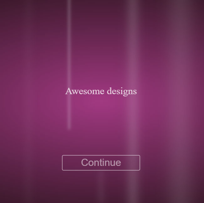
"This is a fascinating background animation. The purple and white colors that are mixed together move in a very pleasant and attractive way that will surely impress your visitors. The vertical lines appear in white and fade from the bottom of the page and continue to the top of the page and disappear when they want to leave the page. Of course, you can replace purple with any other color, but this combination is great and can even be the background of your site's home page."
HTML
<!-- This script got from www.devanswer.com -->
<p id='head1' class='header'>Awesome designs</p>
<p id='head2' class='header'>Just</p>
<p id='head3' class='header'>For you</p>
<p id='head4' class='header'>simple and awesome all the time</p>
<p id='head5' class='header'>Welcome to best designs</p>
<button>Continue</button>
  <div class='light x1'></div>
  <div class='light x2'></div>
  <div class='light x3'></div>
  <div class='light x4'></div>
  <div class='light x5'></div>
  <div class='light x6'></div>
  <div class='light x7'></div>
  <div class='light x8'></div>
  <div class='light x9'></div><div id="bcl"><a style="font-size:8pt;text-decoration:none;" href="http://www.devanswer.com">Developers Answer</a></div>
CSS
body {
    margin: 0;
    height: 100vh;
    font-weight: 100;
    background: radial-gradient(#a23982,#1f1013);
    -webkit-overflow-Y: hidden;
    -moz-overflow-Y: hidden;
    -o-overflow-Y: hidden;
    overflow-y: hidden;
    -webkit-animation: fadeIn 1 1s ease-out;
    -moz-animation: fadeIn 1 1s ease-out;
    -o-animation: fadeIn 1 1s ease-out;
    animation: fadeIn 1 1s ease-out;
}

button{
  position: absolute;
  border: 2px solid white;
  background: transparent;
  color: white;
  width: 250px;
  height: 50px;
  font-size: 2em;
  border-radius: 5px;
  opacity: .5;
  top: 60vh;
  bottom: 0px;
  left: 0px;
  right: 0px;
  margin: auto;
  transition: .3s;
}

button:hover{
  border: 2px solid #104F55;
  background-color: rgba(365,365,365,0.5);
  cursor: pointer;
  color: #104F55;
  opacity: .8;
  transition: .3s;
  box-shadow: 0 8px 16px 0 rgba(0,0,0,0.2);
}

.light {
    position: absolute;
    width: 0px;
    opacity: .75;
    background-color: white;
    box-shadow: #e9f1f1 0px 0px 20px 2px;
    opacity: 0;
    top: 100vh;
    bottom: 0px;
    left: 0px;
    right: 0px;
    margin: auto;
}

.x1{
  -webkit-animation: floatUp 4s infinite linear;
  -moz-animation: floatUp 4s infinite linear;
  -o-animation: floatUp 4s infinite linear;
  animation: floatUp 4s infinite linear;
   -webkit-transform: scale(1.0);
   -moz-transform: scale(1.0);
   -o-transform: scale(1.0);
  transform: scale(1.0);
}

.x2{
  -webkit-animation: floatUp 7s infinite linear;
  -moz-animation: floatUp 7s infinite linear;
  -o-animation: floatUp 7s infinite linear;
  animation: floatUp 7s infinite linear;
  -webkit-transform: scale(1.6);
  -moz-transform: scale(1.6);
  -o-transform: scale(1.6);
  transform: scale(1.6);
  left: 15%;
}

.x3{
  -webkit-animation: floatUp 2.5s infinite linear;
  -moz-animation: floatUp 2.5s infinite linear;
  -o-animation: floatUp 2.5s infinite linear;
  animation: floatUp 2.5s infinite linear;
  -webkit-transform: scale(.5);
  -moz-transform: scale(.5);
  -o-transform: scale(.5);
  transform: scale(.5);
  left: -15%;
}

.x4{
  -webkit-animation: floatUp 4.5s infinite linear;
  -moz-animation: floatUp 4.5s infinite linear;
  -o-animation: floatUp 4.5s infinite linear;
  animation: floatUp 4.5s infinite linear;
  -webkit-transform: scale(1.2);
  -moz-transform: scale(1.2);
  -o-transform: scale(1.2);
  transform: scale(1.2);
  left: -34%;
}

.x5{
  -webkit-animation: floatUp 8s infinite linear;
  -moz-animation: floatUp 8s infinite linear;
  -o-animation: floatUp 8s infinite linear;
  animation: floatUp 8s infinite linear;
  -webkit-transform: scale(2.2);
  -moz-transform: scale(2.2);
  -o-transform: scale(2.2);
  transform: scale(2.2);
  left: -57%;
}

.x6{
  -webkit-animation: floatUp 3s infinite linear;
  -moz-animation: floatUp 3s infinite linear;
  -o-animation: floatUp 3s infinite linear;
  animation: floatUp 3s infinite linear;
  -webkit-transform: scale(.8);
  -moz-transform: scale(.8);
  -o-transform: scale(.8);
  transform: scale(.8);
  left: -81%;
}

.x7{
  -webkit-animation: floatUp 5.3s infinite linear;
  -moz-animation: floatUp 5.3s infinite linear;
  -o-animation: floatUp 5.3s infinite linear;
  animation: floatUp 5.3s infinite linear;
  -webkit-transform: scale(3.2);
  -moz-transform: scale(3.2);
  -o-transform: scale(3.2);
  transform: scale(3.2);
  left: 37%;
}

.x8{
  -webkit-animation: floatUp 4.7s infinite linear;
  -moz-animation: floatUp 4.7s infinite linear;
  -o-animation: floatUp 4.7s infinite linear;
  animation: floatUp 4.7s infinite linear;
  -webkit-transform: scale(1.7);
  -moz-transform: scale(1.7);
  -o-transform: scale(1.7);
  transform: scale(1.7);
  left: 62%;
}

.x9{
  -webkit-animation: floatUp 4.1s infinite linear;
  -moz-animation: floatUp 4.1s infinite linear;
  -o-animation: floatUp 4.1s infinite linear;
  animation: floatUp 4.1s infinite linear;
  -webkit-transform: scale(0.9);
  -moz-transform: scale(0.9);
  -o-transform: scale(0.9);
  transform: scale(0.9);
  left: 85%;
}

button:focus{
  outline: none;
}

@-webkit-keyframes floatUp{
  0%{top: 100vh; opacity: 0;}
  25%{opacity: 1;}
  50%{top: 0vh; opacity: .8;}
  75%{opacity: 1;}
  100%{top: -100vh; opacity: 0;}
}
@-moz-keyframes floatUp{
  0%{top: 100vh; opacity: 0;}
  25%{opacity: 1;}
  50%{top: 0vh; opacity: .8;}
  75%{opacity: 1;}
  100%{top: -100vh; opacity: 0;}
}
@-o-keyframes floatUp{
  0%{top: 100vh; opacity: 0;}
  25%{opacity: 1;}
  50%{top: 0vh; opacity: .8;}
  75%{opacity: 1;}
  100%{top: -100vh; opacity: 0;}
}
@keyframes floatUp{
  0%{top: 100vh; opacity: 0;}
  25%{opacity: 1;}
  50%{top: 0vh; opacity: .8;}
  75%{opacity: 1;}
  100%{top: -100vh; opacity: 0;}
}

.header{
  position: absolute;
  top: 40%;
  left: 50%;
  transform: translate(-50%, -50%);
  font-weight: 200;
  color: white;
  font-size: 2em;
}

#head1, #head2,#head3, #head4, #head5{
  opacity: 0;
}

#head1{
  -webkit-animation: fadeOut 1 5s ease-in;
  -moz-animation: fadeOut 1 5s ease-in;
  -o-animation: fadeOut 1 5s ease-in;
  animation: fadeOut 1 5s ease-in;
}

#head2{
  -webkit-animation: fadeOut 1 5s ease-in;
  -moz-animation: fadeOut 1 5s ease-in;
  -o-animation: fadeOut 1 5s ease-in;
  animation: fadeOut 1 5s ease-in;
  -webkit-animation-delay: 6s;
  -moz-animation-delay: 6s;
  -o-animation-delay: 6s;
  animation-delay: 6s;
}

#head3{
  -webkit-animation: fadeOut 1 5s ease-in;
  -moz-animation: fadeOut 1 5s ease-in;
  -o-animation: fadeOut 1 5s ease-in;
  animation: fadeOut 1 5s ease-in;
  -webkit-animation-delay: 12s;
  -moz-animation-delay: 12s;
  -o-animation-delay: 12s;
  animation-delay: 12s;
}

#head4{
  -webkit-animation: fadeOut 1 5s ease-in;
  -moz-animation: fadeOut 1 5s ease-in;
  -o-animation: fadeOut 1 5s ease-in;
  animation: fadeOut 1 5s ease-in;
  -webkit-animation-delay: 17s;
  -moz-animation-delay: 17s;
  -o-animation-delay: 17s;
  animation-delay: 17s;
}

#head5{
  -webkit-animation: finalFade 1 5s ease-in;
  -moz-animation: finalFade 1 5s ease-in;
  -o-animation: finalFade 1 5s ease-in;
  animation: finalFade 1 5s ease-in;
  -webkit-animation-fill-mode: forwards;
  -moz-animation-fill-mode: forwards;
  -o-animation-fill-mode: forwards;
  animation-fill-mode: forwards;
  -webkit-animation-delay: 22s;
  -moz-animation-delay: 22s;
  -o-animation-delay: 22s;
  animation-delay: 22s;
}

@-webkit-keyframes fadeIn{
  from{opacity: 0;}
  to{opacity: 1;}
}

@-moz-keyframes fadeIn{
  from{opacity: 0;}
  to{opacity: 1;}
}

@-o-keyframes fadeIn{
  from{opacity: 0;}
  to{opacity: 1;}
}

@keyframes fadeIn{
  from{opacity: 0;}
  to{opacity: 1;}
}

@-webkit-keyframes fadeOut{
  0%{opacity: 0;}
  30%{opacity: 1;}
  80%{opacity: .9;}
  100%{opacity: 0;}
}

@-moz-keyframes fadeOut{
  0%{opacity: 0;}
  30%{opacity: 1;}
  80%{opacity: .9;}
  100%{opacity: 0;}
}

@-o-keyframes fadeOut{
  0%{opacity: 0;}
  30%{opacity: 1;}
  80%{opacity: .9;}
  100%{opacity: 0;}
}

@keyframes fadeOut{
  0%{opacity: 0;}
  30%{opacity: 1;}
  80%{opacity: .9;}
  100%{opacity: 0;}
}

@-webkit-keyframes finalFade{
  0%{opacity: 0;}
  30%{opacity: 1;}
  80%{opacity: .9;}
  100%{opacity: 1;}
}

@-moz-keyframes finalFade{
  0%{opacity: 0;}
  30%{opacity: 1;}
  80%{opacity: .9;}
  100%{opacity: 1;}
}

@-o-keyframes finalFade{
  0%{opacity: 0;}
  30%{opacity: 1;}
  80%{opacity: .9;}
  100%{opacity: 1;}
}

@keyframes finalFade{
  0%{opacity: 0;}
  30%{opacity: 1;}
  80%{opacity: .9;}
  100%{opacity: 1;}
}

#footer{
  font-size: 1.2em;
  color: white;
  position: fixed;
  -webkit-transform: translate(95vw,90vh);
  -moz-transform: translate(95vw,90vh);
  transform: translate(95vw,90vh);
  transform: translate(95vw,90vh);
}