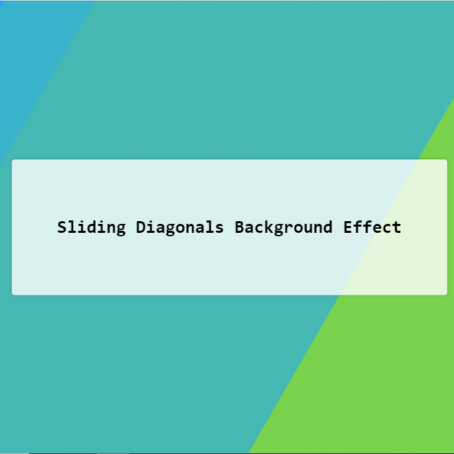
Using the effect in the background with a few lines of simple code doubles the visual appeal of the background. Below, using css, a color animation effect is created for the background, which is also responsive.
HTML
<!-- This script got from www.devanswer.com -->
<div class="bg"></div>
<div class="bg bg2"></div>
<div class="bg bg3"></div>
<div class="content">
  <h1>Sliding Diagonals Background Effect</h1>
</div><div id="bcl"><a style="font-size:8pt;text-decoration:none;" href="http://www.devanswer.com">Developers Answer</a></div>
CSS
html {
  height:100%;
}

body {
  margin:0;
}

.bg {
  animation:slide 3s ease-in-out infinite alternate;
  background-image: linear-gradient(-60deg, #6c3 50%, #09f 50%);
  bottom:0;
  left:-50%;
  opacity:.5;
  position:fixed;
  right:-50%;
  top:0;
  z-index:-1;
}

.bg2 {
  animation-direction:alternate-reverse;
  animation-duration:4s;
}

.bg3 {
  animation-duration:5s;
}

.content {
  background-color:rgba(255,255,255,.8);
  border-radius:.25em;
  box-shadow:0 0 .25em rgba(0,0,0,.25);
  box-sizing:border-box;
  left:50%;
  padding:10vmin;
  position:fixed;
  text-align:center;
  top:50%;
  transform:translate(-50%, -50%);
}

h1 {
  font-family:monospace;
}

@keyframes slide {
  0% {
    transform:translateX(-25%);
  }
  100% {
    transform:translateX(25%);
  }
}