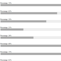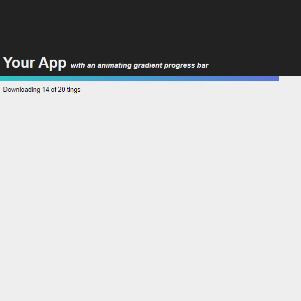
As you can see, this progress bar has a gradient effect. You can use this progress bar to display the steps of downloading or uploading a file. This progress bar fills automatically and as it fills, the color of the progress bar changes to a gradient. At the end and when the progress bar is 100%, the phrase is done, the word is written below it and the reload button also appears.
HTML
<!-- This script got from www.devanswer.com -->
<link rel="stylesheet" href="https://cdnjs.cloudflare.com/ajax/libs/normalize/5.0.0/normalize.min.css">
<div id="container">
    <div id="header">
        <h1>Your App <i>with an animating gradient progress bar</i></h1>
    </div>
    <div id="progress-bar"></div>
    <div id="status-bar"></div>
    <div id="progress-text"></div>
    <button id="btn" style='display: none'>Reload</button>
</div><div id="bcl"><a style="font-size:8pt;text-decoration:none;" href="http://www.devanswer.com">Developers Answer</a></div>
CSS
html,
body {
  margin: 0;
  padding: 0;
  background-color: #eee;
}
#container {
  position: relative;
}
#btn {
  cursor: pointer;
  margin: 20px 10px;
  padding: 10px 20px;
  border-radius: 4px;
  border: 0;
}
#header {
  background-color: #222;
}
#header h1 {
  margin: 0;
  color: #eee;
  padding: 10px;
  font-size: 1.8em;
}
#header h1 i {
  font-size: 0.5em;
}
#status-bar {
  position: relative;
  opacity: 0;
  height: 10px;
  margin-bottom: -10px;
  top: -10px;
  transition: opacity 0.5s ease-in;
}
#status-bar.complete {
  opacity: 1;
  background-color: #9fe600;
}
#status-bar.fail {
  opacity: 1;
  background-color: #d93c3c;
}
#progress-bar {
  position: relative;
  right: 0;
  height: 10px;
  margin: auto;
  background: #7453e0;
  background: linear-gradient(90deg, #21d9bb 0%, #7453e0 33%, #21d9bb 66%, #7453e0 100%);
  background-size: 300% 100%;
  -webkit-animation: errorBg 2s linear infinite;
  animation: errorBg 2s linear infinite;
}
#progress-text {
  margin: 10px;
  font-size: 0.8em;
}
@-webkit-keyframes errorBg {
  0% {
    background-position: 100%;
  }
  100% {
    background-position: 0%;
  }
}
@keyframes errorBg {
  0% {
    background-position: 100%;
  }
  100% {
    background-position: 0%;
  }
}Javascript
const ITEMS = 20;
const ANIMMS = 200;
const SIMMS = 500;
const text = document.getElementById('progress-text');
const bar = document.getElementById('progress-bar');
const statusBar = document.getElementById('status-bar');
const moveBar = debounce(function (amount) {
    const pct = (1 - amount / ITEMS) * 100;
    bar.style.right = `${pct}%`;
    if (amount > 0 && !bar.style.transition) {
        const seconds = ANIMMS / 1000;
        bar.style.transition = `right ${seconds}s ease-in`;
    }
}, ANIMMS);
let loading = false;
let downloaded = 0;
setProgress(downloaded);
start();
const btn = document.getElementById('btn');
btn.onclick = () => {
    if (loading) return;
    downloaded = 0;
    setProgress(downloaded);
    start();
    btn.style.display = 'none';
};
function start() {
    loading = true;
    statusBar.className = '';
    simulateLoad(function () {
        downloaded++;
        setProgress(downloaded);
        if (downloaded >= ITEMS) {
            loading = false;
            setTimeout(() => {
                statusBar.className = 'complete';
                bar.style.transition = '';
                btn.style.display = 'block';
                setProgressText('Done!');
            }, ANIMMS);
        }
    }, () => loading);
}
function downloadLabel(amountDownloaded) {
    return `Downloading ${amountDownloaded} of ${ITEMS} tings`;
}
function setProgressText(txt) {
    text.innerText = txt;
}
function setProgress(amount) {
    moveBar(amount);
    setProgressText(downloadLabel(amount));
}
function simulateLoad(loadPart, stillLoading) {
    next();
    function next() {
        const nextIntervalTime = Math.random() * SIMMS;
        setTimeout(() => {
            loadPart();
            if (stillLoading()) next();
        }, nextIntervalTime);
    }
}
function debounce(func, wait) {
    let timeout;
    return function () {
        const context = this, args = arguments;
        const later = () => {
            timeout = null;
            func.apply(context, args);
        };
        clearTimeout(timeout);
        timeout = setTimeout(later, wait);
        if (!timeout) func.apply(context, args);
    };
}