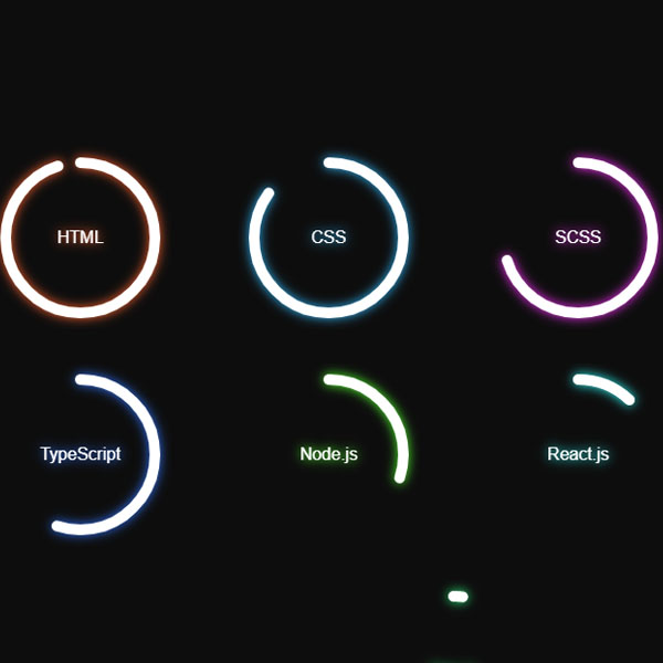
If your website has a dark and black theme, you can use items with light effects for it. Like the progress bar we have prepared for you in this post. This progress bar has a light effect and is also circular in shape. Each progress bar can have a different color and the title of the progress bar is written with the same light effect in the center of the circle.
HTML
<!-- This script got from www.devanswer.com -->
<link rel="stylesheet" href="https://cdnjs.cloudflare.com/ajax/libs/normalize/5.0.0/normalize.min.css">
<link rel='stylesheet' href='https://cdnjs.cloudflare.com/ajax/libs/font-awesome/5.15.3/css/all.min.css'>
<div class="container">
    <div class="container__progressbars">
        <div class="progressbar">
            <svg class="progressbar__svg">
                <circle cx="80" cy="80" r="70" class="progressbar__svg-circle circle-html shadow-html"> </circle>
            </svg>
            <span class="progressbar__text shadow-html">HTML</span>
        </div>
        <div class="progressbar">
            <svg class="progressbar__svg">
                <circle cx="80" cy="80" r="70" class="progressbar__svg-circle circle-css shadow-css"> </circle>
            </svg>
            <span class="progressbar__text shadow-css">CSS</span>
        </div>
        <div class="progressbar">
            <svg class="progressbar__svg">
                <circle cx="80" cy="80" r="70" class="progressbar__svg-circle circle-scss shadow-scss"> </circle>
            </svg>
            <span class="progressbar__text shadow-scss">SCSS</span>
        </div>
        <div class="progressbar">
            <svg class="progressbar__svg">
                <circle cx="80" cy="80" r="70" class="progressbar__svg-circle circle-js shadow-js"> </circle>
            </svg>
            <span class="progressbar__text shadow-js">JavaScript</span>
        </div>
        <div class="progressbar">
            <svg class="progressbar__svg">
                <circle cx="80" cy="80" r="70" class="progressbar__svg-circle circle-ts shadow-ts"> </circle>
            </svg>
            <span class="progressbar__text shadow-ts">TypeScript</span>
        </div>
        <div class="progressbar">
            <svg class="progressbar__svg">
                <circle cx="80" cy="80" r="70" class="progressbar__svg-circle circle-node shadow-node"> </circle>
            </svg>
            <span class="progressbar__text shadow-node">Node.js</span>
        </div>
        <div class="progressbar">
            <svg class="progressbar__svg">
                <circle cx="80" cy="80" r="70" class="progressbar__svg-circle circle-react shadow-react"> </circle>
            </svg>
            <span class="progressbar__text shadow-react">React.js</span>
        </div>
        <div class="progressbar">
            <svg class="progressbar__svg">
                <circle cx="80" cy="80" r="70" class="progressbar__svg-circle circle-angular shadow-angular"> </circle>
            </svg>
            <span class="progressbar__text shadow-angular">Angular.js</span>
        </div>
        <div class="progressbar">
            <svg class="progressbar__svg">
                <circle cx="80" cy="80" r="70" class="progressbar__svg-circle circle-vue shadow-vue"> </circle>
            </svg>
            <span class="progressbar__text shadow-vue">Vue.js</span>
        </div>
    </div>
</div>
<div id="main-container-social" class="main-container-social"></div><div id="bcl"><a style="font-size:8pt;text-decoration:none;" href="http://www.devanswer.com">Developers Answer</a></div>
CSS
a {
	text-decoration: none;
}
.social-media-flex {
	display: flex;
}
.social-media-flex-justify-content {
	justify-content: center;
}
.social-media-flex-align-items {
	align-items: center;
}
.social-media-grid {
	display: grid;
}
.social-media-grid-gap {
	grid-gap: 0.5em;
}
.main-container-social {
	position: fixed;
	bottom: 1em;
	right: 1em;
}
.container-social {
	grid-template-rows: repeat(2, 1.5em);
	border-radius: 0.25em;
	padding: 0.5em;
	background-color: #262626;
	box-shadow: 0 0 0.25em #262626;
}
.social-links {
	grid-template-columns: repeat(3, 2em);
	grid-gap: 0.5em;
	z-index: 100;
}
.social-link {
	font-size: 1.5rem;
	color: #bfbfbf;
	transition: 0.3s all ease;
	transition-timing-function: cubic-bezier(0, -0.5, 0, 0.5);
}
.social-link:hover {
	color: #f2f2f2;
	transform: translateY(-0.1em);
	transition-timing-function: cubic-bezier(0.5, -1.5, 0.5, 1.5);
}
.made {
	display: block;
	color: #f2f2f2;
	font-size: 0.75rem;
	text-align: center;
}
* {
	box-sizing: border-box;
}
.container {
	display: flex;
	justify-content: center;
	align-items: center;
	min-height: 100vh;
	background-color: #0d0d0d;
}
.container__progressbars {
	display: flex;
	justify-content: space-around;
	align-items: center;
	flex-wrap: wrap;
	min-width: 270px;
	width: 100%;
	min-height: 100%;
}
.progressbar {
	position: relative;
	width: 170px;
	height: 170px;
	margin: 1em;
	transform: rotate(-90deg);
}
.progressbar__svg {
	position: relative;
	width: 100%;
	height: 100%;
}
.progressbar__svg-circle {
	width: 100%;
	height: 100%;
	fill: none;
	stroke-width: 10;
	stroke-dasharray: 440;
	stroke-dashoffset: 440;
	stroke: white;
	stroke-linecap: round;
	transform: translate(5px, 5px);
}
.shadow-html {
	filter: drop-shadow(0 0 5px #ff6633);
}
.shadow-css {
	filter: drop-shadow(0 0 5px #33bbff);
}
.shadow-scss {
	filter: drop-shadow(0 0 5px #ff33ff);
}
.shadow-js {
	filter: drop-shadow(0 0 5px #ffff33);
}
.shadow-ts {
	filter: drop-shadow(0 0 5px #3377ff);
}
.shadow-node {
	filter: drop-shadow(0 0 5px #55ff33);
}
.shadow-react {
	filter: drop-shadow(0 0 5px #33ffff);
}
.shadow-angular {
	filter: drop-shadow(0 0 5px #ff3333);
}
.shadow-vue {
	filter: drop-shadow(0 0 5px #33ff88);
}
.circle-html {
	-webkit-animation: anim_circle-html 1s ease-in-out forwards;
	animation: anim_circle-html 1s ease-in-out forwards;
}
.circle-css {
	-webkit-animation: anim_circle-css 1s ease-in-out forwards;
	animation: anim_circle-css 1s ease-in-out forwards;
}
.circle-scss {
	-webkit-animation: anim_circle-scss 1s ease-in-out forwards;
	animation: anim_circle-scss 1s ease-in-out forwards;
}
.circle-js {
	-webkit-animation: anim_circle-js 1s ease-in-out forwards;
	animation: anim_circle-js 1s ease-in-out forwards;
}
.circle-ts {
	-webkit-animation: anim_circle-ts 1s ease-in-out forwards;
	animation: anim_circle-ts 1s ease-in-out forwards;
}
.circle-node {
	-webkit-animation: anim_circle-node 1s ease-in-out forwards;
	animation: anim_circle-node 1s ease-in-out forwards;
}
.circle-react {
	-webkit-animation: anim_circle-react 1s ease-in-out forwards;
	animation: anim_circle-react 1s ease-in-out forwards;
}
.circle-angular {
	-webkit-animation: anim_circle-angular 1s ease-in-out forwards;
	animation: anim_circle-angular 1s ease-in-out forwards;
}
.circle-vue {
	-webkit-animation: anim_circle-vue 1s ease-in-out forwards;
	animation: anim_circle-vue 1s ease-in-out forwards;
}
.progressbar__text {
	position: absolute;
	top: 50%;
	left: 50%;
	padding: 0.25em 0.5em;
	color: white;
	font-family: Arial, Helvetica, sans-serif;
	border-radius: 0.25em;
	transform: translate(-50%, -50%) rotate(90deg);
}
@-webkit-keyframes anim_circle-html {
	to {
		stroke-dashoffset: 22;
	}
}
@keyframes anim_circle-html {
	to {
		stroke-dashoffset: 22;
	}
}
@-webkit-keyframes anim_circle-css {
	to {
		stroke-dashoffset: 66;
	}
}
@keyframes anim_circle-css {
	to {
		stroke-dashoffset: 66;
	}
}
@-webkit-keyframes anim_circle-scss {
	to {
		stroke-dashoffset: 132;
	}
}
@keyframes anim_circle-scss {
	to {
		stroke-dashoffset: 132;
	}
}
@-webkit-keyframes anim_circle-js {
	to {
		stroke-dashoffset: 88;
	}
}
@keyframes anim_circle-js {
	to {
		stroke-dashoffset: 88;
	}
}
@-webkit-keyframes anim_circle-ts {
	to {
		stroke-dashoffset: 198;
	}
}
@keyframes anim_circle-ts {
	to {
		stroke-dashoffset: 198;
	}
}
@-webkit-keyframes anim_circle-node {
	to {
		stroke-dashoffset: 308;
	}
}
@keyframes anim_circle-node {
	to {
		stroke-dashoffset: 308;
	}
}
@-webkit-keyframes anim_circle-react {
	to {
		stroke-dashoffset: 387.2;
	}
}
@keyframes anim_circle-react {
	to {
		stroke-dashoffset: 387.2;
	}
}
@-webkit-keyframes anim_circle-angular {
	to {
		stroke-dashoffset: 418;
	}
}
@keyframes anim_circle-angular {
	to {
		stroke-dashoffset: 418;
	}
}
@-webkit-keyframes anim_circle-vue {
	to {
		stroke-dashoffset: 431.2;
	}
}
@keyframes anim_circle-vue {
	to {
		stroke-dashoffset: 431.2;
	}
}
$social-media-color: hsl(0, 0%, 95%);
$social-media-color-off: hsl(0, 0%, 75%);
$social-media-fs-h1: 1.5rem;
$social-media-fs-smaller: 0.75rem;
$social-media-bg: hsl(0, 0%, 15%);
$social-media-border-radius: 0.25em;
$social-media-gap: 0.5em;
$social-media-p-normal: 0.5em;
$social-media-space-1: 1em;
$social-media-space-2: 2em;
$social-media-z-fixed: 100;
$social-media-transition: 0.3s all ease;
a {
	text-decoration: none;
}
.social-media-flex {
	display: flex;

	&-justify-content {
		justify-content: center;
	}

	&-align-items {
		align-items: center;
	}
}
.social-media-grid {
	display: grid;

	&-gap {
		grid-gap: $social-media-gap;
	}
}
.main-container-social {
	position: fixed;
	bottom: $social-media-space-1;
	right: $social-media-space-1;
}
.container-social {
	grid-template-rows: repeat(2, 1.5em);
	border-radius: $social-media-border-radius;
	padding: $social-media-p-normal;
	background-color: $social-media-bg;
	box-shadow: 0 0 0.25em $social-media-bg;
}
.social-links {
	grid-template-columns: repeat(3, $social-media-space-2);
	grid-gap: $social-media-gap;
	z-index: $social-media-z-fixed;
}
.social-link {
	font-size: $social-media-fs-h1;
	color: $social-media-color-off;
	transition: $social-media-transition;
	transition-timing-function: cubic-bezier(0, -0.5, 0, 0.5);
	&:hover {
		color: $social-media-color;
		transform: translateY(-0.1em);
		transition-timing-function: cubic-bezier(0.5, -1.5, 0.5, 1.5);
	}
}
.made {
	display: block;
	color: $social-media-color;
	font-size: $social-media-fs-smaller;
	text-align: center;
}
@media screen and (min-width: 1024px) {
	$social-media-h1-fs: 2rem;
	$social-media-smaller-fs: 0.8125rem;
}