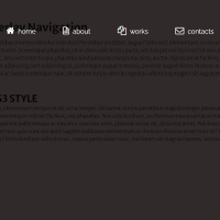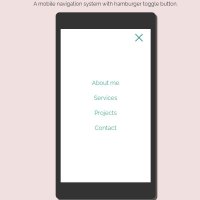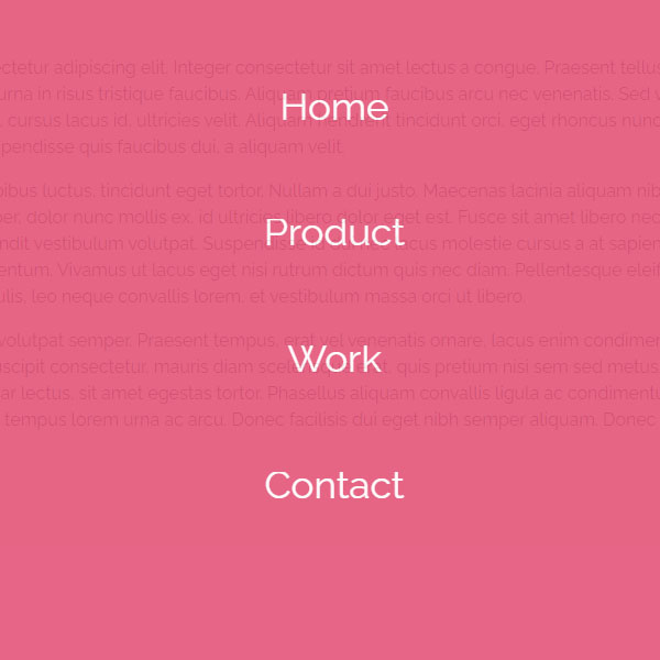
Full screen menus can be used to save space on the website. In this code, one of these menus is displayed. This menu opens by clicking on the hamburger button on the right side of the page. The background of the menu is pink and the items are white. My items are displayed with animation.
HTML
<!-- This script got from www.devanswer.com -->
<script src="https://code.jquery.com/jquery-1.12.4.js"></script>
<div class="fullnavBtn" id="toggle">
    <span class="top"></span>
    <span class="middle"></span>
    <span class="bottom"></span>
</div>
<div class="fullnav" id="fullnav">
    <nav class="fullnavMenu">
        <ul>
            <li><a href="#">Home</a></li>
            <li><a href="#">Product</a></li>
            <li><a href="#">Work</a></li>
            <li><a href="#">Contact</a></li>
        </ul>
    </nav>
</div>
<section>
    <div class="rt-container">
        <div class="col-rt-12">
            <p>Lorem ipsum dolor sit amet, consectetur adipiscing elit. Integer consectetur sit amet lectus a congue. Praesent tellus lectus, vehicula nec velit sed, facilisis sagittis metus. Donec nec urna in risus tristique faucibus. Aliquam pretium faucibus arcu nec venenatis. Sed vulputate elit vitae tristique eleifend. Mauris vitae nulla facilisis, cursus lacus id, ultricies velit. Aliquam hendrerit tincidunt orci, eget rhoncus nunc. Vivamus imperdiet velit justo, ut egestas lacus feugiat tristique. Suspendisse quis faucibus dui, a aliquam velit.</p>
            <p>Phasellus ex velit, feugiat vitae dapibus luctus, tincidunt eget tortor. Nullam a dui justo. Maecenas lacinia aliquam nibh ac condimentum. Pellentesque faucibus, augue nec pretium semper, dolor nunc mollis ex, id ultricies libero dolor eget est. Fusce sit amet libero nec risus hendrerit porta eget a dui. Nullam quis purus metus. Cras blandit vestibulum volutpat. Suspendisse id dui nec lacus molestie cursus a at sapien. Donec suscipit massa id purus tempor, quis pulvinar urna condimentum. Vivamus ut lacus eget nisi rutrum dictum quis nec diam. Pellentesque eleifend condimentum sapien. Phasellus feugiat, leo a rutrum iaculis, leo neque convallis lorem, et vestibulum massa orci ut libero.</p>
            <p>Vivamus interdum odio non tortor volutpat semper. Praesent tempus, erat vel venenatis ornare, lacus enim condimentum massa, ut semper urna nibh sed leo. Cras rutrum, massa sed suscipit consectetur, mauris diam scelerisque erat, quis pretium nisi sem sed metus. Etiam at neque a mauris dictum elementum. Suspendisse et pulvinar lectus, sit amet egestas tortor. Phasellus aliquam convallis ligula ac condimentum. Sed sodales, dui vel aliquet consequat, ex risus aliquet erat, ac tempus lorem urna ac arcu. Donec facilisis dui eget nibh semper aliquam. Donec laoreet a quam quis mollis. </p>
        </div>
    </div>
</section><div id="bcl"><a style="font-size:8pt;text-decoration:none;" href="http://www.devanswer.com">Developers Answer</a></div>
CSS
@import url('https://fonts.googleapis.com/css?family=Raleway:400,500,600,700,800,900');
@import url(http://fonts.googleapis.com/css?family=Lato:400,300,300italic,400italic,700,700italic,900);
html {
  box-sizing: border-box;
}
*, *:before, *:after {
  box-sizing: inherit;
}
article, header, section, aside, details, figcaption, figure, footer, header, hgroup, main, nav, section, summary {
    display: block;
}
body {
    background:#e7e7e7 none repeat scroll 0 0;
    color: #222;
    font-family: "Raleway",sans-serif;
    font-size: 100%;
    line-height: 24px;
    margin: 0;
	padding:0;
}
a{
	font-family: "Raleway",sans-serif;
	text-decoration: none;
	outline: none;
}
a:hover, a:focus {
	color: #373e18;
}
section {
    float: left;
    width: 100%;
	 margin-top:3em;
	 margin-bottom:2em;
}
h2 {
    color: #1a0e0e;
    font-size: 26px;
    font-weight: 700;
    margin: 0;
    line-height: normal;
	text-transform:uppercase;
}
h2 span {
    display: block;
    padding: 0;
    font-size: 18px;
    opacity: 0.7;
    margin-top: 5px;
	text-transform:uppercase;
}
#float-right{
	float:right;
}
/* ******************************************************
	Header
*********************************************************/
.ScriptTop {
    background: #fff none repeat scroll 0 0;
    float: left;
    font-size: 0.69em;
    font-weight: 600;
    line-height: 2.2;
    padding: 12px 0;
    text-transform: uppercase;
    width: 100%;
}
/* To Navigation Style 1*/
.ScriptTop ul {
    margin: 24px 0;
    padding: 0;
    text-align: left;
}
.ScriptTop li{
	list-style:none;
	display:inline-block;
}
.ScriptTop li a {
    background: #6a4aed none repeat scroll 0 0;
    color: #fff;
    display: inline-block;
    font-size: 14px;
    font-weight: 600;
    padding: 5px 18px;
    text-decoration: none;
    text-transform: capitalize;
}
.ScriptTop li a:hover{
	background:#000;
	color:#fff;
}
/* Header*/
.ScriptHeader {
    float: left;
    width: 100%;
    padding-top: 3em;
	text-align:center;
}
.rt-heading {
    padding-bottom: 10px;
    margin: 0 auto;
}
.ScriptHeader h1{
	font-size: 22px;
	font-weight: 400;
	margin: 0;
	color: #BF4A67;
	border-bottom: solid 3px #BF4A67;
	display: inline-block;
	padding-bottom: 10px;
}
.ScriptHeader h2 {
	font-size: 24px;
	font-weight: 300;
	margin: 10px 0 0 0;
	color: #868686;
	text-transform: uppercase;
}
.ScriptHeader h1 span {
    display: block;
    padding: 0;
    font-size: 22px;
    opacity: 0.7;
    margin-top: 5px;
	text-transform:uppercase;
}
.ScriptHeader span {
    display: block;
    padding: 0;
    font-size: 22px;
    opacity: 0.7;
    margin-top: 5px;
}
/* ******************************************************
	Responsive Grids
*********************************************************/
.rt-container {
	margin: 0 auto;
	padding-left:12px;
	padding-right:12px;
}
.rt-row:before, .rt-row:after {
  display: table;
  line-height: 0;
  content: "";
}
.rt-row:after {
  clear: both;
}
[class^="col-rt-"] {
  box-sizing: border-box;
  -webkit-box-sizing: border-box;
  -moz-box-sizing: border-box;
  -o-box-sizing: border-box;
  -ms-box-sizing: border-box;
  padding: 0 15px;
  min-height: 1px;
  position: relative;
}
@media (min-width: 768px) {
  .rt-container {
    width: 750px;
  }
  [class^="col-rt-"] {
    float: left;
    width: 49.9999999999%;
  }
  .col-rt-6, .col-rt-12 {
    width: 100%;
  }
}
@media (min-width: 1200px) {
	.rt-container {
		width: 1170px;
	}
	.col-rt-1 {
		width:16.6%;
	}
	.col-rt-2 {
		width:30.33%;
	}
	.col-rt-3 {
		width:50%;
	}
	.col-rt-4 {
		width: 67.664%;
	}
	.col-rt-5 {
		width: 83.33%;
	}
}
@media only screen and (min-width:240px) and (max-width: 768px){
	 .ScriptTop h1, .ScriptTop ul {
		text-align: center;
	}
	.ScriptTop h1{
		margin-top:0;
		margin-bottom:15px;
	}
	.ScriptTop ul{
		 margin-top:12px;
	}
	.ScriptHeader h1,
	.ScriptHeader h2,
	.scriptnav ul{
		text-align:center;
	}
	.scriptnav ul{
		 margin-top:12px;
	}
	#float-right{
		float:none;
	}
}
/* Overlay style */
.fullnav {
  font-family: 'Lato',sans-serif;
  position: fixed;
  background: #E6567A;
  top: 0;
  left: 0;
  width: 100%;
  height: 0%;
  opacity: 0;
  visibility: hidden;
  -webkit-transition: opacity .35s, visibility .35s, height .35s;
  transition: opacity .35s, visibility .35s, height .35s;
  overflow: hidden;
}
.fullnav.open {
  opacity: .9;
  visibility: visible;
  height: 100%;
  z-index:99;
}
.fullnav.open li {
  -webkit-animation: fadeInRight .5s ease forwards;
          animation: fadeInRight .5s ease forwards;
  -webkit-animation-delay: .35s;
          animation-delay: .35s;
}
.fullnav.open li:nth-of-type(2) {
  -webkit-animation-delay: .4s;
          animation-delay: .4s;
}
.fullnav.open li:nth-of-type(3) {
  -webkit-animation-delay: .45s;
          animation-delay: .45s;
}
.fullnav.open li:nth-of-type(4) {
  -webkit-animation-delay: .50s;
          animation-delay: .50s;
}
.fullnav nav {
  position: relative;
  height: 70%;
  top: 50%;
  -webkit-transform: translateY(-50%);
          transform: translateY(-50%);
  font-size: 35px;
  font-family: 'Lato',sans-serif;
  font-weight: 400;
  text-align: center;
}
.fullnav ul {
  list-style: none;
  padding: 0;
  margin: 0 auto;
  display: inline-block;
  position: relative;
  height: 100%;
}
.fullnav ul li {
  display: block;
  height: 25%;
  height: calc(100% / 4);
  min-height: 50px;
  position: relative;
  opacity: 0;
}
.fullnav ul li a {
  display: block;
  position: relative;
  color: #FFF;
  text-decoration: none;
  overflow: hidden;
}
.fullnav ul li a:hover:after, .fullnav ul li a:focus:after, .fullnav ul li a:active:after {
  width: 100%;
}
.fullnav ul li a:after {
  content: '';
  position: absolute;
  bottom: 0;
  left: 50%;
  width: 0%;
  -webkit-transform: translateX(-50%);
          transform: translateX(-50%);
  height: 3px;
  background: #FFF;
  -webkit-transition: .35s;
  transition: .35s;
}
@-webkit-keyframes fadeInRight {
  0% {
    opacity: 0;
    left: 20%;
  }
  100% {
    opacity: 1;
    left: 0;
  }
}
@keyframes fadeInRight {
  0% {
    opacity: 0;
    left: 20%;
  }
  100% {
    opacity: 1;
    left: 0;
  }
}
/* Overlay style button*/
.fullnavBtn {
  position: fixed;
  top: 5%;
  right: 2%;
  height: 27px;
  width: 35px;
  cursor: pointer;
  z-index: 100;
  -webkit-transition: opacity .25s ease;
  transition: opacity .25s ease;
}
.fullnavBtn:hover {
  opacity: .7;
}
.fullnavBtn.active .top {
  -webkit-transform: translateY(11px) translateX(0) rotate(45deg);
          transform: translateY(11px) translateX(0) rotate(45deg);
  background: #FFF;
}
.fullnavBtn.active .middle {
  opacity: 0;
  background: #FFF;
}
.fullnavBtn.active .bottom {
  -webkit-transform: translateY(-11px) translateX(0) rotate(-45deg);
          transform: translateY(-11px) translateX(0) rotate(-45deg);
  background: #FFF;
}
.fullnavBtn span {
  background: #BF4A67;
  border: none;
  height: 5px;
  width: 100%;
  position: absolute;
  top: 0;
  left: 0;
  -webkit-transition: all .35s ease;
  transition: all .35s ease;
  cursor: pointer;
}
.fullnavBtn span:nth-of-type(2) {
  top: 11px;
}
.fullnavBtn span:nth-of-type(3) {
  top: 22px;
}Javascript
$(document).ready(function () {
    $('#toggle').click(function () {
        $(this).toggleClass('active');
        $('#fullnav').toggleClass('open');
    });
});