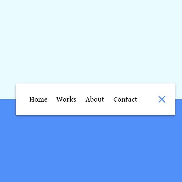
To make your website more beautiful you can use unique styles for different sections. One of these styles is in this code. In this code to display the menu, an animation like packman is run and the menu is opened. By clicking on the close button this animation is executed again and the menu is closed and only the hamburger stand remains. This menu is very suitable for situations when you want the menu to take up little space on your website
HTML
<!-- This script got from www.devanswer.com -->
<nav class="active" id="nav">
  <ul>
    <li><a href="#">Home</a></li>
    <li><a href="#">Works</a></li>
    <li><a href="#">About</a></li>
    <li><a href="#">Contact</a></li>
  </ul>
  <button class="icon" id="toggle">
    <div class="line line1"></div>
    <div class="line line2"></div>
  </button>
</nav><div id="bcl"><a style="font-size:8pt;text-decoration:none;" href="http://www.devanswer.com">Developers Answer</a></div>
CSS
@import url('https://fonts.googleapis.com/css2?family=David+Libre:wght@500&display=swap');
* {
    box-sizing: border-box;
    font-family: 'David Libre', serif;
}
body {
    background-color: #eafbff;
    background-image: linear-gradient( to bottom, #eafbff 0%, #eafbff 50%, #5290f9 50%, #5290f9 100% );
    display: flex;
    align-items: center;
    justify-content: center;
    height: 100vh;
    margin: 0;
}
nav {
    background-color: #fff;
    padding: 20px;
    width: 80px;
    display: flex;
    align-items: center;
    justify-content: center;
    border-radius: 3px;
    box-shadow: 0 2px 5px rgba(0, 0, 0, 0.3);
    transition: width 0.6s linear;
}
nav.active {
    width: 350px;
}
nav ul {
    display: flex;
    list-style-type: none;
    padding: 0;
    margin: 0;
    width: 0;
    transition: width 0.6s linear;
}
nav.active ul {
    width: 100%;
}
nav ul li {
    transform: rotateY(0deg);
    opacity: 0;
    transition: transform 0.6s linear, opacity 0.6s linear;
}
nav.active ul li {
    opacity: 1;
    transform: rotateY(360deg);
}
nav ul a {
    position: relative;
    color: #000;
    text-decoration: none;
    margin: 0 10px;
}
.icon {
    background-color: #fff;
    border: 0;
    cursor: pointer;
    padding: 0;
    position: relative;
    height: 30px;
    width: 30px;
}
.icon:focus {
    outline: 0;
}
.icon .line {
    background-color: #5290f9;
    height: 2px;
    width: 20px;
    position: absolute;
    top: 10px;
    left: 5px;
    transition: transform 0.6s linear;
}
.icon .line2 {
    top: auto;
    bottom: 10px;
}
nav.active .icon .line1 {
    transform: rotate(-765deg) translateY(5.5px);
}
nav.active .icon .line2 {
    transform: rotate(765deg) translateY(-5.5px);
}Javascript
const toggle = document.getElementById("toggle");
const nav = document.getElementById("nav");
toggle.addEventListener("click", () => nav.classList.toggle("active"));