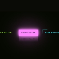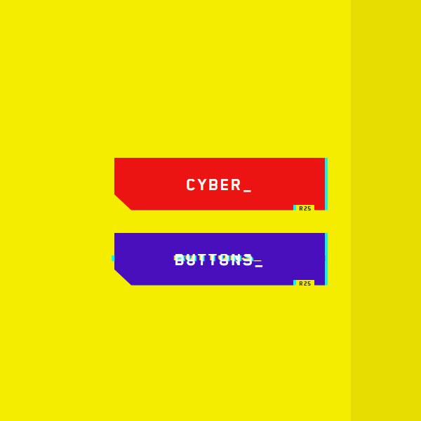
You can use different styles for different items to differentiate your website. One of these different styles is the use of the glitch effect. This beautiful effect is defined in this code for stalls. We have two buttons in this code that all the buttons are displayed on each of the buttons during the hover and when the mouse cursor goes, the glitch effect is displayed.
HTML
<!-- This script got from www.devanswer.com -->
<link rel="stylesheet" href="https://cdnjs.cloudflare.com/ajax/libs/normalize/5.0.0/normalize.min.css">
<button class="cybr-btn">
    Cyber<span aria-hidden>_</span>
    <span aria-hidden class="cybr-btn__glitch">Cyber_</span>
    <span aria-hidden class="cybr-btn__tag">R25</span>
</button>
<button class="cybr-btn">
    Buttons<span aria-hidden>_</span>
    <span aria-hidden class="cybr-btn__glitch">Buttons_</span>
    <span aria-hidden class="cybr-btn__tag">R25</span>
</button><div id="bcl"><a style="font-size:8pt;text-decoration:none;" href="http://www.devanswer.com">Developers Answer</a></div>
CSS
@font-face {
	font-family: Cyber;
	src: url("http://www.devanswer.com/codes/files/Blender-Pro-Bold.otf");
	font-display: swap;
}
* {
	box-sizing: border-box;
}
body {
	display: flex;
	align-items: center;
	flex-direction: column;
	justify-content: center;
	min-height: 100vh;
	font-family: 'Cyber', sans-serif;
	background: linear-gradient(90deg, #f5ed00 70%, #e6de00 70%), #fff700;
}
body .cybr-btn+.cybr-btn {
	margin-top: 2rem;
}
.cybr-btn {
	--primary: hsl(var(--primary-hue), 85%, calc(var(--primary-lightness, 50) * 1%));
	--shadow-primary: hsl(var(--shadow-primary-hue), 90%, 50%);
	--primary-hue: 0;
	--primary-lightness: 50;
	--color: hsl(0, 0%, 100%);
	--font-size: 26px;
	--shadow-primary-hue: 180;
	--label-size: 9px;
	--shadow-secondary-hue: 60;
	--shadow-secondary: hsl(var(--shadow-secondary-hue), 90%, 60%);
	--clip: polygon(0 0, 100% 0, 100% 100%, 95% 100%, 95% 90%, 85% 90%, 85% 100%, 8% 100%, 0 70%);
	--border: 4px;
	--shimmy-distance: 5;
	--clip-one: polygon(0 2%, 100% 2%, 100% 95%, 95% 95%, 95% 90%, 85% 90%, 85% 95%, 8% 95%, 0 70%);
	--clip-two: polygon(0 78%, 100% 78%, 100% 100%, 95% 100%, 95% 90%, 85% 90%, 85% 100%, 8% 100%, 0 78%);
	--clip-three: polygon(0 44%, 100% 44%, 100% 54%, 95% 54%, 95% 54%, 85% 54%, 85% 54%, 8% 54%, 0 54%);
	--clip-four: polygon(0 0, 100% 0, 100% 0, 95% 0, 95% 0, 85% 0, 85% 0, 8% 0, 0 0);
	--clip-five: polygon(0 0, 100% 0, 100% 0, 95% 0, 95% 0, 85% 0, 85% 0, 8% 0, 0 0);
	--clip-six: polygon(0 40%, 100% 40%, 100% 85%, 95% 85%, 95% 85%, 85% 85%, 85% 85%, 8% 85%, 0 70%);
	--clip-seven: polygon(0 63%, 100% 63%, 100% 80%, 95% 80%, 95% 80%, 85% 80%, 85% 80%, 8% 80%, 0 70%);
	font-family: 'Cyber', sans-serif;
	color: var(--color);
	cursor: pointer;
	background: transparent;
	text-transform: uppercase;
	font-size: var(--font-size);
	outline: transparent;
	letter-spacing: 2px;
	position: relative;
	font-weight: 700;
	border: 0;
	min-width: 300px;
	height: 75px;
	line-height: 75px;
	transition: background 0.2s;
}
.cybr-btn:hover {
	--primary: hsl(var(--primary-hue), 85%, calc(var(--primary-lightness, 50) * 0.8%));
}
.cybr-btn:active {
	--primary: hsl(var(--primary-hue), 85%, calc(var(--primary-lightness, 50) * 0.6%));
}
.cybr-btn:after, .cybr-btn:before {
	content: '';
	position: absolute;
	top: 0;
	left: 0;
	right: 0;
	bottom: 0;
	-webkit-clip-path: var(--clip);
	clip-path: var(--clip);
	z-index: -1;
}
.cybr-btn:before {
	background: var(--shadow-primary);
	transform: translate(var(--border), 0);
}
.cybr-btn:after {
	background: var(--primary);
}
.cybr-btn__tag {
	position: absolute;
	padding: 1px 4px;
	letter-spacing: 1px;
	line-height: 1;
	bottom: -5%;
	right: 5%;
	font-weight: normal;
	color: hsl(0, 0%, 0%);
	font-size: var(--label-size);
}
.cybr-btn__glitch {
	position: absolute;
	top: calc(var(--border) * -1);
	left: calc(var(--border) * -1);
	right: calc(var(--border) * -1);
	bottom: calc(var(--border) * -1);
	background: var(--shadow-primary);
	text-shadow: 2px 2px var(--shadow-primary), -2px -2px var(--shadow-secondary);
	-webkit-clip-path: var(--clip);
	clip-path: var(--clip);
	-webkit-animation: glitch 2s infinite;
	animation: glitch 2s infinite;
	display: none;
}
.cybr-btn:hover .cybr-btn__glitch {
	display: block;
}
.cybr-btn__glitch:before {
	content: '';
	position: absolute;
	top: calc(var(--border) * 1);
	right: calc(var(--border) * 1);
	bottom: calc(var(--border) * 1);
	left: calc(var(--border) * 1);
	-webkit-clip-path: var(--clip);
	clip-path: var(--clip);
	background: var(--primary);
	z-index: -1;
}
@-webkit-keyframes glitch {
	0% {
		-webkit-clip-path: var(--clip-one);
		clip-path: var(--clip-one);
	}
	2%, 8% {
		-webkit-clip-path: var(--clip-two);
		clip-path: var(--clip-two);
		transform: translate(calc(var(--shimmy-distance) * -1%), 0);
	}
	6% {
		-webkit-clip-path: var(--clip-two);
		clip-path: var(--clip-two);
		transform: translate(calc(var(--shimmy-distance) * 1%), 0);
	}
	9% {
		-webkit-clip-path: var(--clip-two);
		clip-path: var(--clip-two);
		transform: translate(0, 0);
	}
	10% {
		-webkit-clip-path: var(--clip-three);
		clip-path: var(--clip-three);
		transform: translate(calc(var(--shimmy-distance) * 1%), 0);
	}
	13% {
		-webkit-clip-path: var(--clip-three);
		clip-path: var(--clip-three);
		transform: translate(0, 0);
	}
	14%, 21% {
		-webkit-clip-path: var(--clip-four);
		clip-path: var(--clip-four);
		transform: translate(calc(var(--shimmy-distance) * 1%), 0);
	}
	25% {
		-webkit-clip-path: var(--clip-five);
		clip-path: var(--clip-five);
		transform: translate(calc(var(--shimmy-distance) * 1%), 0);
	}
	30% {
		-webkit-clip-path: var(--clip-five);
		clip-path: var(--clip-five);
		transform: translate(calc(var(--shimmy-distance) * -1%), 0);
	}
	35%, 45% {
		-webkit-clip-path: var(--clip-six);
		clip-path: var(--clip-six);
		transform: translate(calc(var(--shimmy-distance) * -1%));
	}
	40% {
		-webkit-clip-path: var(--clip-six);
		clip-path: var(--clip-six);
		transform: translate(calc(var(--shimmy-distance) * 1%));
	}
	50% {
		-webkit-clip-path: var(--clip-six);
		clip-path: var(--clip-six);
		transform: translate(0, 0);
	}
	55% {
		-webkit-clip-path: var(--clip-seven);
		clip-path: var(--clip-seven);
		transform: translate(calc(var(--shimmy-distance) * 1%), 0);
	}
	60% {
		-webkit-clip-path: var(--clip-seven);
		clip-path: var(--clip-seven);
		transform: translate(0, 0);
	}
	31%, 61%, 100% {
		-webkit-clip-path: var(--clip-four);
		clip-path: var(--clip-four);
	}
}
@keyframes glitch {
	0% {
		-webkit-clip-path: var(--clip-one);
		clip-path: var(--clip-one);
	}
	2%, 8% {
		-webkit-clip-path: var(--clip-two);
		clip-path: var(--clip-two);
		transform: translate(calc(var(--shimmy-distance) * -1%), 0);
	}
	6% {
		-webkit-clip-path: var(--clip-two);
		clip-path: var(--clip-two);
		transform: translate(calc(var(--shimmy-distance) * 1%), 0);
	}
	9% {
		-webkit-clip-path: var(--clip-two);
		clip-path: var(--clip-two);
		transform: translate(0, 0);
	}
	10% {
		-webkit-clip-path: var(--clip-three);
		clip-path: var(--clip-three);
		transform: translate(calc(var(--shimmy-distance) * 1%), 0);
	}
	13% {
		-webkit-clip-path: var(--clip-three);
		clip-path: var(--clip-three);
		transform: translate(0, 0);
	}
	14%, 21% {
		-webkit-clip-path: var(--clip-four);
		clip-path: var(--clip-four);
		transform: translate(calc(var(--shimmy-distance) * 1%), 0);
	}
	25% {
		-webkit-clip-path: var(--clip-five);
		clip-path: var(--clip-five);
		transform: translate(calc(var(--shimmy-distance) * 1%), 0);
	}
	30% {
		-webkit-clip-path: var(--clip-five);
		clip-path: var(--clip-five);
		transform: translate(calc(var(--shimmy-distance) * -1%), 0);
	}
	35%, 45% {
		-webkit-clip-path: var(--clip-six);
		clip-path: var(--clip-six);
		transform: translate(calc(var(--shimmy-distance) * -1%));
	}
	40% {
		-webkit-clip-path: var(--clip-six);
		clip-path: var(--clip-six);
		transform: translate(calc(var(--shimmy-distance) * 1%));
	}
	50% {
		-webkit-clip-path: var(--clip-six);
		clip-path: var(--clip-six);
		transform: translate(0, 0);
	}
	55% {
		-webkit-clip-path: var(--clip-seven);
		clip-path: var(--clip-seven);
		transform: translate(calc(var(--shimmy-distance) * 1%), 0);
	}
	60% {
		-webkit-clip-path: var(--clip-seven);
		clip-path: var(--clip-seven);
		transform: translate(0, 0);
	}
	31%, 61%, 100% {
		-webkit-clip-path: var(--clip-four);
		clip-path: var(--clip-four);
	}
}
.cybr-btn:nth-of-type(2) {
	--primary-hue: 260;
}