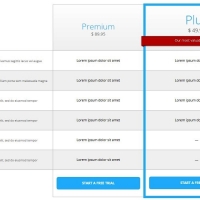
Pricing tables, and in fact all of the elements in a web page, should be responsive. Therefore, you will be sure that all devices can view them correctly. Despite the fact that the following pricing table is responsive and adaptive, it has many effects such as zooming for each plan and moving for the buttons.
HTML
<!-- This script got from www.devanswer.com -->
<div class="pricingTable">
<br>
<ul class="pricingTable-firstTable">
<li class="pricingTable-firstTable_table">
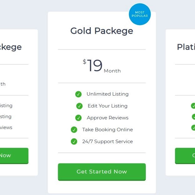
<h1 class="pricingTable-firstTable_table__header">Bronze Packege</h1>
<p class="pricingTable-firstTable_table__pricing"><span>$</span><span>10</span><span>Month</span></p>
<ul class="pricingTable-firstTable_table__options">
<li>Unlimited Listing</li>
<li>Edit Your Listing</li>
<li>Approve Reviews</li>
</ul>
<div class="pricingTable-firstTable_table__getstart">Get Started Now</div>
</li><li class="pricingTable-firstTable_table">
<h1 class="pricingTable-firstTable_table__header">Gold Packege</h1>
<p class="pricingTable-firstTable_table__pricing"><span>$</span><span>19</span><span>Month</span></p>
<ul class="pricingTable-firstTable_table__options">
<li>Unlimited Listing</li>
<li>Edit Your Listing</li>
<li>Approve Reviews</li>
<li>Take Booking Online</li>
<li>24/7 Support Service</li>
</ul>
<div class="pricingTable-firstTable_table__getstart">Get Started Now</div>
</li><li class="pricingTable-firstTable_table">
<h1 class="pricingTable-firstTable_table__header">Platinum Packege</h1>
<p class="pricingTable-firstTable_table__pricing"><span>$</span><span>49</span><span>Month</span></p>
<ul class="pricingTable-firstTable_table__options">
<li>Unlimited Listing</li>
<li>Edit Your Listing</li>
<li>Approve Reviews</li>
</ul>
<div class="pricingTable-firstTable_table__getstart">Get Started Now</div>
</li>
</ul>
</div>
<link href="https://fonts.googleapis.com/css?family=Montserrat" rel="stylesheet"><div id="bcl"><a style="font-size:8pt;text-decoration:none;" href="http://www.devanswer.com">Developers Answer</a></div>
CSS
@charset "UTF-8";
.pricingTable {
  margin: 40px auto;
}
.pricingTable > .pricingTable-title {
  text-align: center;
  color: #6e768d;
  font-size: 3em;
  font-size: 300%;
  margin-bottom: 20px;
  letter-spacing: 0.04em;
}
.pricingTable > .pricingTable-subtitle {
  text-align: center;
  color: #b4bdc6;
  font-size: 1.8em;
  letter-spacing: 0.04em;
  margin-bottom: 60px;
}
@media screen and (max-width: 480px) {
  .pricingTable > .pricingTable-subtitle {
    margin-bottom: 30px;
  }
}
.pricingTable-firstTable {
  list-style: none;
  padding-left: 2em;
  padding-right: 2em;
  text-align: center;
}
.pricingTable-firstTable_table {
  vertical-align: middle;
  width: 31%;
  background-color: #ffffff;
  display: inline-block;
  padding: 0px 30px 40px;
  text-align: center;
  max-width: 320px;
  transition: all 0.3s ease;
  border-radius: 5px;
}
@media screen and (max-width: 767px) {
  .pricingTable-firstTable_table {
    display: block;
    width: 90%;
    margin: 0 auto;
    max-width: 90%;
    margin-bottom: 20px;
    padding: 10px;
    padding-left: 20px;
  }
}
@media screen and (max-width: 767px) {
  .pricingTable-firstTable_table > * {
    display: inline-block;
    vertical-align: middle;
  }
}
@media screen and (max-width: 480px) {
  .pricingTable-firstTable_table > * {
    display: block;
    float: none;
  }
}
@media screen and (max-width: 767px) {
  .pricingTable-firstTable_table:after {
    display: table;
    content: '';
    clear: both;
  }
}
.pricingTable-firstTable_table:hover {
  -webkit-transform: scale(1.08);
          transform: scale(1.08);
}
@media screen and (max-width: 767px) {
  .pricingTable-firstTable_table:hover {
    -webkit-transform: none;
            transform: none;
  }
}
.pricingTable-firstTable_table:not(:last-of-type) {
  margin-right: 3.5%;
}
@media screen and (max-width: 767px) {
  .pricingTable-firstTable_table:not(:last-of-type) {
    margin-right: auto;
  }
}
.pricingTable-firstTable_table:nth-of-type(2) {
  position: relative;
}
@media screen and (max-width: 767px) {
  .pricingTable-firstTable_table:nth-of-type(2) h1 {
    padding-top: 8%;
  }
}
.pricingTable-firstTable_table:nth-of-type(2):before {
  content: 'Most Popular';
  position: absolute;
  color: white;
  display: block;
  background-color: #3bbdee;
  text-align: center;
  right: 15px;
  top: -25px;
  height: 65px;
  width: 65px;
  border-radius: 50%;
  box-sizing: border-box;
  font-size: 0.5em;
  padding-top: 22px;
  text-transform: uppercase;
  letter-spacing: 0.13em;
  transition: all 0.5s ease;
}
@media screen and (max-width: 988px) {
  .pricingTable-firstTable_table:nth-of-type(2):before {
    font-size: 0.6em;
  }
}
@media screen and (max-width: 767px) {
  .pricingTable-firstTable_table:nth-of-type(2):before {
    left: 10px;
    width: 45px;
    height: 45px;
    top: -10px;
    padding-top: 13px;
  }
}
@media screen and (max-width: 480px) {
  .pricingTable-firstTable_table:nth-of-type(2):before {
    font-size: 0.8em;
  }
}
.pricingTable-firstTable_table:nth-of-type(2):hover:before {
  -webkit-transform: rotate(360deg);
          transform: rotate(360deg);
}
.pricingTable-firstTable_table__header {
  font-size: 1.6em;
  padding: 40px 0px;
  border-bottom: 2px solid #ebedec;
  letter-spacing: 0.03em;
}
@media screen and (max-width: 1068px) {
  .pricingTable-firstTable_table__header {
    font-size: 1.45em;
  }
}
@media screen and (max-width: 767px) {
  .pricingTable-firstTable_table__header {
    padding: 0px;
    border-bottom: none;
    float: left;
    width: 33%;
    padding-top: 3%;
    padding-bottom: 2%;
  }
}
@media screen and (max-width: 610px) {
  .pricingTable-firstTable_table__header {
    font-size: 1.3em;
  }
}
@media screen and (max-width: 480px) {
  .pricingTable-firstTable_table__header {
    float: none;
    width: 100%;
    font-size: 1.8em;
    margin-bottom: 5px;
  }
}
.pricingTable-firstTable_table__pricing {
  font-size: 3em;
  padding: 30px 0px;
  border-bottom: 2px solid #ebedec;
  line-height: 0.7;
}
@media screen and (max-width: 1068px) {
  .pricingTable-firstTable_table__pricing {
    font-size: 2.8em;
  }
}
@media screen and (max-width: 767px) {
  .pricingTable-firstTable_table__pricing {
    border-bottom: none;
    padding: 0;
    float: left;
    clear: left;
    width: 33%;
  }
}
@media screen and (max-width: 610px) {
  .pricingTable-firstTable_table__pricing {
    font-size: 2.4em;
  }
}
@media screen and (max-width: 480px) {
  .pricingTable-firstTable_table__pricing {
    float: none;
    width: 100%;
    font-size: 3em;
    margin-bottom: 10px;
  }
}
.pricingTable-firstTable_table__pricing span:first-of-type {
  font-size: 0.35em;
  vertical-align: top;
  letter-spacing: 0.15em;
}
@media screen and (max-width: 1068px) {
  .pricingTable-firstTable_table__pricing span:first-of-type {
    font-size: 0.3em;
  }
}
.pricingTable-firstTable_table__pricing span:last-of-type {
  vertical-align: bottom;
  font-size: 0.30em;
  letter-spacing: 0.04em;
  padding-left: 0.2em;
}
@media screen and (max-width: 1068px) {
  .pricingTable-firstTable_table__pricing span:last-of-type {
    font-size: 0.25em;
  }
}
.pricingTable-firstTable_table__options {
  list-style: none;
  padding: 15px;
  font-size: 0.9em;
  border-bottom: 2px solid #ebedec;
}
@media screen and (max-width: 1068px) {
  .pricingTable-firstTable_table__options {
    font-size: 0.85em;
  }
}
@media screen and (max-width: 767px) {
  .pricingTable-firstTable_table__options {
    border-bottom: none;
    padding: 0;
    margin-right: 10%;
  }
}
@media screen and (max-width: 610px) {
  .pricingTable-firstTable_table__options {
    font-size: 0.7em;
    margin-right: 8%;
  }
}
@media screen and (max-width: 480px) {
  .pricingTable-firstTable_table__options {
    font-size: 1.3em;
    margin-right: none;
    margin-bottom: 10px;
  }
}
.pricingTable-firstTable_table__options > li {
  padding: 8px 0px;
}
@media screen and (max-width: 767px) {
  .pricingTable-firstTable_table__options > li {
    text-align: left;
  }
}
@media screen and (max-width: 610px) {
  .pricingTable-firstTable_table__options > li {
    padding: 5px 0;
  }
}
@media screen and (max-width: 480px) {
  .pricingTable-firstTable_table__options > li {
    text-align: center;
  }
}
.pricingTable-firstTable_table__options > li:before {
  content: '✓';
  display: inline-block;
  margin-right: 15px;
  color: white;
  background-color: #74ce6a;
  border-radius: 50%;
  width: 15px;
  height: 15px;
  font-size: 0.8em;
  padding: 2px;
  text-align: center;
}
@media screen and (max-width: 1068px) {
  .pricingTable-firstTable_table__options > li:before {
    width: 14px;
    height: 14px;
    padding: 1.5px;
  }
}
@media screen and (max-width: 767px) {
  .pricingTable-firstTable_table__options > li:before {
    width: 12px;
    height: 12px;
  }
}
.pricingTable-firstTable_table__getstart {
  color: white;
  background-color: #71ce73;
  margin-top: 30px;
  border-radius: 5px;
  cursor: pointer;
  padding: 15px;
  box-shadow: 0px 3px 0px 0px #66ac64;
  letter-spacing: 0.07em;
  transition: all 0.4s ease;
}
@media screen and (max-width: 1068px) {
  .pricingTable-firstTable_table__getstart {
    font-size: 0.95em;
  }
}
@media screen and (max-width: 767px) {
  .pricingTable-firstTable_table__getstart {
    margin-top: 0;
  }
}
@media screen and (max-width: 610px) {
  .pricingTable-firstTable_table__getstart {
    font-size: 0.9em;
    padding: 10px;
  }
}
@media screen and (max-width: 480px) {
  .pricingTable-firstTable_table__getstart {
    font-size: 1em;
    width: 50%;
    margin: 10px auto;
  }
}
.pricingTable-firstTable_table__getstart:hover {
  -webkit-transform: translateY(-10px);
          transform: translateY(-10px);
  box-shadow: 0px 40px 29px -19px rgba(102, 172, 100, 0.9);
}
@media screen and (max-width: 767px) {
  .pricingTable-firstTable_table__getstart:hover {
    -webkit-transform: none;
            transform: none;
    box-shadow: none;
  }
}
.pricingTable-firstTable_table__getstart:active {
  box-shadow: inset 0 0 10px 1px #66a564, 0px 40px 29px -19px rgba(102, 172, 100, 0.95);
  -webkit-transform: scale(0.95) translateY(-9px);
          transform: scale(0.95) translateY(-9px);
}
@media screen and (max-width: 767px) {
  .pricingTable-firstTable_table__getstart:active {
    -webkit-transform: scale(0.95) translateY(0);
            transform: scale(0.95) translateY(0);
    box-shadow: none;
  }
}

body {
  font-family: 'Montserrat', sans-serif;
  font-size: 100%;
  background-color: #f0f4f7;
  color: #717787;
}
@media screen and (max-width: 960px) {
  body {
    font-size: 80%;
  }
}
@media screen and (max-width: 776px) {
  body {
    font-size: 70%;
  }
}
@media screen and (max-width: 496px) {
  body {
    font-size: 50%;
  }
}
@media screen and (max-width: 320px) {
  body {
    font-size: 40%;
  }
}

* {
  padding: 0;
  margin: 0;
  box-sizing: border-box;
}