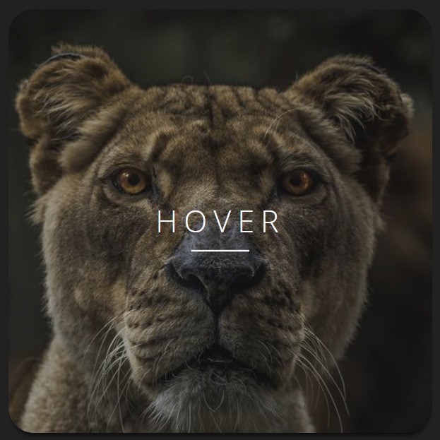
Thumbnails can be as simple as an image. There is no need to make them so complex. However, a wise choice is to put some information behind them. When one interested on the thumbnails and moves mouse towards it, suddenly the hidden info bumps into the thumbnail with hovering effect. The following script shows what we mean!
HTML
<!-- This script got from www.devanswer.com -->
<div class="thumbnail">
<div class="thumbnail__container">
<div class="thumbnail__img" style="background-image: url(http://devanswer.com/codes/files/thumbnail-hover.jpg);"></div>
<div class="thumbnail__content">
<h1 class="thumbnail__caption">Caption goes here</h1>
</div>
</div>
</div><div id="bcl"><a style="font-size:8pt;text-decoration:none;" href="http://www.devanswer.com">Developers Answer</a></div>
CSS
@import url("https://fonts.googleapis.com/css?family=Open+Sans:300");
* {
  box-sizing: border-box;
}

body {
  display: flex;
  align-items: center;
  justify-content: center;
  height: 100vh;
  padding: 24px;
  background-color: #212121;
}

.thumbnail {
  position: relative;
  width: 400px;
  border-radius: 6%;
  box-shadow: 0 5px 5px -3px rgba(0, 0, 0, 0.8);
  overflow: hidden;
  cursor: pointer;
  transition: box-shadow 0.35s ease;
  /* Hover transition */
}
.thumbnail:before {
  content: "";
  display: block;
  width: 100%;
  padding-bottom: 100%;
}
.thumbnail:hover {
  box-shadow: 0 20px 15px -8px rgba(0, 0, 0, 0.8);
}

.thumbnail__container {
  display: flex;
  flex-direction: column;
  position: absolute;
  top: 0;
  left: 0;
  width: 100%;
  height: 100%;
}

.thumbnail__img {
  flex: 4 0 auto;
  background-position: center;
  background-size: cover;
  -webkit-transform: scale(1.2);
          transform: scale(1.2);
  transition: -webkit-transform 0.35s ease;
  transition: transform 0.35s ease;
  transition: transform 0.35s ease, -webkit-transform 0.35s ease;
  /* Hover transition */
}
.thumbnail:hover .thumbnail__img {
  -webkit-transform: scale(1);
          transform: scale(1);
}
.thumbnail__img:before, .thumbnail__img:after {
  position: absolute;
}
.thumbnail__img:before {
  content: "Hover";
  top: 50%;
  left: 50%;
  z-index: 10;
  color: #F8F8F8;
  font-family: "Open Sans", sans-serif;
  font-size: 24px;
  font-weight: 300;
  letter-spacing: 5px;
  line-height: 2;
  text-transform: uppercase;
  background-image: linear-gradient(to right, #F8F8F8 0%, #F8F8F8 100%);
  background-position: center bottom;
  background-repeat: no-repeat;
  background-size: 45% 3%;
  -webkit-transform: translate(-50%, -50%);
          transform: translate(-50%, -50%);
  transition: opacity 0.35s linear, -webkit-transform 0.35s ease;
  transition: opacity 0.35s linear, transform 0.35s ease;
  transition: opacity 0.35s linear, transform 0.35s ease, -webkit-transform 0.35s ease;
  /* Hover transition */
}
.thumbnail:hover .thumbnail__img:before {
  opacity: 0;
  -webkit-transform: translate(-50%, -500%) scale(0.5);
          transform: translate(-50%, -500%) scale(0.5);
}
.thumbnail__img:after {
  content: "";
  top: 0;
  left: 0;
  width: 100%;
  height: 100%;
  background-color: #000;
  opacity: .3;
  transition: opacity 0.35s linear;
  /* Hover transition */
}
.thumbnail:hover .thumbnail__img:after {
  opacity: 0;
}

.thumbnail__content {
  display: flex;
  align-items: center;
  justify-content: center;
  flex: 0 0 0;
  background-color: #F8F8F8;
  overflow: hidden;
  transition: flex-grow 0.35s ease;
  /* Hover transition */
}
.thumbnail:hover .thumbnail__content {
  flex-grow: 1;
}

.thumbnail__caption {
  color: #ABABAB;
  font-family: "Open Sans", sans-serif;
  font-size: 16px;
  font-weight: 300;
  line-height: 1.5;
  overflow: hidden;
  opacity: 0;
  -webkit-transform: scale(0.5) translateY(100%);
          transform: scale(0.5) translateY(100%);
  transition: opacity 0.35s linear, -webkit-transform 0.35s ease;
  transition: opacity 0.35s linear, transform 0.35s ease;
  transition: opacity 0.35s linear, transform 0.35s ease, -webkit-transform 0.35s ease;
  /* Hover transition */
}
.thumbnail:hover .thumbnail__caption {
  -webkit-transform: scale(1);
          transform: scale(1);
  opacity: 1;
}