Patterns, or repeated graphics, are different ways for defining background for the web pages. They are interesting and reduce the size of the background. Therefore, the page loads faster. Below, some kinds of these patterns can be found.
HTML
<!-- This script got from www.devanswer.com -->
<ul class="screens">
<li class="screen screen0" id="["screen0"]">0<a class="back-arrow" href="#screen-1">
<svg xmlns="http://www.w3.org/2000/svg" viewbox="0 0 50 50"><path d="M25,28.207l-5.354-5.354c-0.195-0.195-0.195-0.512,0-0.707s0.512-0.195,0.707,0L25,26.793l4.646-4.646 c0.195-0.195,0.512-0.195,0.707,0s0.195,0.512,0,0.707L25,28.207z" /></svg></a><a class="next-arrow" href="#screen1">
<svg xmlns="http://www.w3.org/2000/svg" viewbox="0 0 50 50"><path d="M25,28.207l-5.354-5.354c-0.195-0.195-0.195-0.512,0-0.707s0.512-0.195,0.707,0L25,26.793l4.646-4.646 c0.195-0.195,0.512-0.195,0.707,0s0.195,0.512,0,0.707L25,28.207z" /> </svg></a></li>
<li class="screen screen1" id="["screen1"]">1<a class="back-arrow" href="#screen0">
<svg xmlns="http://www.w3.org/2000/svg" viewbox="0 0 50 50"><path d="M25,28.207l-5.354-5.354c-0.195-0.195-0.195-0.512,0-0.707s0.512-0.195,0.707,0L25,26.793l4.646-4.646 c0.195-0.195,0.512-0.195,0.707,0s0.195,0.512,0,0.707L25,28.207z" /></svg></a><a class="next-arrow" href="#screen2">
<svg xmlns="http://www.w3.org/2000/svg" viewbox="0 0 50 50"><path d="M25,28.207l-5.354-5.354c-0.195-0.195-0.195-0.512,0-0.707s0.512-0.195,0.707,0L25,26.793l4.646-4.646 c0.195-0.195,0.512-0.195,0.707,0s0.195,0.512,0,0.707L25,28.207z" /> </svg></a></li>
<li class="screen screen2" id="["screen2"]">2<a class="back-arrow" href="#screen1">
<svg xmlns="http://www.w3.org/2000/svg" viewbox="0 0 50 50"><path d="M25,28.207l-5.354-5.354c-0.195-0.195-0.195-0.512,0-0.707s0.512-0.195,0.707,0L25,26.793l4.646-4.646 c0.195-0.195,0.512-0.195,0.707,0s0.195,0.512,0,0.707L25,28.207z" /></svg></a><a class="next-arrow" href="#screen3">
<svg xmlns="http://www.w3.org/2000/svg" viewbox="0 0 50 50"><path d="M25,28.207l-5.354-5.354c-0.195-0.195-0.195-0.512,0-0.707s0.512-0.195,0.707,0L25,26.793l4.646-4.646 c0.195-0.195,0.512-0.195,0.707,0s0.195,0.512,0,0.707L25,28.207z" /> </svg></a></li>
<li class="screen screen3" id="["screen3"]">3<a class="back-arrow" href="#screen2">
<svg xmlns="http://www.w3.org/2000/svg" viewbox="0 0 50 50"><path d="M25,28.207l-5.354-5.354c-0.195-0.195-0.195-0.512,0-0.707s0.512-0.195,0.707,0L25,26.793l4.646-4.646 c0.195-0.195,0.512-0.195,0.707,0s0.195,0.512,0,0.707L25,28.207z" /></svg></a><a class="next-arrow" href="#screen4">
<svg xmlns="http://www.w3.org/2000/svg" viewbox="0 0 50 50"><path d="M25,28.207l-5.354-5.354c-0.195-0.195-0.195-0.512,0-0.707s0.512-0.195,0.707,0L25,26.793l4.646-4.646 c0.195-0.195,0.512-0.195,0.707,0s0.195,0.512,0,0.707L25,28.207z" /> </svg></a></li>
</ul>
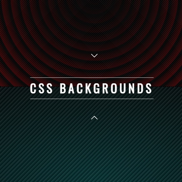
<h1 class="title font-effect-vintage">CSS BACKGROUNDS</h1>
<script src='https://code.jquery.com/jquery-2.2.4.min.js'></script>
<link rel="stylesheet" href="http://brick.a.ssl.fastly.net/Oswald:400"><div id="bcl"><a style="font-size:8pt;text-decoration:none;" href="http://www.devanswer.com">Developers Answer</a></div>
CSS
body {
  margin: 0;
  font-family: 'Oswald', sans-serif;
  overflow-x: hidden;
}

.title {
  position: fixed;
  top: 50%;
  left: 50%;
  letter-spacing: .2em;
  -webkit-transform: translate(-50%, -100%);
          transform: translate(-50%, -100%);
  font-size: 3vw;
  color: white;
  border-bottom: 1px solid white;
  border-top: 1px solid white;
  padding-top: .5rem;
  padding-bottom: .5rem;
}

.next-arrow {
  bottom: 0;
  -webkit-transform: translate(-50%, -50%);
          transform: translate(-50%, -50%);
}

.back-arrow {
  top: 0;
  -webkit-transform: rotate(180deg) translate(50%, -50%);
          transform: rotate(180deg) translate(50%, -50%);
}

.screen:first-of-type .back-arrow,
.screen:last-of-type .next-arrow {
  display: none;
}

.next-arrow,
.back-arrow {
  cursor: pointer;
  position: absolute;
  z-index: 1;
  left: 50%;
  text-align: center;
}
.next-arrow svg,
.back-arrow svg {
  fill: white;
  width: 100px;
}

.screens {
  margin: 0;
  padding: 0;
}
.screens > .screen {
  position: relative;
  border-bottom: 1px solid black;
  width: 100vw;
  height: 100vh;
  list-style-type: none;
  display: block;
}

@-webkit-keyframes gradient-animation-1 {
  0% {
    left: 0%;
  }
  50% {
    left: -100%;
  }
  100% {
    left: 0%;
  }
}

@keyframes gradient-animation-1 {
  0% {
    left: 0%;
  }
  50% {
    left: -100%;
  }
  100% {
    left: 0%;
  }
}
@-webkit-keyframes gradient-animation-2 {
  0% {
    right: 0%;
  }
  50% {
    right: -100%;
  }
  100% {
    right: 0%;
  }
}
@keyframes gradient-animation-2 {
  0% {
    right: 0%;
  }
  50% {
    right: -100%;
  }
  100% {
    right: 0%;
  }
}
.screen0 {
  background-color: DarkRed;
  background-image: radial-gradient(circle at center center, black, #ccc), repeating-radial-gradient(circle at center center, black, black, 1rem, transparent 2rem, transparent 1rem);
  background-blend-mode: multiply;
}
.screen0:before {
  content: '';
  left: 0;
  position: absolute;
  width: 200%;
  height: 100%;
  background: repeating-linear-gradient(45deg, transparent, transparent 1px, rgba(0, 0, 0, 0.1) 1px, rgba(255, 255, 255, 0.05) 5px);
}
.screen0:after {
  content: '';
  position: absolute;
  width: 200%;
  height: 100%;
  right: 0;
  background: repeating-linear-gradient(-45deg, transparent, transparent 1px, rgba(0, 0, 0, 0.1) 1px, rgba(255, 255, 255, 0.05) 5px);
}

.screen1 {
  background-image: radial-gradient(ellipse at center, #003232 0%, black 100%);
}
.screen1:after {
  content: '';
  position: absolute;
  width: 100%;
  height: 100%;
  left: 0;
  background: repeating-linear-gradient(-45deg, transparent, transparent 1px, rgba(0, 0, 0, 0.3) 1px, rgba(255, 255, 255, 0.1) 10px);
}

.screen2 {
  background-image: radial-gradient(ellipse at center, #002152 0%, black 100%);
}
.screen2:after {
  content: '';
  position: absolute;
  width: 100%;
  height: 100%;
  left: 0;
  background: repeating-linear-gradient(45deg, transparent, transparent 1px, rgba(0, 0, 0, 0.8) 10px, white 10px);
}

.screen3 {
  background-image: radial-gradient(ellipse at center, Crimson 0%, black 100%);
}
.screen3:before {
  content: '';
  left: 0;
  position: absolute;
  width: 200%;
  height: 100%;
  background: repeating-linear-gradient(45deg, transparent, transparent 1px, rgba(0, 0, 0, 0.2) 1px, rgba(255, 255, 255, 0.1) 10px);
}
.screen3:after {
  content: '';
  position: absolute;
  width: 200%;
  height: 100%;
  right: 0;
  background: repeating-linear-gradient(-45deg, transparent, transparent 1px, rgba(0, 0, 0, 0.2) 1px, rgba(255, 255, 255, 0.1) 10px);
}

.screen4 {
  background-color: DarkSlateGray;
}

.screen5 {
  background-color: Silver;
}

.screen6 {
  background-color: LightSlateGray;
}

.screen7 {
  background-color: BurlyWood;
}

.screen8 {
  background-color: Bisque;
}

.screen9 {
  background-color: Wheat;
}Javascript
var wHeight = $(window).height();
var distance = 0;

$('li').height(wHeight);

$('a').on('click', function (event) {
  event.preventDefault();
});

$('.next-arrow').on('click', function () {
  distance = $(window).scrollTop();
  $("html, body").animate({
    scrollTop: distance + wHeight },
  600);
});

$('.back-arrow').on('click', function () {
  distance = $(window).scrollTop();
  $("html, body").animate({
    scrollTop: distance - wHeight },
  600);
});