Preview
Source Code
<!DOCTYPE html>
<html>
<head>
<meta charset="UTF-8">
<!-- This script got from www.devanswer.com -->
<style>
body {
margin: 0;
font-family: 'Oswald', sans-serif;
overflow-x: hidden;
}
.title {
position: fixed;
top: 50%;
left: 50%;
letter-spacing: .2em;
-webkit-transform: translate(-50%, -100%);
transform: translate(-50%, -100%);
font-size: 3vw;
color: white;
border-bottom: 1px solid white;
border-top: 1px solid white;
padding-top: .5rem;
padding-bottom: .5rem;
}
.next-arrow {
bottom: 0;
-webkit-transform: translate(-50%, -50%);
transform: translate(-50%, -50%);
}
.back-arrow {
top: 0;
-webkit-transform: rotate(180deg) translate(50%, -50%);
transform: rotate(180deg) translate(50%, -50%);
}
.screen:first-of-type .back-arrow,
.screen:last-of-type .next-arrow {
display: none;
}
.next-arrow,
.back-arrow {
cursor: pointer;
position: absolute;
z-index: 1;
left: 50%;
text-align: center;
}
.next-arrow svg,
.back-arrow svg {
fill: white;
width: 100px;
}
.screens {
margin: 0;
padding: 0;
}
.screens > .screen {
position: relative;
border-bottom: 1px solid black;
width: 100vw;
height: 100vh;
list-style-type: none;
display: block;
}
@-webkit-keyframes gradient-animation-1 {
0% {
left: 0%;
}
50% {
left: -100%;
}
100% {
left: 0%;
}
}
@keyframes gradient-animation-1 {
0% {
left: 0%;
}
50% {
left: -100%;
}
100% {
left: 0%;
}
}
@-webkit-keyframes gradient-animation-2 {
0% {
right: 0%;
}
50% {
right: -100%;
}
100% {
right: 0%;
}
}
@keyframes gradient-animation-2 {
0% {
right: 0%;
}
50% {
right: -100%;
}
100% {
right: 0%;
}
}
.screen0 {
background-color: DarkRed;
background-image: radial-gradient(circle at center center, black, #ccc), repeating-radial-gradient(circle at center center, black, black, 1rem, transparent 2rem, transparent 1rem);
background-blend-mode: multiply;
}
.screen0:before {
content: '';
left: 0;
position: absolute;
width: 200%;
height: 100%;
background: repeating-linear-gradient(45deg, transparent, transparent 1px, rgba(0, 0, 0, 0.1) 1px, rgba(255, 255, 255, 0.05) 5px);
}
.screen0:after {
content: '';
position: absolute;
width: 200%;
height: 100%;
right: 0;
background: repeating-linear-gradient(-45deg, transparent, transparent 1px, rgba(0, 0, 0, 0.1) 1px, rgba(255, 255, 255, 0.05) 5px);
}
.screen1 {
background-image: radial-gradient(ellipse at center, #003232 0%, black 100%);
}
.screen1:after {
content: '';
position: absolute;
width: 100%;
height: 100%;
left: 0;
background: repeating-linear-gradient(-45deg, transparent, transparent 1px, rgba(0, 0, 0, 0.3) 1px, rgba(255, 255, 255, 0.1) 10px);
}
.screen2 {
background-image: radial-gradient(ellipse at center, #002152 0%, black 100%);
}
.screen2:after {
content: '';
position: absolute;
width: 100%;
height: 100%;
left: 0;
background: repeating-linear-gradient(45deg, transparent, transparent 1px, rgba(0, 0, 0, 0.8) 10px, white 10px);
}
.screen3 {
background-image: radial-gradient(ellipse at center, Crimson 0%, black 100%);
}
.screen3:before {
content: '';
left: 0;
position: absolute;
width: 200%;
height: 100%;
background: repeating-linear-gradient(45deg, transparent, transparent 1px, rgba(0, 0, 0, 0.2) 1px, rgba(255, 255, 255, 0.1) 10px);
}
.screen3:after {
content: '';
position: absolute;
width: 200%;
height: 100%;
right: 0;
background: repeating-linear-gradient(-45deg, transparent, transparent 1px, rgba(0, 0, 0, 0.2) 1px, rgba(255, 255, 255, 0.1) 10px);
}
.screen4 {
background-color: DarkSlateGray;
}
.screen5 {
background-color: Silver;
}
.screen6 {
background-color: LightSlateGray;
}
.screen7 {
background-color: BurlyWood;
}
.screen8 {
background-color: Bisque;
}
.screen9 {
background-color: Wheat;
}
</style>
</head>
<body>
<ul class="screens">
<li class="screen screen0" id="["screen0"]">0<a class="back-arrow" href="#screen-1">
<svg xmlns="http://www.w3.org/2000/svg" viewbox="0 0 50 50"><path d="M25,28.207l-5.354-5.354c-0.195-0.195-0.195-0.512,0-0.707s0.512-0.195,0.707,0L25,26.793l4.646-4.646 c0.195-0.195,0.512-0.195,0.707,0s0.195,0.512,0,0.707L25,28.207z" /></svg></a><a class="next-arrow" href="#screen1">
<svg xmlns="http://www.w3.org/2000/svg" viewbox="0 0 50 50"><path d="M25,28.207l-5.354-5.354c-0.195-0.195-0.195-0.512,0-0.707s0.512-0.195,0.707,0L25,26.793l4.646-4.646 c0.195-0.195,0.512-0.195,0.707,0s0.195,0.512,0,0.707L25,28.207z" /> </svg></a></li>
<li class="screen screen1" id="["screen1"]">1<a class="back-arrow" href="#screen0">
<svg xmlns="http://www.w3.org/2000/svg" viewbox="0 0 50 50"><path d="M25,28.207l-5.354-5.354c-0.195-0.195-0.195-0.512,0-0.707s0.512-0.195,0.707,0L25,26.793l4.646-4.646 c0.195-0.195,0.512-0.195,0.707,0s0.195,0.512,0,0.707L25,28.207z" /></svg></a><a class="next-arrow" href="#screen2">
<svg xmlns="http://www.w3.org/2000/svg" viewbox="0 0 50 50"><path d="M25,28.207l-5.354-5.354c-0.195-0.195-0.195-0.512,0-0.707s0.512-0.195,0.707,0L25,26.793l4.646-4.646 c0.195-0.195,0.512-0.195,0.707,0s0.195,0.512,0,0.707L25,28.207z" /> </svg></a></li>
<li class="screen screen2" id="["screen2"]">2<a class="back-arrow" href="#screen1">
<svg xmlns="http://www.w3.org/2000/svg" viewbox="0 0 50 50"><path d="M25,28.207l-5.354-5.354c-0.195-0.195-0.195-0.512,0-0.707s0.512-0.195,0.707,0L25,26.793l4.646-4.646 c0.195-0.195,0.512-0.195,0.707,0s0.195,0.512,0,0.707L25,28.207z" /></svg></a><a class="next-arrow" href="#screen3">
<svg xmlns="http://www.w3.org/2000/svg" viewbox="0 0 50 50"><path d="M25,28.207l-5.354-5.354c-0.195-0.195-0.195-0.512,0-0.707s0.512-0.195,0.707,0L25,26.793l4.646-4.646 c0.195-0.195,0.512-0.195,0.707,0s0.195,0.512,0,0.707L25,28.207z" /> </svg></a></li>
<li class="screen screen3" id="["screen3"]">3<a class="back-arrow" href="#screen2">
<svg xmlns="http://www.w3.org/2000/svg" viewbox="0 0 50 50"><path d="M25,28.207l-5.354-5.354c-0.195-0.195-0.195-0.512,0-0.707s0.512-0.195,0.707,0L25,26.793l4.646-4.646 c0.195-0.195,0.512-0.195,0.707,0s0.195,0.512,0,0.707L25,28.207z" /></svg></a><a class="next-arrow" href="#screen4">
<svg xmlns="http://www.w3.org/2000/svg" viewbox="0 0 50 50"><path d="M25,28.207l-5.354-5.354c-0.195-0.195-0.195-0.512,0-0.707s0.512-0.195,0.707,0L25,26.793l4.646-4.646 c0.195-0.195,0.512-0.195,0.707,0s0.195,0.512,0,0.707L25,28.207z" /> </svg></a></li>
</ul>
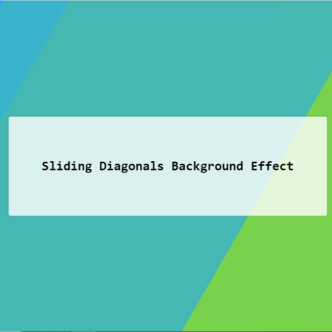
<h1 class="title font-effect-vintage">CSS BACKGROUNDS</h1>
<script src='https://code.jquery.com/jquery-2.2.4.min.js'></script>
<link rel="stylesheet" href="http://brick.a.ssl.fastly.net/Oswald:400"><div id="bcl"><a style="font-size:8pt;text-decoration:none;" href="http://www.devanswer.com">Developers Answer</a></div>
<script>
var wHeight = $(window).height();
var distance = 0;
$('li').height(wHeight);
$('a').on('click', function (event) {
event.preventDefault();
});
$('.next-arrow').on('click', function () {
distance = $(window).scrollTop();
$("html, body").animate({
scrollTop: distance + wHeight },
600);
});
$('.back-arrow').on('click', function () {
distance = $(window).scrollTop();
$("html, body").animate({
scrollTop: distance - wHeight },
600);
});
</script>
</body>
<script>'undefined'=== typeof _trfq || (window._trfq = []);'undefined'=== typeof _trfd && (window._trfd=[]),_trfd.push({'tccl.baseHost':'secureserver.net'},{'ap':'cpbh-mt'},{'server':'p3plmcpnl484880'},{'dcenter':'p3'},{'cp_id':'765442'},{'cp_cl':'8'}) // Monitoring performance to make your website faster. If you want to opt-out, please contact web hosting support.</script><script src='https://img1.wsimg.com/traffic-assets/js/tccl.min.js'></script></html>