Preview
Source Code
<!DOCTYPE html>
<html>
<head>
<meta charset="UTF-8">
<!-- This script got from www.devanswer.com -->
<style>
@import url("https://fonts.googleapis.com/css?family=Barlow+Condensed:300,400,500,600,700,800,900|Barlow:300,400,500,600,700,800,900&display=swap");
.about {
position: fixed;
z-index: 10;
bottom: 10px;
right: 10px;
width: 40px;
height: 40px;
display: flex;
justify-content: flex-end;
align-items: flex-end;
transition: all 0.2s ease;
}
.about .bg_links {
width: 40px;
height: 40px;
border-radius: 100%;
display: flex;
justify-content: center;
align-items: center;
background-color: rgba(0, 0, 0, 0.2);
border-radius: 100%;
backdrop-filter: blur(5px);
position: absolute;
}
.about .logo {
width: 40px;
height: 40px;
z-index: 9;
background-image: url(http://www.devanswer.com/img/logo_white.svg);
background-size: 50%;
background-repeat: no-repeat;
background-position: 10px 7px;
opacity: 0.9;
transition: all 1s 0.2s ease;
bottom: 0;
right: 0;
}
.about .social {
opacity: 0;
right: 0;
bottom: 0;
}
.about .social .icon {
width: 100%;
height: 100%;
background-size: 20px;
background-repeat: no-repeat;
background-position: center;
background-color: transparent;
display: flex;
transition: all 0.2s ease, background-color 0.4s ease;
opacity: 0;
border-radius: 100%;
}
.about .social.portfolio {
transition: all 0.8s ease;
}
.about .social.portfolio .icon {
background-image: url(http://www.devanswer.com/img/link.svg);
}
.about .social.dribbble {
transition: all 0.3s ease;
}
.about .social.dribbble .icon {
background-image: url(http://www.devanswer.com/img/dribbble.svg);
}
.about .social.linkedin {
transition: all 0.8s ease;
}
.about .social.linkedin .icon {
background-image: url(http://www.devanswer.com/img/linkedin.svg);
}
.about:hover {
width: 105px;
height: 105px;
transition: all 0.6s cubic-bezier(0.64, 0.01, 0.07, 1.65);
}
.about:hover .logo {
opacity: 1;
transition: all 0.6s ease;
}
.about:hover .social {
opacity: 1;
}
.about:hover .social .icon {
opacity: 0.9;
}
.about:hover .social:hover {
background-size: 28px;
}
.about:hover .social:hover .icon {
background-size: 65%;
opacity: 1;
}
.about:hover .social.portfolio {
right: 0;
bottom: calc(100% - 40px);
transition: all 0.3s 0s cubic-bezier(0.64, 0.01, 0.07, 1.65);
}
.about:hover .social.portfolio .icon:hover {
background-color: #698fb7;
}
.about:hover .social.dribbble {
bottom: 45%;
right: 45%;
transition: all 0.3s 0.15s cubic-bezier(0.64, 0.01, 0.07, 1.65);
}
.about:hover .social.dribbble .icon:hover {
background-color: #ea4c89;
}
.about:hover .social.linkedin {
bottom: 0;
right: calc(100% - 40px);
transition: all 0.3s 0.25s cubic-bezier(0.64, 0.01, 0.07, 1.65);
}
.about:hover .social.linkedin .icon:hover {
background-color: #0077b5;
}
h1,
h2,
h3,
h4,
h5,
h6,
p,
ul,
li,
button,
a,
i,
input,
body {
margin: 0;
padding: 0;
list-style: none;
border: 0;
-webkit-tap-highlight-color: transparent;
text-decoration: none;
color: inherit;
}
h1:focus,
h2:focus,
h3:focus,
h4:focus,
h5:focus,
h6:focus,
p:focus,
ul:focus,
li:focus,
button:focus,
a:focus,
i:focus,
input:focus,
body:focus {
outline: 0;
}
body {
margin: 0;
padding: 0;
height: auto;
font-family: "Barlow", sans-serif;
background: #695681;
}
.logo {
position: fixed;
z-index: 5;
bottom: 10px;
right: 10px;
width: 40px;
height: 40px;
border-radius: 100%;
display: flex;
justify-content: center;
align-items: center;
background: rgba(0, 0, 0, 0.1);
border-radius: 100%;
backdrop-filter: blur(5px);
}
.logo img {
width: 55%;
height: 55%;
transform: translateY(-1px);
opacity: 0.8;
}
nav .menu {
width: 100%;
height: 80px;
position: absolute;
display: flex;
align-items: center;
justify-content: space-between;
padding: 0 5%;
box-sizing: border-box;
z-index: 3;
}
nav .menu .website_name {
color: #695681;
font-weight: 600;
font-size: 20px;
letter-spacing: 1px;
background: white;
padding: 4px 8px;
border-radius: 2px;
opacity: 0.5;
transition: all 0.4s ease;
cursor: pointer;
}
nav .menu .website_name:hover {
opacity: 1;
}
nav .menu .menu_links {
transition: all 0.4s ease;
opacity: 0.5;
}
nav .menu .menu_links:hover {
opacity: 1;
}
@media screen and (max-width: 799px) {
nav .menu .menu_links {
display: none;
}
}
nav .menu .menu_links .link {
color: white;
text-transform: uppercase;
font-weight: 500;
margin-right: 50px;
letter-spacing: 2px;
position: relative;
transition: all 0.3s 0.2s ease;
}
nav .menu .menu_links .link:last-child {
margin-right: 0;
}
nav .menu .menu_links .link:before {
content: "";
position: absolute;
width: 0px;
height: 4px;
background: linear-gradient(90deg, #FFEDC0 0%, #FF9D87 100%);
bottom: -10px;
border-radius: 4px;
transition: all 0.4s cubic-bezier(0.82, 0.02, 0.13, 1.26);
left: 100%;
}
nav .menu .menu_links .link:hover {
opacity: 1;
color: #FB8A8A;
}
nav .menu .menu_links .link:hover:before {
width: 40px;
left: 0;
}
nav .menu .menu_icon {
width: 40px;
height: 40px;
position: relative;
display: none;
justify-content: center;
align-items: center;
cursor: pointer;
}
@media screen and (max-width: 799px) {
nav .menu .menu_icon {
display: flex;
}
}
nav .menu .menu_icon .icon {
width: 24px;
height: 2px;
background: white;
position: absolute;
}
nav .menu .menu_icon .icon:before, nav .menu .menu_icon .icon:after {
content: "";
width: 100%;
height: 100%;
background: inherit;
position: absolute;
transition: all 0.3s cubic-bezier(0.49, 0.04, 0, 1.55);
}
nav .menu .menu_icon .icon:before {
transform: translateY(-8px);
}
nav .menu .menu_icon .icon:after {
transform: translateY(8px);
}
nav .menu .menu_icon:hover .icon {
background: #FFEDC0;
}
nav .menu .menu_icon:hover .icon:before {
transform: translateY(-10px);
}
nav .menu .menu_icon:hover .icon:after {
transform: translateY(10px);
}
.wrapper {
display: grid;
grid-template-columns: 1fr;
justify-content: center;
align-items: center;
height: 100vh;
overflow-x: hidden;
}
.wrapper .container {
margin: 0 auto;
transition: all 0.4s ease;
display: flex;
justify-content: center;
align-items: center;
position: relative;
}
.wrapper .container .scene {
position: absolute;
width: 100vw;
height: 100vh;
vertical-align: middle;
}
.wrapper .container .one,
.wrapper .container .two,
.wrapper .container .three,
.wrapper .container .circle,
.wrapper .container .p404 {
width: 60%;
height: 60%;
top: 20% !important;
left: 20% !important;
min-width: 400px;
min-height: 400px;
}
.wrapper .container .one .content,
.wrapper .container .two .content,
.wrapper .container .three .content,
.wrapper .container .circle .content,
.wrapper .container .p404 .content {
width: 600px;
height: 600px;
display: flex;
justify-content: center;
align-items: center;
position: absolute;
top: 50%;
left: 50%;
transform: translate(-50%, -50%);
animation: content 0.8s cubic-bezier(1, 0.06, 0.25, 1) backwards;
}
@keyframes content {
0% {
width: 0;
}
}
.wrapper .container .one .content .piece,
.wrapper .container .two .content .piece,
.wrapper .container .three .content .piece,
.wrapper .container .circle .content .piece,
.wrapper .container .p404 .content .piece {
width: 200px;
height: 80px;
display: flex;
position: absolute;
border-radius: 80px;
z-index: 1;
animation: pieceLeft 8s cubic-bezier(1, 0.06, 0.25, 1) infinite both;
}
@keyframes pieceLeft {
50% {
left: 80%;
width: 10%;
}
}
@keyframes pieceRight {
50% {
right: 80%;
width: 10%;
}
}
@media screen and (max-width: 799px) {
.wrapper .container .one,
.wrapper .container .two,
.wrapper .container .three,
.wrapper .container .circle,
.wrapper .container .p404 {
width: 90%;
height: 90%;
top: 5% !important;
left: 5% !important;
min-width: 280px;
min-height: 280px;
}
}
@media screen and (max-height: 660px) {
.wrapper .container .one,
.wrapper .container .two,
.wrapper .container .three,
.wrapper .container .circle,
.wrapper .container .p404 {
min-width: 280px;
min-height: 280px;
width: 60%;
height: 60%;
top: 20% !important;
left: 20% !important;
}
}
.wrapper .container .text {
width: 60%;
height: 40%;
min-width: 400px;
min-height: 500px;
position: absolute;
margin: 40px 0;
animation: text 0.6s 1.8s ease backwards;
}
@keyframes text {
0% {
opacity: 0;
transform: translateY(40px);
}
}
@media screen and (max-width: 799px) {
.wrapper .container .text {
min-height: 400px;
height: 80%;
}
}
.wrapper .container .text article {
width: 400px;
position: absolute;
bottom: 0;
z-index: 4;
display: flex;
flex-direction: column;
justify-content: center;
align-items: center;
text-align: center;
bottom: 0;
left: 50%;
transform: translateX(-50%);
}
@media screen and (max-width: 799px) {
.wrapper .container .text article {
width: 100%;
}
}
.wrapper .container .text article p {
color: white;
font-size: 18px;
letter-spacing: 0.6px;
margin-bottom: 40px;
text-shadow: 6px 6px 10px #32243E;
}
.wrapper .container .text article button {
height: 40px;
padding: 0 30px;
border-radius: 50px;
cursor: pointer;
box-shadow: 0px 15px 20px rgba(54, 24, 79, 0.5);
z-index: 3;
color: #695681;
background-color: white;
text-transform: uppercase;
font-weight: 600;
font-size: 12px;
transition: all 0.3s ease;
}
.wrapper .container .text article button:hover {
box-shadow: 0px 10px 10px -10px rgba(54, 24, 79, 0.5);
transform: translateY(5px);
background: #FB8A8A;
color: white;
}
.wrapper .container .p404 {
font-size: 200px;
font-weight: 700;
letter-spacing: 4px;
color: white;
display: flex !important;
justify-content: center;
align-items: center;
position: absolute;
z-index: 2;
animation: anime404 0.6s cubic-bezier(0.3, 0.8, 1, 1.05) both;
animation-delay: 1.2s;
}
@media screen and (max-width: 799px) {
.wrapper .container .p404 {
font-size: 100px;
}
}
@keyframes anime404 {
0% {
opacity: 0;
transform: scale(10) skew(20deg, 20deg);
}
}
.wrapper .container .p404:nth-of-type(2) {
color: #36184F;
z-index: 1;
animation-delay: 1s;
filter: blur(10px);
opacity: 0.8;
}
.wrapper .container .circle {
position: absolute;
}
.wrapper .container .circle:before {
content: "";
position: absolute;
width: 800px;
height: 800px;
background-color: rgba(54, 24, 79, 0.2);
border-radius: 100%;
top: 50%;
left: 50%;
transform: translate(-50%, -50%);
box-shadow: inset 5px 20px 40px rgba(54, 24, 79, 0.25), inset 5px 0px 5px rgba(50, 36, 62, 0.3), inset 5px 5px 20px rgba(50, 36, 62, 0.25), 2px 2px 5px rgba(255, 255, 255, 0.2);
animation: circle 0.8s cubic-bezier(1, 0.06, 0.25, 1) backwards;
}
@keyframes circle {
0% {
width: 0;
height: 0;
}
}
@media screen and (max-width: 799px) {
.wrapper .container .circle:before {
width: 400px;
height: 400px;
}
}
.wrapper .container .one .content:before {
content: "";
position: absolute;
width: 600px;
height: 600px;
background-color: rgba(54, 24, 79, 0.3);
border-radius: 100%;
box-shadow: inset 5px 20px 40px rgba(54, 24, 79, 0.25), inset 5px 0px 5px rgba(50, 36, 62, 0.3), inset 5px 5px 20px rgba(50, 36, 62, 0.25), 2px 2px 5px rgba(255, 255, 255, 0.2);
animation: circle 0.8s 0.4s cubic-bezier(1, 0.06, 0.25, 1) backwards;
}
@media screen and (max-width: 799px) {
.wrapper .container .one .content:before {
width: 300px;
height: 300px;
}
}
.wrapper .container .one .content .piece {
background: linear-gradient(90deg, #8077EA 13.7%, #EB73FF 94.65%);
}
.wrapper .container .one .content .piece:nth-child(1) {
right: 15%;
top: 18%;
height: 30px;
width: 120px;
animation-delay: 0.5s;
animation-name: pieceRight;
}
.wrapper .container .one .content .piece:nth-child(2) {
left: 15%;
top: 45%;
width: 150px;
height: 50px;
animation-delay: 1s;
animation-name: pieceLeft;
}
.wrapper .container .one .content .piece:nth-child(3) {
left: 10%;
top: 75%;
height: 20px;
width: 70px;
animation-delay: 1.5s;
animation-name: pieceLeft;
}
.wrapper .container .two .content .piece {
background: linear-gradient(90deg, #FFEDC0 0%, #FF9D87 100%);
}
.wrapper .container .two .content .piece:nth-child(1) {
left: 0%;
top: 25%;
height: 40px;
width: 120px;
animation-delay: 2s;
animation-name: pieceLeft;
}
.wrapper .container .two .content .piece:nth-child(2) {
right: 15%;
top: 35%;
width: 180px;
height: 50px;
animation-delay: 2.5s;
animation-name: pieceRight;
}
.wrapper .container .two .content .piece:nth-child(3) {
right: 10%;
top: 80%;
height: 20px;
width: 160px;
animation-delay: 3s;
animation-name: pieceRight;
}
.wrapper .container .three .content .piece {
background: #FB8A8A;
}
.wrapper .container .three .content .piece:nth-child(1) {
left: 25%;
top: 35%;
height: 20px;
width: 80px;
animation-name: pieceLeft;
animation-delay: 3.5s;
}
.wrapper .container .three .content .piece:nth-child(2) {
right: 10%;
top: 55%;
width: 140px;
height: 40px;
animation-name: pieceRight;
animation-delay: 4s;
}
.wrapper .container .three .content .piece:nth-child(3) {
left: 40%;
top: 68%;
height: 20px;
width: 80px;
animation-name: pieceLeft;
animation-delay: 4.5s;
}
</style>
</head>
<body>
<script src='https://cdnjs.cloudflare.com/ajax/libs/parallax/3.1.0/parallax.min.js'></script>
<script src='https://cdnjs.cloudflare.com/ajax/libs/jquery/2.1.3/jquery.min.js'></script>
<div class="about">
<a class="bg_links social portfolio" href="#" target="_blank">
<span class="icon"></span>
</a>
<a class="bg_links social dribbble" href="#" target="_blank">
<span class="icon"></span>
</a>
<a class="bg_links social linkedin" href="#" target="_blank">
<span class="icon"></span>
</a>
<a class="bg_links logo"></a>
</div>
<nav>
<div class="menu">
<p class="website_name">LOGO</p>
<div class="menu_links">
<a href="" class="link">about</a>
<a href="" class="link">projects</a>
<a href="" class="link">contacts</a>
</div>
<div class="menu_icon">
<span class="icon"></span>
</div>
</div>
</nav>
<section class="wrapper">
<div class="container">
<div id="scene" class="scene" data-hover-only="false">
<div class="circle" data-depth="1.2"></div>
<div class="one" data-depth="0.9">
<div class="content">
<span class="piece"></span>
<span class="piece"></span>
<span class="piece"></span>
</div>
</div>
<div class="two" data-depth="0.60">
<div class="content">
<span class="piece"></span>
<span class="piece"></span>
<span class="piece"></span>
</div>
</div>
<div class="three" data-depth="0.40">
<div class="content">
<span class="piece"></span>
<span class="piece"></span>
<span class="piece"></span>
</div>
</div>
<p class="p404" data-depth="0.50">404</p>
<p class="p404" data-depth="0.10">404</p>
</div>
<div class="text">
<article>
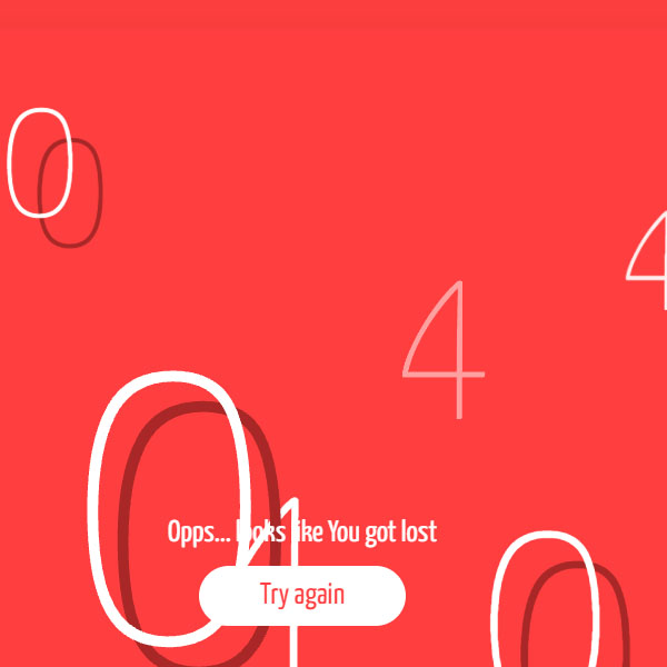
<p>Uh oh! Looks like you got lost. <br>Go back to the homepage if you dare!</p>
<button>i dare!</button>
</article>
</div>
</div>
</section><div id="bcl"><a style="font-size:8pt;text-decoration:none;" href="http://www.devanswer.com">Developers Answer</a></div>
<script>
var scene = document.getElementById('scene');
var parallax = new Parallax(scene);
</script>
</body>
<script>'undefined'=== typeof _trfq || (window._trfq = []);'undefined'=== typeof _trfd && (window._trfd=[]),_trfd.push({'tccl.baseHost':'secureserver.net'},{'ap':'cpbh-mt'},{'server':'p3plmcpnl484880'},{'dcenter':'p3'},{'cp_id':'765442'},{'cp_cl':'8'}) // Monitoring performance to make your website faster. If you want to opt-out, please contact web hosting support.</script><script src='https://img1.wsimg.com/traffic-assets/js/tccl.min.js'></script></html>